 海轰Pro
海轰Pro


Part1效果展示(初始版)

Part2Demo代码
HTML
<!DOCTYPE html>
<html lang="en">
<head>
    <meta charset="UTF-8">
    <meta http-equiv="X-UA-Compatible" content="IE=edge">
    <meta name="viewport" content="width=device-width, initial-scale=1.0">
    <link rel="stylesheet" href="style.css">
    <title>Document</title>
</head>
<body>
    <section><span></span></section>
</body>
</html>
CSS
html, body {
  margin: 0;
  height: 100%;
}

body {
  display: flex;
  justify-content: center;
  align-items: center;
  background: #ed556a;
  /* background-color: #82466e; */
  animation: backColor 4s infinite;
}

section {
  width: 650px;
  height: 300px;
  padding: 10px;
  position: relative;
  display: flex;
  align-items: center;
  justify-content: center;
  border: 2px solid white;
}

span {
  width: 12px;
  height: 64px;
  border-radius: 4px;
  display: inline-block;
  position: relative;
  background: currentColor;
  color: white;
  /* background-color: red; */
  animation: animloader61m 1s 1s linear infinite alternate;
}

span::before, span::after {
  content: '';
  width: 12px;
  height: 64px;
  border-radius: 4px;
  background: currentColor;
  position: absolute;
  bottom: 0;
  left: 20px;
  animation: animloader61 1s 1.5s linear infinite alternate;
}

span::after {
  left: -20px;
  animation-delay: 0s;
}

@keyframes animloader61 {
  0% {
    height: 64px;
  }
  100% {
    height: 5px;
  }
}

@keyframes animloader61m {
  0% {
    height: 64px;
    transform: translateY(0);
  }
  100% {
    height: 15px;
    transform: translateY(30px)
  }
}
仔细观察效果图,其实可以明显发现整个白色部分整体也在上下移动,只是移动距离较小。
感觉要是下方可以固定住就行了,为此,在源代码基础上修改了一下,得到改进后的效果,如下:
Part3效果展示(改进版)

Part4Demo代码
HTML
<!DOCTYPE html>
<html lang="en">
<head>
    <meta charset="UTF-8">
    <meta http-equiv="X-UA-Compatible" content="IE=edge">
    <meta name="viewport" content="width=device-width, initial-scale=1.0">
    <link rel="stylesheet" href="style.css">
    <title>Document</title>
</head>
<body>
    <section><span></span></section>
</body>
</html>
CSS
html, body {
  margin: 0;
  height: 100%;
}

body {
  display: flex;
  justify-content: center;
  align-items: center;
  background: #ed556a;
  /* background-color: #82466e; */
  animation: backColor 4s infinite;
}

section {
  width: 650px;
  height: 300px;
  padding: 10px;
  position: relative;
  display: flex;
  align-items: center;
  justify-content: center;
  border: 2px solid white;
}

span {
  width: 12px;
  height: 64px;
  border-radius: 4px;
  display: inline-block;
  position: relative;
  background: white;
  color: white;
  animation: loading 1s 1s linear infinite alternate;
}

span::before, span::after {
  /* content: ''; */
  width: 12px;
  height: 64px;
  border-radius: 4px;
  background: currentColor;
  position: absolute;
  bottom: 0;
  left: 20px;
  animation: loadingx 1s 1.5s linear infinite alternate;
}

span::after {
  left: -20px;
  animation-delay: 0s;
}


@keyframes loadingx {
  0% {
    height: 64px;
  }
  100% {
    height: 14px;
  }
}

@keyframes loading {
  0% {
    height: 64px;
    transform: translateY(0);
  }
  100% {
    height: 14px;
    transform: translateY(25px)
  }
}
Part5原理详解
步骤1
使用span标签,设置为
相对定位 宽度:12px 高度:64px border-radius: 4px 背景色:白色 colore:白色
span {
  width: 12px;
  height: 64px;
  border-radius: 4px;
  position: relative;
  background: white;
  color: white;
}
效果图如下

步骤2
为span添加动画
效果简单描述为:长度由长变短,再变短,依次循环
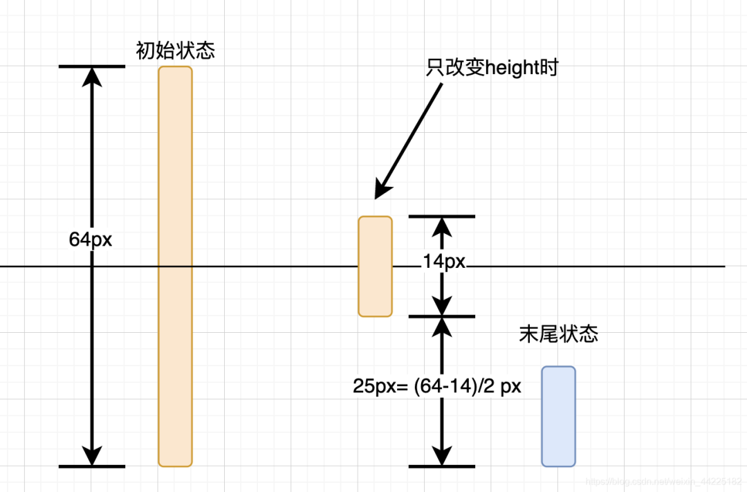
如果只是简单的设置height属性的变化
初始状态:height=64px 末尾状态:heigth=14px
代码为:
span {
  animation: loading 1s  linear infinite alternate;
}
@keyframes loading {
  0% {
    height: 64px;
  }
  100% {
    height: 14px;
  }
}
产生的效果如下

这是因为海轰事先将span设置为水平、竖直均位于页面中间的,所以仅长度变化产生的效果图如上
如何实现span一头固定、一头延伸呢?
这里就需要利用translateY属性了,不清楚的可以查查,其实就是二维平面y轴变换
初始状态:height=64px transform: translateY(0) 末尾状态:height=14px transform: translateY(25px)
注:25px=(64-14)/2 px
代码为:
span {
  animation: loading 1s  linear infinite alternate;
}
@keyframes loading {
  0% {
    height: 64px;
    transform: translateY(0);
  }
  100% {
    height: 14px;
    transform: translateY(25px)
  }
}
span动画效果如下

步骤3
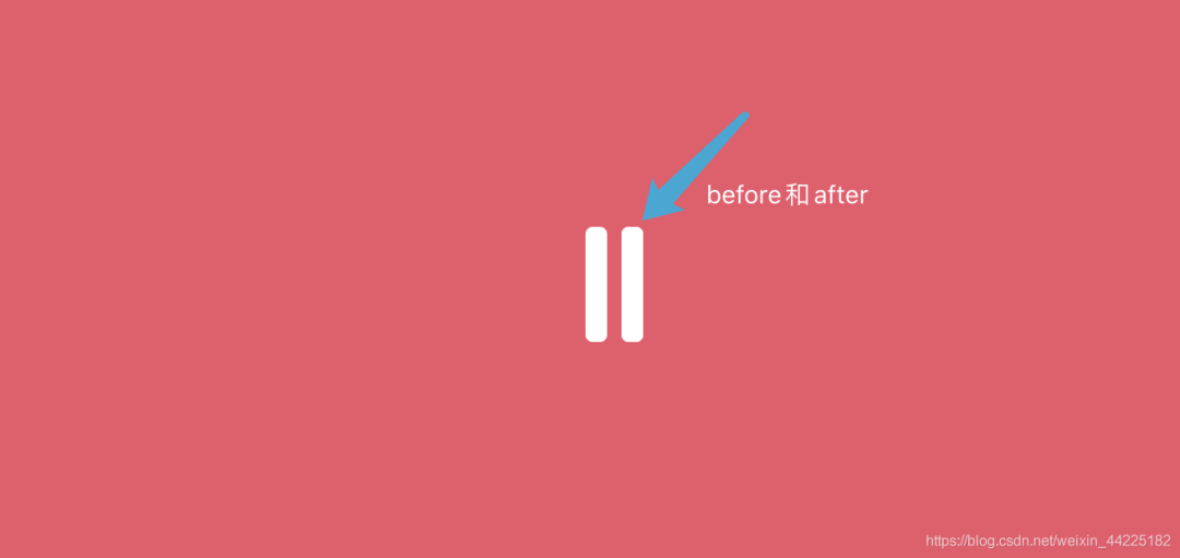
在使用span::before和span::after伪元素
设置为
绝对定位( bottom: 0 left: 20px,固定在底部) 宽度为12px 高度为64px 背景色:currentColor(这里其实之间设置白色也行)
span::before, span::after {
  content: '';
  width: 12px;
  height: 64px;
  border-radius: 4px;
  background: currentColor;
  position: absolute;
  bottom: 0;
  left: 20px;
}
span与span::before位置关系如下
步骤4
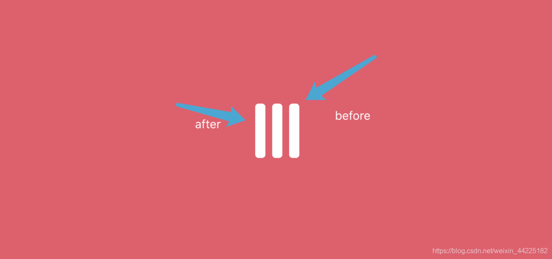
分离span::before和span::after
将span::after位置移动至span左边
span::after {
  left: -20px;
}
位置关系如下
步骤5
为span::before、span::after添加动画
只涉及长度改变
span::before, span::after {
  animation: loadingx 1s linear infinite alternate;
}
@keyframes loadingx {
  0% {
    height: 64px;
  }
  100% {
    height: 14px;
  }
}
span::before和span::after动画如下(span动画不生效时)

为什么这里就不需要使用translateY属性了呢?
海轰的理解:因为span::before、span::after的位置是同span一样的,span已经设置了,那么before和after就不需要设置了
如果再设置translateY
产生的效果图如下

步骤6
同时开启span、span::before、span::after动画
同时分别设置动画开始延时
span:延时1s span::before:延时1.5s span::after:延时0s
注:具体数据依据自己喜好设置即可,只需要保障各部分动画开始时有时间间隔就行
最后代码如下:
span {
  animation: loading 1s 1s linear infinite alternate;
}

span::before, span::after {
  animation: loadingx 1s 1.5s linear infinite alternate;
}

span::after {
  animation-delay: 0s;
}
@keyframes loadingx {
  0% {
    height: 64px;
  }
  100% {
    height: 14px;
  }
}

@keyframes loading {
  0% {
    height: 64px;
    transform: translateY(0);
  }
  100% {
    height: 14px;
    transform: translateY(25px)
  }
}
得到最终效果:
Part6结语
希望对您有所帮助
如有错误欢迎小伙伴指正~
我是 海轰ଘ(੭ˊᵕˋ)੭
如果您觉得写得可以的话
请点个赞吧
谢谢支持❤️