 海轰Pro
海轰Pro


效果展示
Demo代码
HTML
<!DOCTYPE html>
<html lang="en">
<head>
    <meta charset="UTF-8">
    <meta http-equiv="X-UA-Compatible" content="IE=edge">
    <meta name="viewport" content="width=device-width, initial-scale=1.0">
    <link rel="stylesheet" href="style.css">
    <title>Document</title>
</head>
<body>
    <section><span></span></section>
</body>
</html>
CSS
html, body {
  margin: 0;
  height: 100%;
}

body {
  display: flex;
  justify-content: center;
  align-items: center;
  background: #ed556a;
}

section {
  width: 650px;
  height: 300px;
  padding: 10px;
  position: relative;
  display: flex;
  align-items: center;
  justify-content: center;
  border: 2px solid white;
}

span {
  width: 64px;
  height: 64px;
  display: inline-block;
  position: relative;
}

span::after {
  content: '';
  width: 32px;
  height: 32px;
  position: absolute;
  left: 0;
  top: 0;
  background: white;
  color: white;
  animation: loading 2s linear infinite alternate;
}

@keyframes loading {
  0% {
    box-shadow: 0 0, 0 0, 0 0
  }
  33% {
    box-shadow: 32px 0px, 32px 0px, 32px 0px
  }
  66% {
    box-shadow: 32px 32px, 32px 32px, 32px 0px
  }
  100% {
    box-shadow: 0px 32px, 32px 32px, 32px 0px
  }
}
原理详解
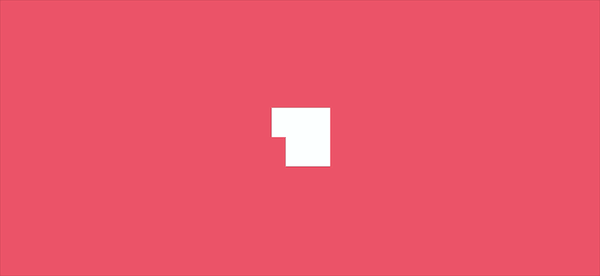
步骤1
使用span标签,设置为
宽度、高度均为64px 相对定位 背景色:goldenrod
span {
  width: 64px;
  height: 64px;
  position: relative;
  background-color:goldenrod;
}
效果图如下
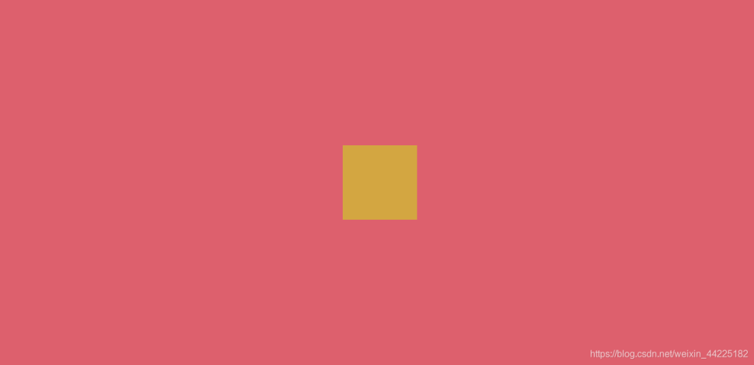
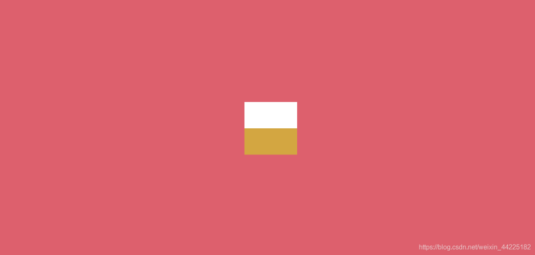
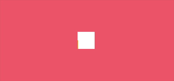
步骤2
使用span::after伪元素,设置为
绝对定位(top:0 left:0) 宽度、高度均为32px(大小是span的四分之一) 背景色:白色 color:白色
span::after {
  content: '';
  width: 32px;
  height: 32px;
  position: absolute;
  left: 0;
  top: 0;
  background: white;
  color: white;
}
效果图如下
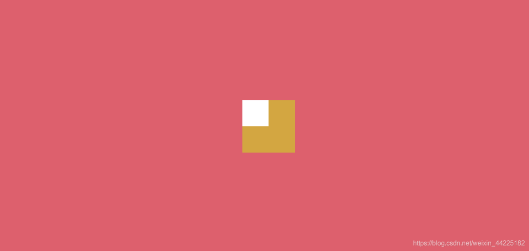
步骤3
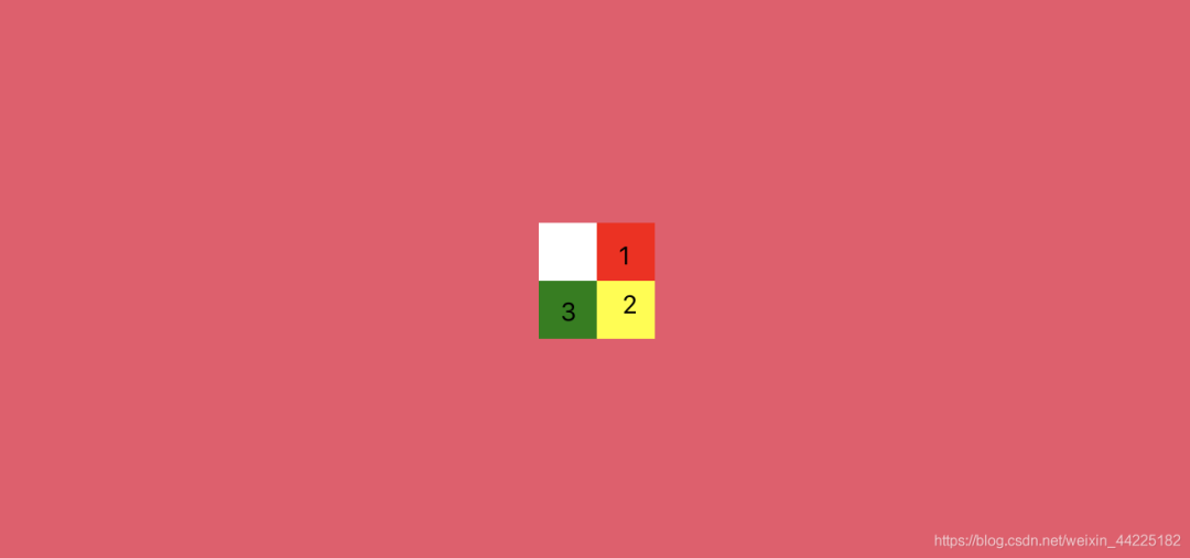
使用span::after的阴影(box-shadow) 需要三个
位置分别是(注意是span::after的阴影):
/*阴影1*/
32px 0px ,

/*阴影2*/
32px 32px ,

/*阴影3*/
0px 32px ;
理论图如下
步骤4
利用步骤3的三个阴影组成动画
阴影均为白色(步骤3是为了区分不同阴影而采用的彩色)
有关键四帧
第一帧
阴影1、2、3均不显示
box-shadow: 0 0, 0 0, 0 0
效果图如下
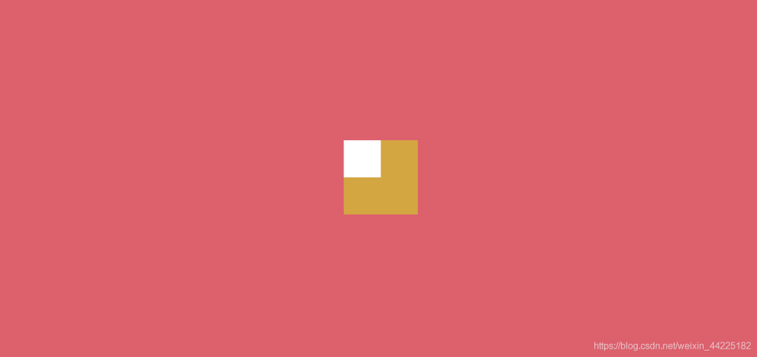
第二帧
显示阴影1 阴影2、3不显示
box-shadow: 32px 0px, 32px 0px, 32px 0px
效果图如下
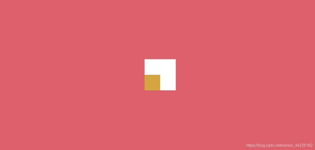
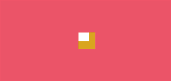
第三帧
显示阴影1、2 阴影3不显示
box-shadow: 32px 32px, 32px 32px, 32px 0px
效果图如下
第四帧
同时显示阴影1、2、3
box-shadow: 0px 32px, 32px 32px, 32px 0px
效果图如下

动画从第一帧逐步过渡至第四帧
span::after {
  animation: loading 2s linear infinite alternate;
}
@keyframes loading {
  0% {
    box-shadow: 0 0, 0 0, 0 0
  }
  33% {
    box-shadow: 32px 0px, 32px 0px, 32px 0px
  }
  66% {
    box-shadow: 32px 32px, 32px 32px, 32px 0px
  }
  100% {
    box-shadow: 0px 32px, 32px 32px, 32px 0px
  }
}
效果图如下
步骤5
动画采用alternate交替
animation: loading 2s linear infinite alternate;
效果图如下
步骤6
去掉span背景色
最后效果图如下
结语
希望对您有所帮助
如有错误欢迎小伙伴指正~
我是 海轰ଘ(੭ˊᵕˋ)੭
如果您觉得写得可以的话
请点个赞吧
谢谢支持❤️