 海轰Pro
海轰Pro


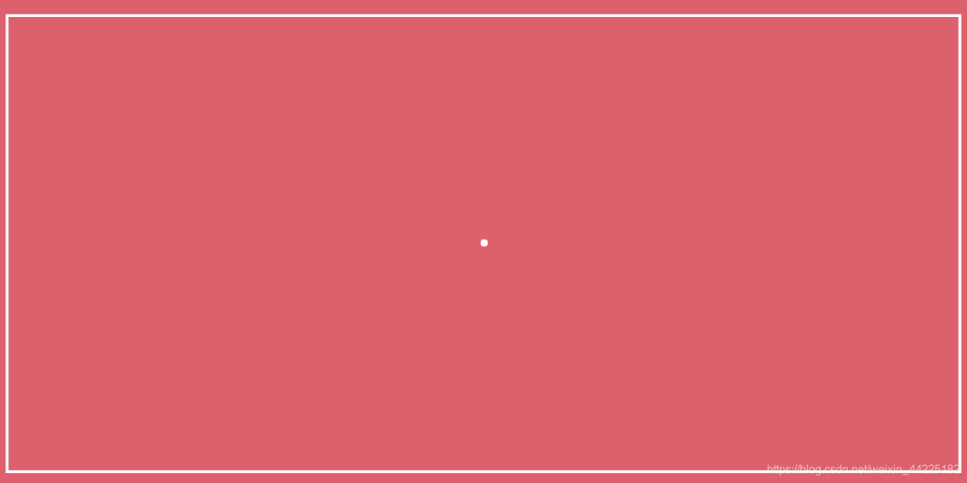
Part1效果展示

Part2Demo代码
HTML
<!DOCTYPE html>
<html lang="en">
<head>
    <meta charset="UTF-8">
    <meta http-equiv="X-UA-Compatible" content="IE=edge">
    <meta name="viewport" content="width=device-width, initial-scale=1.0">
    <link rel="stylesheet" href="style.css">
    <title>Document</title>
</head>
<body>
    <section><span></span></section>
</body>
</html>
CSS
html, body {
  margin: 0;
  height: 100%;
}

body {
  display: flex;
  justify-content: center;
  align-items: center;
  background: #ed556a;
  /* background-color: #82466e; */
  animation: backColor 4s infinite;
}

section {
  width: 650px;
  height: 300px;
  padding: 10px;
  position: relative;
  display: flex;
  align-items: center;
  justify-content: center;
  border: 2px solid white;
}

span {
  width: 5px;
  height: 5px;
  display: inline-block;
  position: relative;
  border-radius: 4px;
  color: white;
  background: currentColor;
  animation: animloader66 0.6s 0.6s linear infinite alternate;
}

span::before, span::after {
  content: '';
  width: 5px;
  height: 5px;
  border-radius: 4px;
  background: currentColor;
  position: absolute;
  left: 0;
  top: 15px;
  animation: animloader66 0.6s 0.9s linear infinite alternate;
}

[data-index="66"] {
  justify-content: normal;
  padding-left: 15%;
}

span::after {
  top: -15px;
  animation-delay: 0s;
}

@keyframes animloader66 {
  0% {
    width: 5px;
  }
  100% {
    width: 48px;
  }
}
Part3原理详解
步骤1
使用span标签,设置为
相对定位 宽度、高度均为5px 背景色:白色 color:白色 border-radius: 4px
span {
  width: 5px;
  height: 5px;
  position: relative;
  border-radius: 4px;
  color: white;
  background: white;
}
效果图如下
步骤2
为span添加动画
动画描述效果为:span宽度从5px变化到48px,再回到5px
span {
  animation: loading 0.6s 0s linear infinite alternate;
}
@keyframes loading {
  0% {
    width: 5px;
  }
  100% {
    width: 48px;
  }
}
效果图如下
 注:span事先是设置固定在页面正中的,所以才会出现上图效果
步骤3
使用span的两个伪元素:span::before、span::after
同时设置为
绝对定位( left: 0 top: 15px) 宽度、高度均为5px 背景色:白色 border-radius: 4px
span::before, span::after {
  content: '';
  width: 5px;
  height: 5px;
  border-radius: 4px;
  background: white;
  position: absolute;
  left: 0;
  top: 15px;
}
位置关系如下

为span::before、span::after添加同span一样的动画,只是动画开始延迟时间设置为0.6s
span::before, span::after {
  animation: loading 0.6s 0.6s linear infinite alternate;
}
效果图如下:

注:可以发现,span和它的两个伪元素的左部分一直是处于同一条直线上

步骤4
分离span::before、span::after
将span::after移动至位于span上方15px处 且动画延迟时间修改为0.9s
span::after {
  top: -15px;
  animation-delay: 0.9s;
}
得到最终的效果图
Part4结语
希望对您有所帮助
如有错误欢迎小伙伴指正~
我是 海轰ଘ(੭ˊᵕˋ)੭
如果您觉得写得可以的话
请点个赞吧
谢谢支持❤️