
【动画消消乐】HTML+CSS 自定义加载动画 058
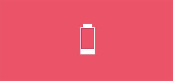
效果展示
Demo代码
HTML
<!DOCTYPE html>
<html lang="en">
<head>
    <meta charset="UTF-8">
    <meta http-equiv="X-UA-Compatible" content="IE=edge">
    <meta name="viewport" content="width=device-width, initial-scale=1.0">
    <link rel="stylesheet" href="style.css">
    <title>Document</title>
</head>
<body>
    <section><span></span></section>
</body>
</html>
CSS
html, body {
  margin: 0;
  height: 100%;
}

body {
  display: flex;
  justify-content: center;
  align-items: center;
  background: #ed556a;
}

section {
  width: 650px;
  height: 300px;
  padding: 10px;
  position: relative;
  display: flex;
  align-items: center;
  justify-content: center;
  border: 2px solid white;
}

span {
  width: 48px;
  height: 96px;
  display: inline-block;
  position: relative;
  color: white;
  border: 3px solid;
  animation: loading 2s linear infinite alternate;
}

span::before {
  content: '';
  position: absolute;
  top: -15px;
  left: 6px;
  width: 36px;
  height: 12px;
  background-color: white;
}

@keyframes loading {
  0% {
    box-shadow: 0 0 inset
  }
  100% {
    box-shadow: 0 -96px inset
  }
}
原理详解
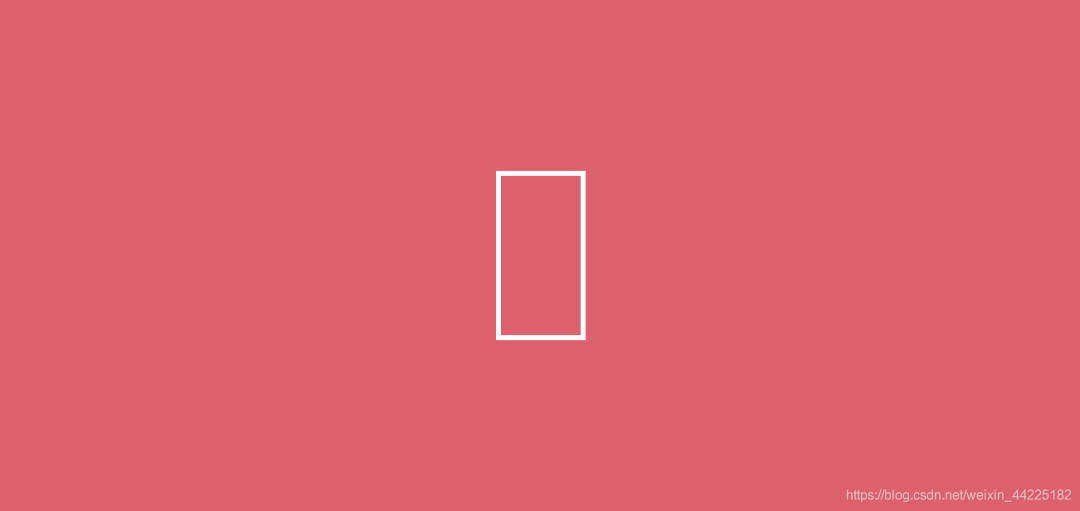
步骤1
使用span标签,设置为
相对定位 宽度48px,高度96px 边框:3px solid 白色 color:白色
span {
  width: 48px;
  height: 96px;
  position: relative;
  color: white;
  border: 3px solid;
}
效果图如下
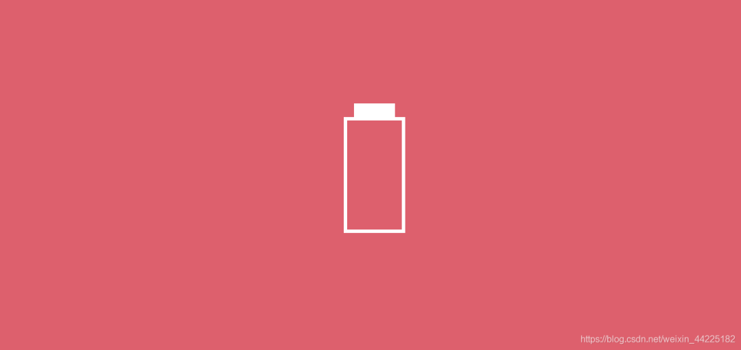
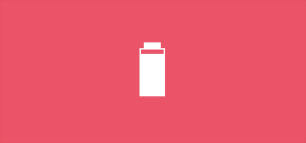
步骤2
利用span::before伪元素,充当最上方白色方块
设置为
绝对定位(top -15px,left 6px) 宽度:36px 高度:12px 背景色:白色
span::before {
  content: '';
  position: absolute;
  top: -15px;
  left: 6px;
  width: 36px;
  height: 12px;
  background-color: white;
}
效果图如下
注:
top是-15px,是因为上方白色方块宽度12px,还需要加上下方白色边框3px,一共12+3=15px left为6px,是因为要使上方白色方块居中,需要向左移动(48-36)/2=6px
步骤3
使用span的阴影(box-shadow)作为动画
需要实现的效果:逐渐填充下方白色部分内部
阴影向内
以动画中的几帧说明:
当阴影向内延伸10px时
span {
  box-shadow: 0 -10px inset
}
效果图如下
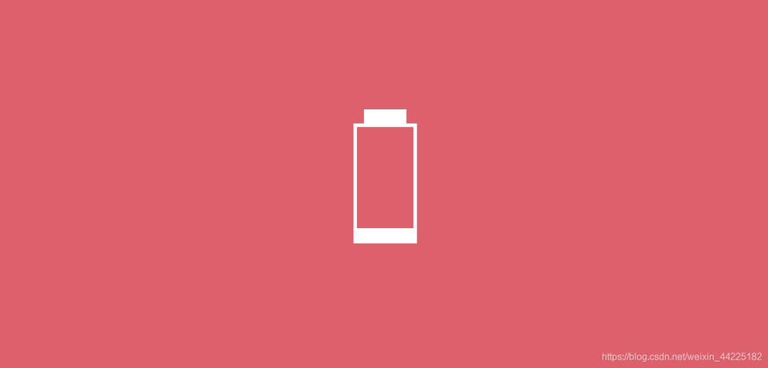
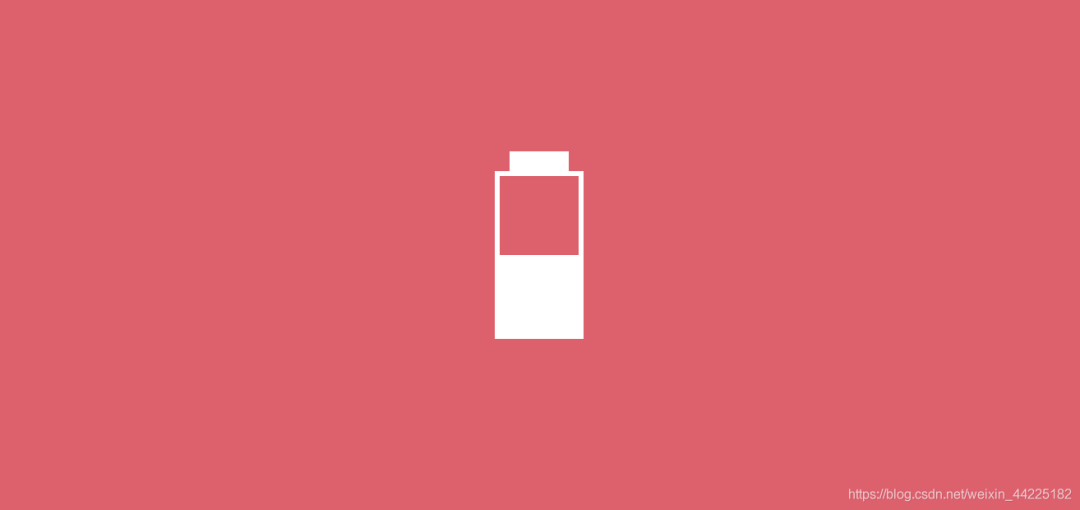
当阴影向内延伸48px时
span {
  box-shadow: 0 -48px inset
}
效果图如下
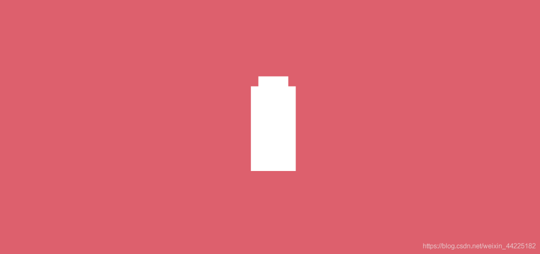
当阴影向内延伸96px时
span {
  box-shadow: 0 -96px inset
}
效果图如下
综上:阴影向内从0延伸96px,重复即可
animation: loading 2s linear infinite ;
@keyframes loading {
  0% {
    box-shadow: 0 0 inset
  }
  100% {
    box-shadow: 0 -96px inset
  }
}
效果图如下
步骤4
设置动画交替进行
animation: loading 2s linear infinite alternate;
效果图如下
结语
希望对您有所帮助
如有错误欢迎小伙伴指正~
我是 海轰ଘ(੭ˊᵕˋ)੭
如果您觉得写得可以的话
请点个赞吧
谢谢支持❤️
评论