 机器学习初学者


默认出图丑陋 重复执行一行代码设置一个参数的繁琐行为 复杂多子图个性化 自定义字体困难等等......
 本期的主角是ProPlot,ProPlot是Matplotlib面向对象绘图方法(object-oriented interface)的高级封装,整合了cartopy/basemap地图库、xarray和pandas,可弥补Matplotlib的部分缺陷,ProPlot让Matplotlib爱好者拥有更加smoother plotting experience。
在构造上,使用proplot.figure.Figure替代matplotlib.figure.Figure、proplot.axes.Axes替代matplotlib.axes.Axes、proplot.gridspec.GridSpec替代matplotlib.gridspec.GridSpec。
作者为气象学领域的PhD,难怪ProPlot重点整合cartopy、basemap地图库(见后文)
直接来看看Proplot的9大亮点:
1、更简简洁的代码,更好看的图形
将Matplotlib一行代码设置一个参数的繁琐行为直接通过format方法一次搞定,比如下图,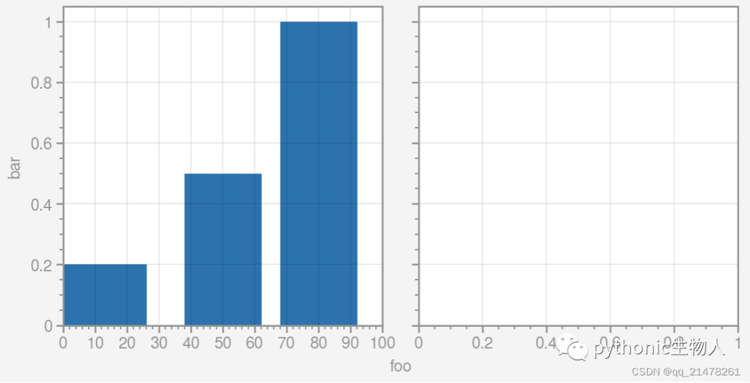 Proplot中代码
import proplot as pplt

fig, axs = pplt.subplots(ncols=2)
axs.format(color='gray', linewidth=1) #format设置所有子图属性
axs[0].bar([10, 50, 80], [0.2, 0.5, 1])
axs[0].format(xlim=(0, 100), #format设置子图1属性
              xticks=10,
              xtickminor=True,
              xlabel='foo',
              ylabel='bar')
Matplotlib中代码,
import matplotlib.pyplot as plt
import matplotlib.ticker as mticker
import matplotlib as mpl
with mpl.rc_context(rc={'axes.linewidth': 1, 'axes.edgecolor': 'gray'}):
    fig, axs = plt.subplots(ncols=2, sharey=True)
    axs[0].set_ylabel('bar', color='gray')
    axs[0].bar([10, 50, 80], [0.2, 0.5, 1], width=14)
    for ax in axs:
        #每一行代码设置一个图形参数
        ax.set_xlim(0, 100)
        ax.xaxis.set_major_locator(mticker.MultipleLocator(10))
        ax.tick_params(width=1, color='gray', labelcolor='gray')
        ax.tick_params(axis='x', which='minor', bottom=True)
        ax.set_xlabel('foo', color='gray')
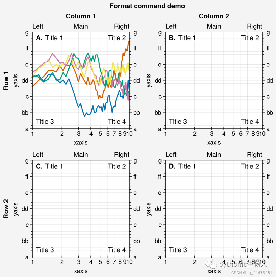
可见,Proplot中代码量会少很多。 一个更完整的format使用案例,
import proplot as pplt
import numpy as np

fig, axs = pplt.subplots(ncols=2, nrows=2, refwidth=2, share=False)
state = np.random.RandomState(51423)
N = 60
x = np.linspace(1, 10, N)
y = (state.rand(N, 5) - 0.5).cumsum(axis=0)
axs[0].plot(x, y, linewidth=1.5)

# 图表诸多属性可在format中设置
axs.format(
    suptitle='Format command demo',
    abc='A.',
    abcloc='ul',
    title='Main',
    ltitle='Left',
    rtitle='Right',  # different titles
    ultitle='Title 1',
    urtitle='Title 2',
    lltitle='Title 3',
    lrtitle='Title 4',
    toplabels=('Column 1', 'Column 2'),
    leftlabels=('Row 1', 'Row 2'),
    xlabel='xaxis',
    ylabel='yaxis',
    xscale='log',
    xlim=(1, 10),
    xticks=1,
    ylim=(-3, 3),
    yticks=pplt.arange(-3, 3),
    yticklabels=('a', 'bb', 'c', 'dd', 'e', 'ff', 'g'),
    ytickloc='both',
    yticklabelloc='both',
    xtickdir='inout',
    xtickminor=False,
    ygridminor=True,
)
2、更友好的类构造函数
将Matplotlib中类名书写不友好的类进行封装,可通过简洁的关键字参数调用。例如,mpl_toolkits.basemap.Basemap()、matplotlib.ticker.LogFormatterExponent()、ax.xaxis.set_major_locator(MultipleLocator(1.000))等等,封装后,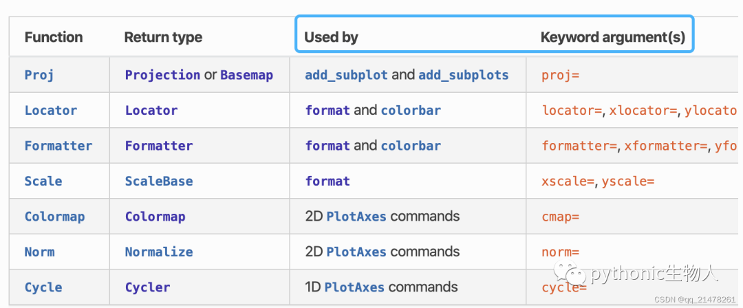
3、图形大小、子图间距自适应
proplot通过refwidth、refheight、refaspect、refheight、proplot.gridspec.GridSpec等控制图形大小和子图间距,替代Matplotlib自带的tightlayout,避免图形重叠、标签不完全等问题。推荐阅读
一个案例,proplot如何更科学控制图形大小?
import proplot as pplt
import numpy as np
state = np.random.RandomState(51423)
colors = np.tile(state.rand(8, 12, 1), (1, 1, 3))
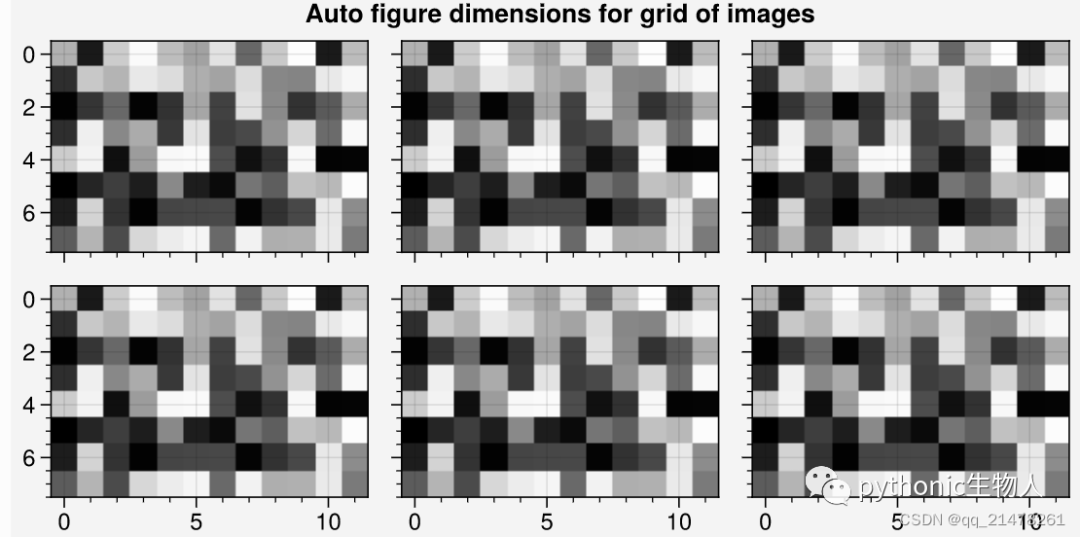
fig, axs = pplt.subplots(ncols=3, nrows=2, refwidth=1.7) #refwidth的使用
fig.format(suptitle='Auto figure dimensions for grid of images')
for ax in axs:
ax.imshow(colors)
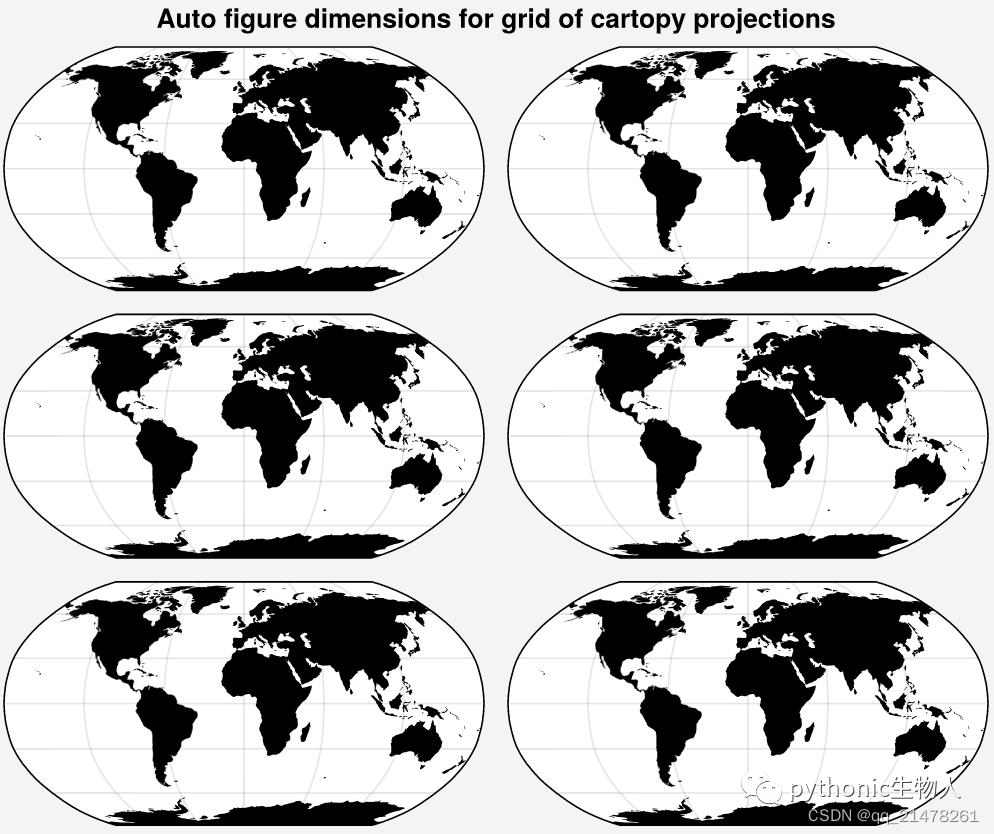
# 结合上文第2部分看,使用proj='robin'关键字参数调用cartopy projections'
fig, axs = pplt.subplots(ncols=2, nrows=3, proj='robin')
axs.format(land=True, landcolor='k')
fig.format(suptitle='Auto figure dimensions for grid of cartopy projections')
 一个案例,proplot如何更科学
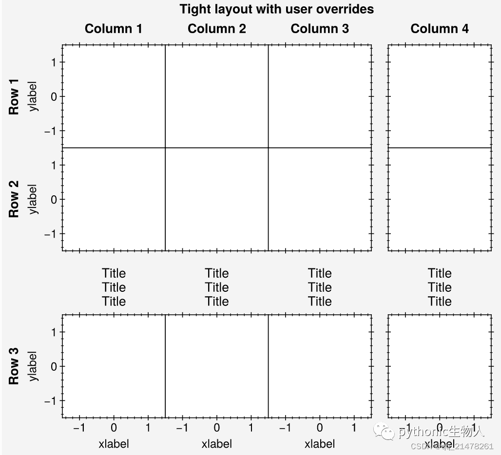
控制子图间距?
import proplot as pplt

fig, axs = pplt.subplots(
    ncols=4, nrows=3, refwidth=1.1, span=False,
    bottom='5em', right='5em',
    wspace=(0, 0, None), hspace=(0, None),
) # proplot新的子图间距控制算法
axs.format(
    grid=False,
    xlocator=1, ylocator=1, tickdir='inout',
    xlim=(-1.5, 1.5), ylim=(-1.5, 1.5),
    suptitle='Tight layout with user overrides',
    toplabels=('Column 1', 'Column 2', 'Column 3', 'Column 4'),
    leftlabels=('Row 1', 'Row 2', 'Row 3'),
)
axs[0, :].format(xtickloc='top')
axs[2, :].format(xtickloc='both')
axs[:, 1].format(ytickloc='neither')
axs[:, 2].format(ytickloc='right')
axs[:, 3].format(ytickloc='both')
axs[-1, :].format(xlabel='xlabel', title='Title\nTitle\nTitle')
axs[:, 0].format(ylabel='ylabel')
4、多子图个性化设置
推荐阅读👉matplotlib-多子图绘制(为所欲为版)Matplotlib对于多子图轴标签、legend和colorbar等处理存在冗余问题,proplot使用Figure、colorbar和legend方法处理这种情况,使多子图绘图更简洁。
子图灵活设置坐标轴标签
sharex, sharey, spanx, spany, alignx和aligny参数控制,效果见下图(相同颜色比较来看),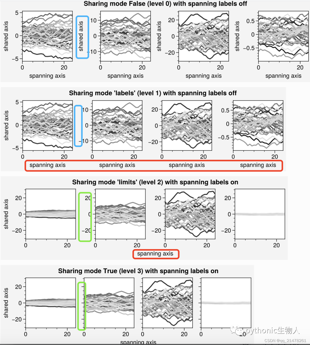
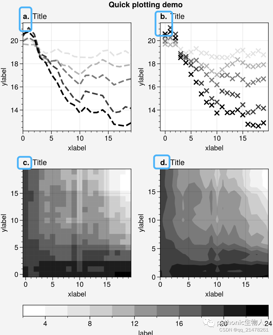
子图灵活添加编号
一行代码为各子图添加编号
import proplot as pplt
import numpy as np
N = 20
state = np.random.RandomState(51423)
data = N + (state.rand(N, N) - 0.55).cumsum(axis=0).cumsum(axis=1)

cycle = pplt.Cycle('greys', left=0.2, N=5)
fig, axs = pplt.subplots(ncols=2, nrows=2, figwidth=5, share=False)
axs[0].plot(data[:, :5], linewidth=2, linestyle='--', cycle=cycle)
axs[1].scatter(data[:, :5], marker='x', cycle=cycle)
axs[2].pcolormesh(data, cmap='greys')
m = axs[3].contourf(data, cmap='greys')
axs.format(
    abc='a.', titleloc='l', title='Title',
    xlabel='xlabel', ylabel='ylabel', suptitle='Quick plotting demo'
) #abc='a.'为各子图添加编号
fig.colorbar(m, loc='b', label='label')
子图灵活设置Panels

子图各自外观灵活自定义
主要使用proplot.gridspec.SubplotGrid.format,
import proplot as pplt
import numpy as np
state = np.random.RandomState(51423)
# Selected subplots in a simple grid
fig, axs = pplt.subplots(ncols=4, nrows=4, refwidth=1.2, span=True)
axs.format(xlabel='xlabel', ylabel='ylabel', suptitle='Simple SubplotGrid')
axs.format(grid=False, xlim=(0, 50), ylim=(-4, 4))
# 使用axs[:, 0].format自定义某个子图外观
axs[:, 0].format(facecolor='blush', edgecolor='gray7', linewidth=1) # eauivalent
axs[:, 0].format(fc='blush', ec='gray7', lw=1)
axs[0, :].format(fc='sky blue', ec='gray7', lw=1)
axs[0].format(ec='black', fc='gray5', lw=1.4)
axs[1:, 1:].format(fc='gray1')
for ax in axs[1:, 1:]:
ax.plot((state.rand(50, 5) - 0.5).cumsum(axis=0), cycle='Grays', lw=2)
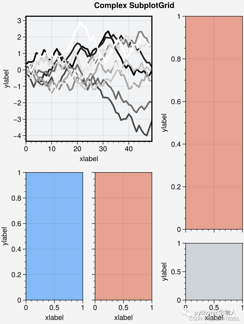
# 使用axs[1, 1:].format自定义某个子图外观
fig = pplt.figure(refwidth=1, refnum=5, span=False)
axs = fig.subplots([[1, 1, 2], [3, 4, 2], [3, 4, 5]], hratios=[2.2, 1, 1])
axs.format(xlabel='xlabel', ylabel='ylabel', suptitle='Complex SubplotGrid')
axs[0].format(ec='black', fc='gray1', lw=1.4)
axs[1, 1:].format(fc='blush')
axs[1, :1].format(fc='sky blue')
axs[-1, -1].format(fc='gray4', grid=False)
axs[0].plot((state.rand(50, 10) - 0.5).cumsum(axis=0), cycle='Grays_r', lw=2)
实现如下效果变得简单,赞啊~ 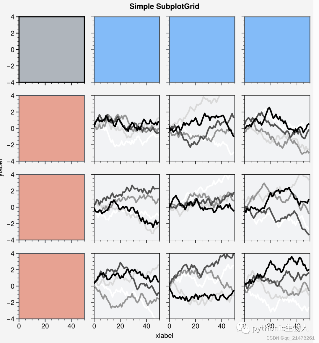
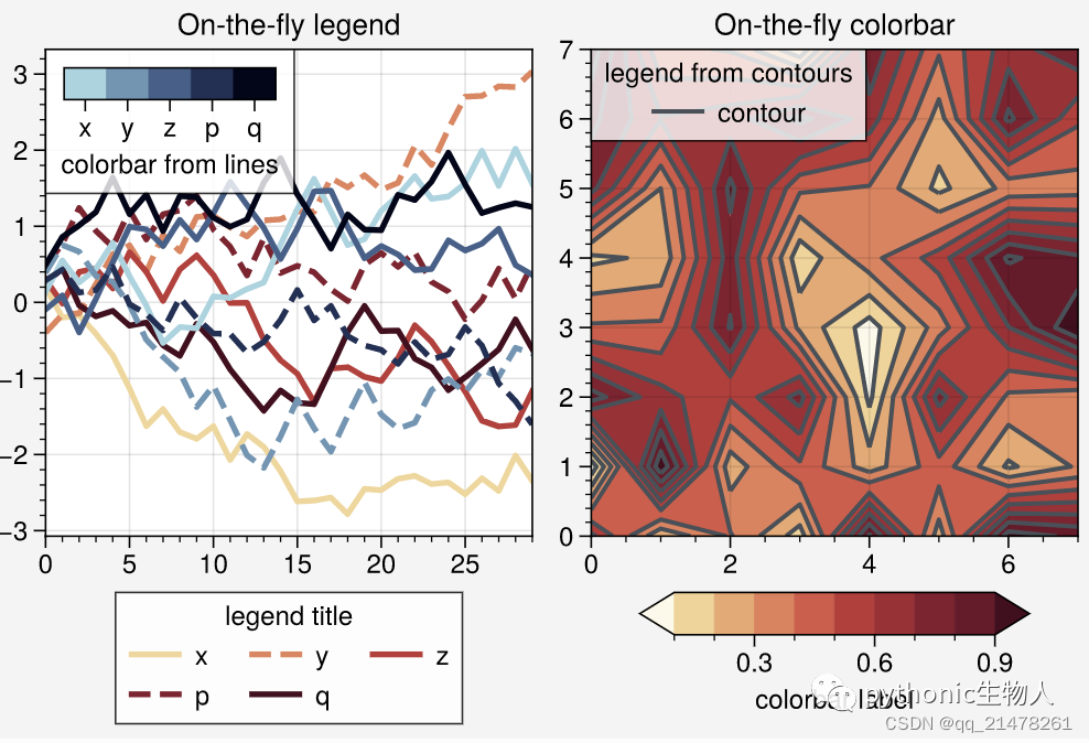
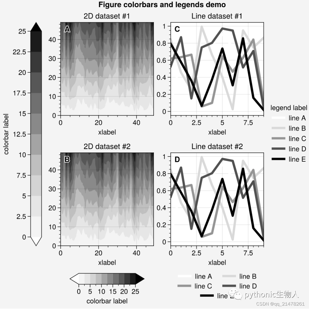
5、图例、colorbar灵活设置
主要新增proplot.figure.Figure.colorbar、proplot.figure.Figure.legend方法,
图例、colorbar位置指定
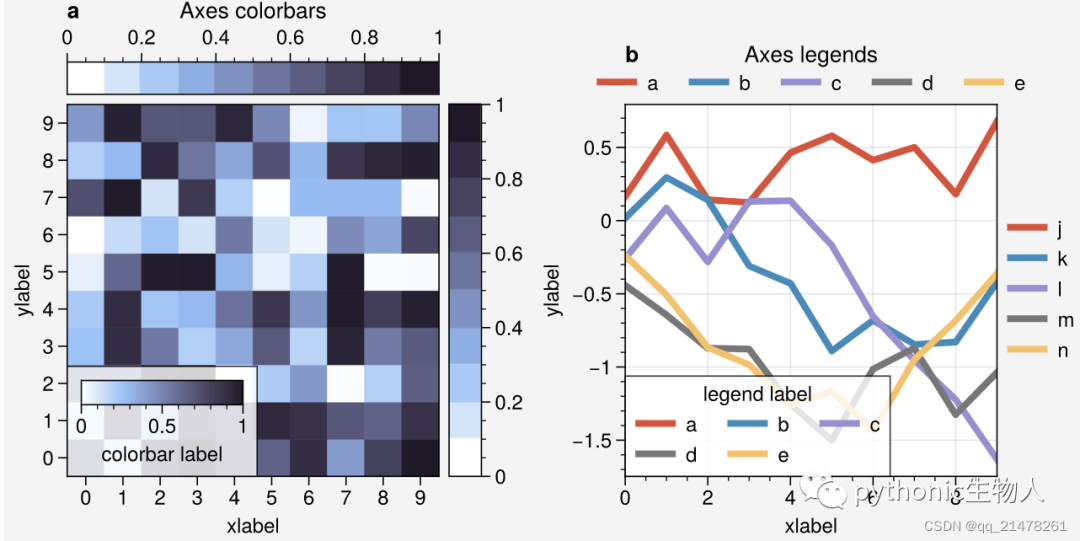
图例、colorbar:On-the-fly,
图例、colorbar:Figure-wide
图例外观个性化
可轻松设置图例顺序、位置、颜色等等,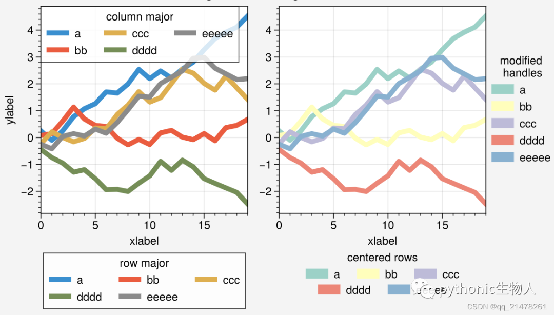
colorbar外观个性化
可轻松设置colorbar的刻度、标签、宽窄等,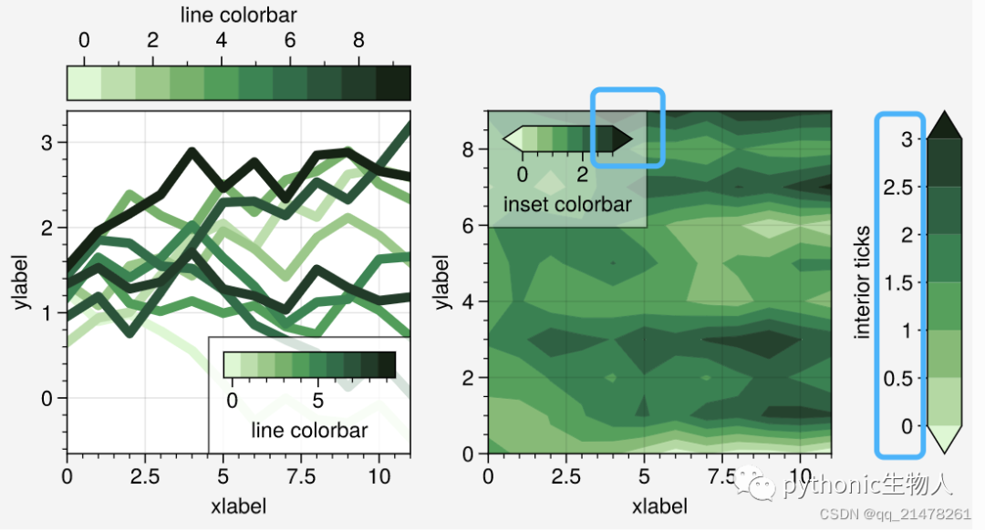
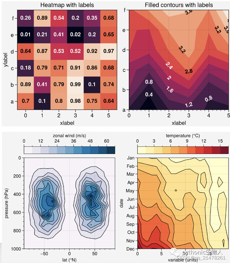
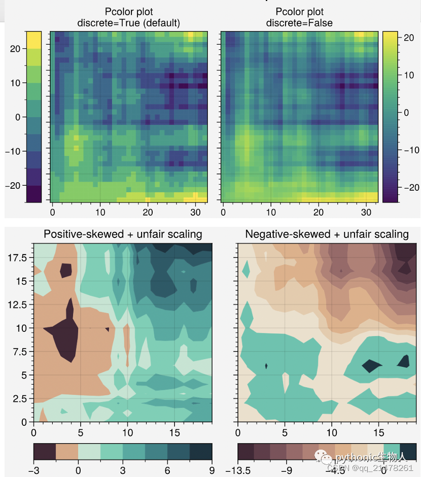
6、更加优化的绘图指令
众所周知,matplotlib默认出图很丑陋,seaborn, xarray和pandas都做过改进,proplot将这些改进进一步优化。无论是1D或2D图,效果都非常不错,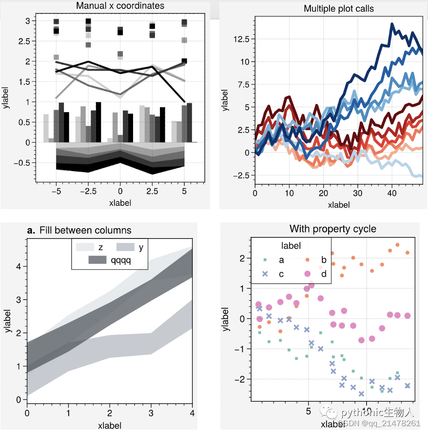
7、整合地图库Cartopy和basemap
Cartopy和basemap是Python里非常强大的地图库,二者介绍👉11个地理空间数据可视化工具
proplot将cartopy和basemap进行了整合,解决了basemap使用需要创建新的axes、cartopy使用时代码冗长等缺陷。
看案例,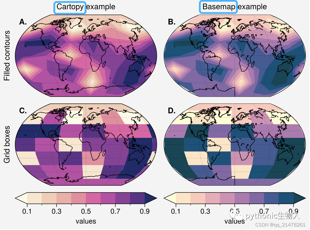 个性化设置,
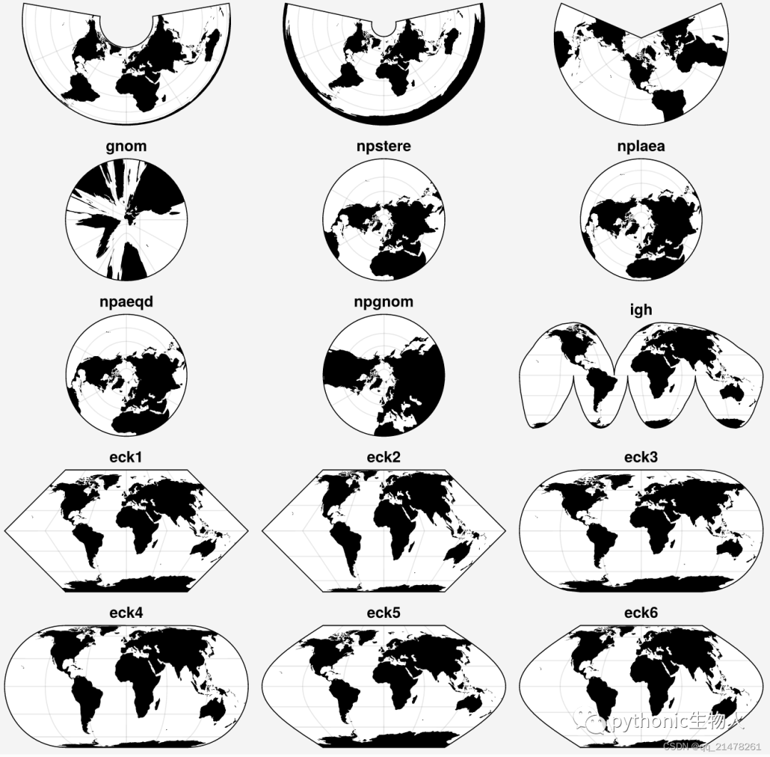
 支持cartopy中的各种投影,'cyl', 'merc', 'mill', 'lcyl', 'tmerc', 'robin', 'hammer', 'moll', 'kav7', 'aitoff', 'wintri', 'sinu', 'geos', 'ortho', 'nsper', 'aea', 'eqdc', 'lcc', 'gnom', 'npstere', 'nplaea', 'npaeqd', 'npgnom', 'igh', 'eck1', 'eck2', 'eck3', 'eck4', 'eck5', 'eck6'
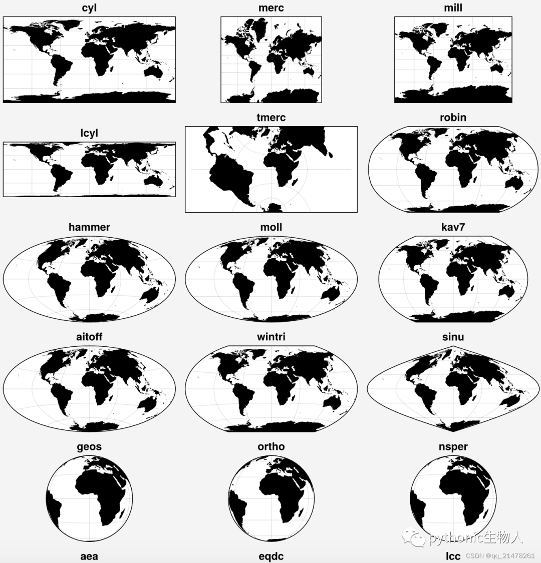
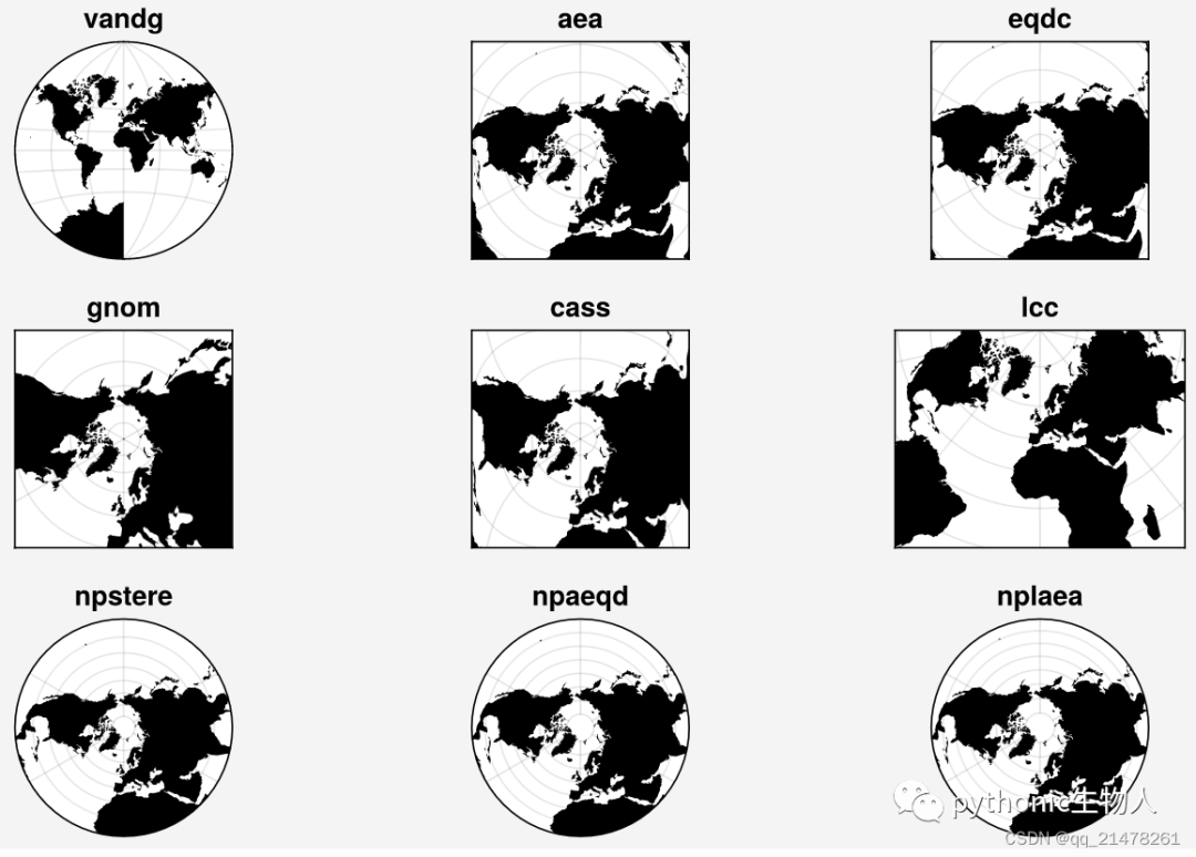
 当然,也支持basemap中的各种投影,'cyl', 'merc', 'mill', 'cea', 'gall', 'sinu', 'eck4', 'robin', 'moll', 'kav7', 'hammer', 'mbtfpq', 'geos', 'ortho', 'nsper', 'vandg', 'aea', 'eqdc', 'gnom', 'cass', 'lcc', 'npstere', 'npaeqd', 'nplaea'。
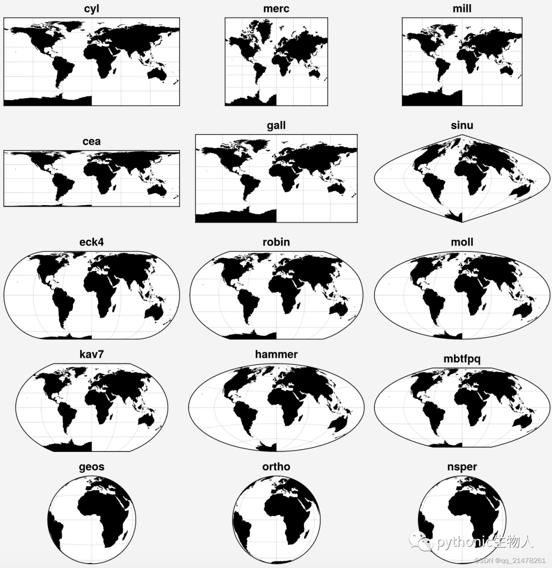
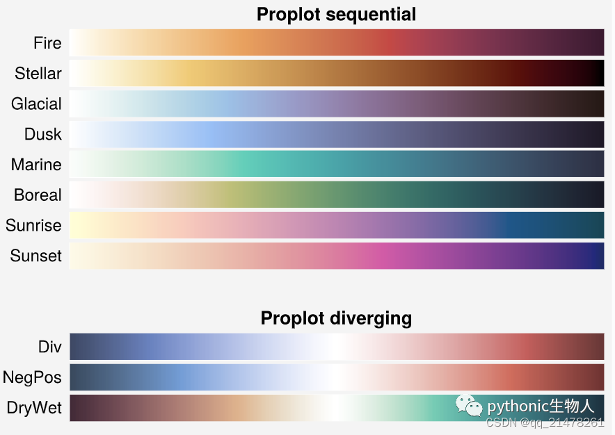
8、更美观的colormaps, colors和fonts
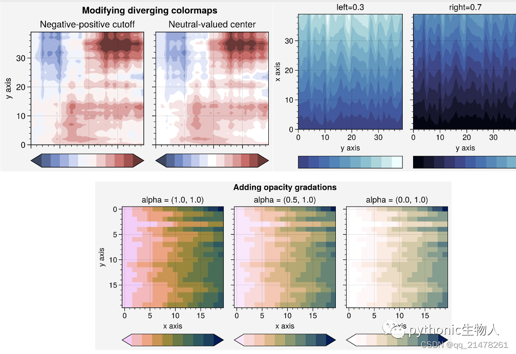
proplot除了整合seaborn, cmocean, SciVisColor及Scientific Colour Maps projects中的colormaps之外,还增加了新的colormaps,同时增加PerceptualColormap方法来制作colormaps(貌似比Matplotlib的ListedColormap、LinearSegmentedColormap好用),ContinuousColormap和DiscreteColormap方法修改colormaps等等。
proplot中可非常便利的添加字体。
proplot新增colormaps
PerceptualColormap制作colormaps
效果还不错,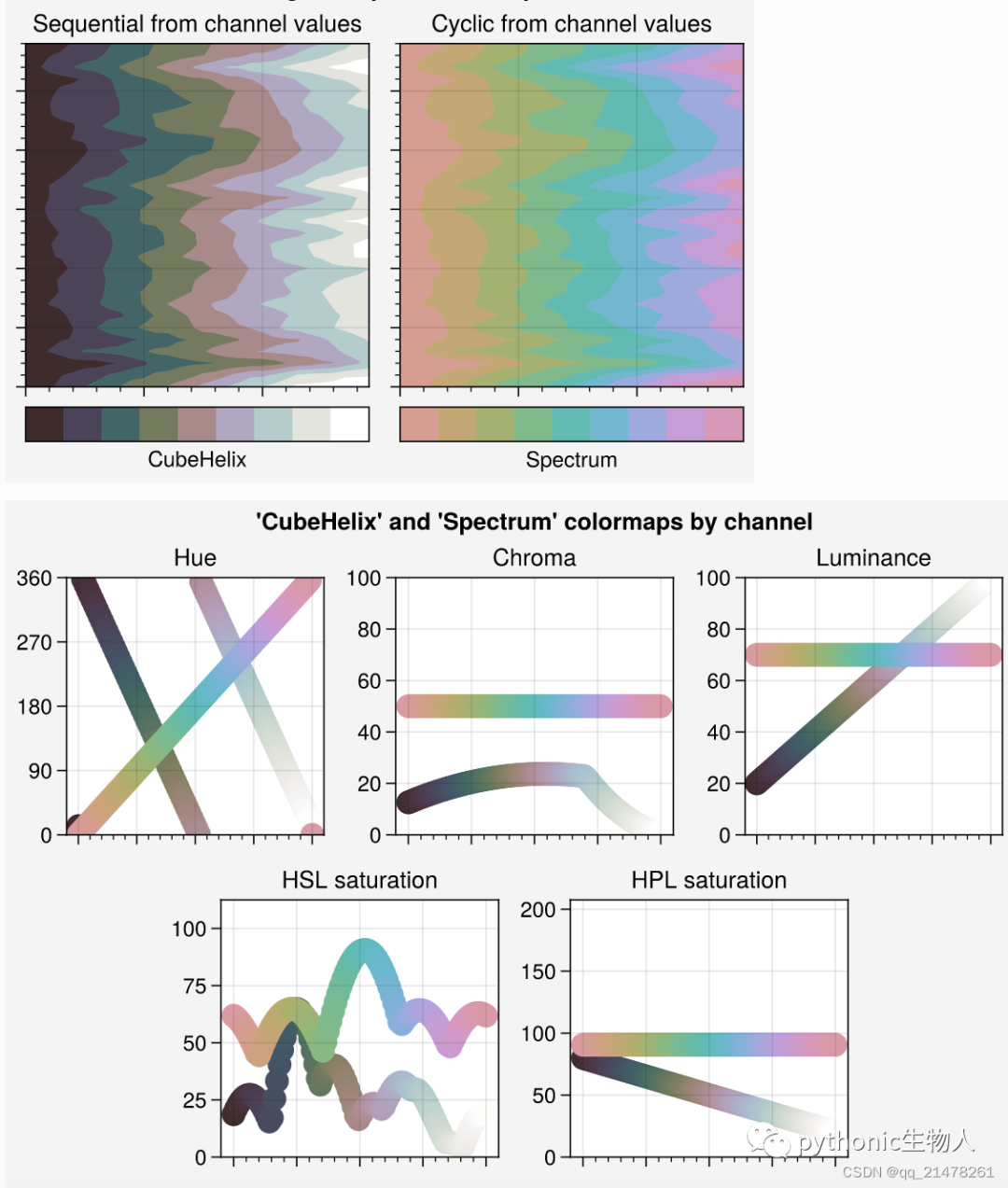
将多个colormaps融合
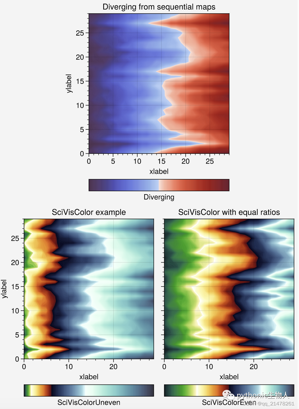
ContinuousColormap和DiscreteColormap方法修改colormaps
proplot添加字体
自定义的.ttc、.ttf等格式字体保存~/.proplot/fonts文件中。
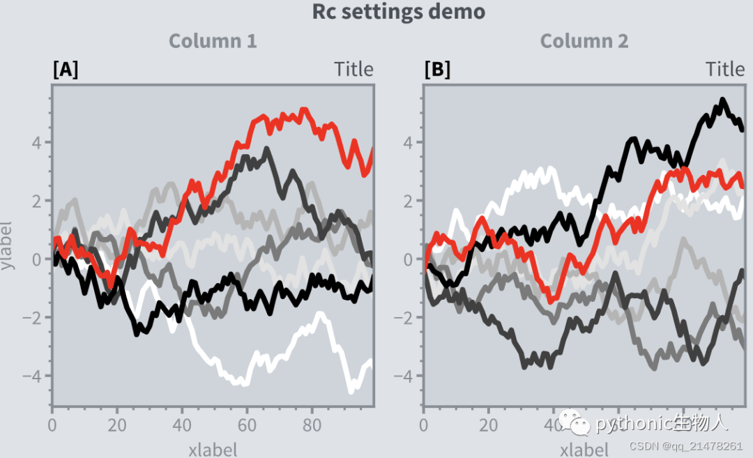
9、全局参数设置更灵活
新的rc方法更新全局参数
import proplot as pplt
import numpy as np

# 多种方法Update全局参数
pplt.rc.metacolor = 'gray6'
pplt.rc.update({'fontname': 'Source Sans Pro', 'fontsize': 11})
pplt.rc['figure.facecolor'] = 'gray3'
pplt.rc.axesfacecolor = 'gray4'

# 使用Update后的全局参数:with pplt.rc.context法
with pplt.rc.context({'suptitle.size': 13}, toplabelcolor='gray6', metawidth=1.5):
    fig = pplt.figure(figwidth=6, sharey='limits', span=False)
    axs = fig.subplots(ncols=2)
N, M = 100, 7
state = np.random.RandomState(51423)
values = np.arange(1, M + 1)
cycle = pplt.get_colors('grays', M - 1) + ['red']
for i, ax in enumerate(axs):
    data = np.cumsum(state.rand(N, M) - 0.5, axis=0)
    lines = ax.plot(data, linewidth=3, cycle=cycle)

# 使用Update后的全局参数:format()法
axs.format(
    grid=False, xlabel='xlabel', ylabel='ylabel',
    toplabels=('Column 1', 'Column 2'),
    suptitle='Rc settings demo',
    suptitlecolor='gray7',
    abc='[A]', abcloc='l',
    title='Title', titleloc='r', titlecolor='gray7'
)

# 恢复设置
pplt.rc.reset()
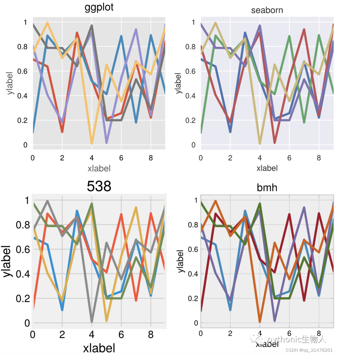
 全局设置'ggplot', 'seaborn'的style
import proplot as pplt
import numpy as np
state = np.random.RandomState(51423)
data = state.rand(10, 5)

# Set up figure
fig, axs = pplt.subplots(ncols=2, nrows=2, span=False, share=False)
axs.format(suptitle='Stylesheets demo')
styles = ('ggplot', 'seaborn', '538', 'bmh')

# 直接使用format()方法
for ax, style in zip(axs, styles):
    ax.format(style=style, xlabel='xlabel', ylabel='ylabel', title=style)
    ax.plot(data, linewidth=3)
-END-
往期精彩回顾
适合初学者入门人工智能的路线及资料下载 (图文+视频)机器学习入门系列下载 中国大学慕课《机器学习》(黄海广主讲) 机器学习及深度学习笔记等资料打印 《统计学习方法》的代码复现专辑 机器学习交流qq群955171419,加入微信群请扫码