
上下求索 flexbox 优雅布局
共 30289字,需浏览 61分钟
· 2022-12-07
前端布局问题在工作中俯拾皆是,是时候花些时间上下求索一番。
本文尝试从标题布局、左右布局、均分布局、跟随布局、父子宽度约束探究和空间无限缩小共六个案例练练解题思路和见招拆招。
希望对你提高工作效率和技术水平有启发。
㈠ 标题布局
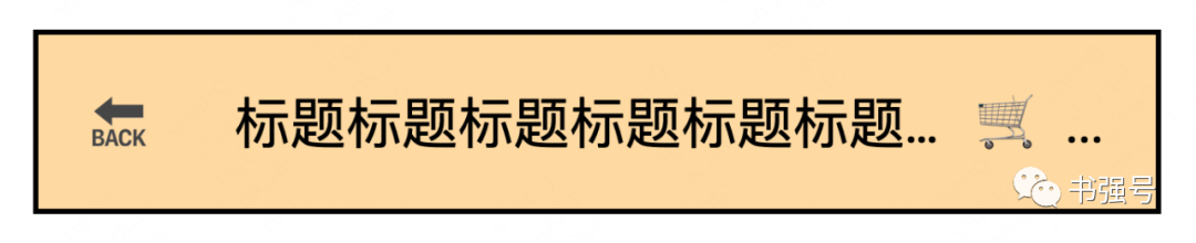
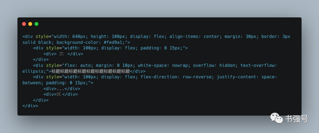
题目:标题居中且超长打点,标题左右包含若干图标。
解答:
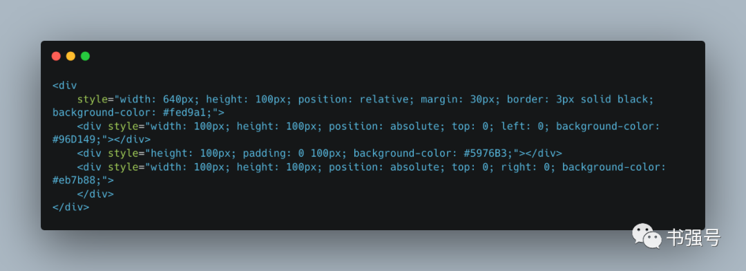
⑴ 标题居中,必须控制左右距离相等,即典型的左中右结构。
常见做法是使用绝对布局,标题左右设置相同边距(margin 或 padding),左右图标使用绝对布局(position: absolute)盖在标题左右边距上。
需要注意的是标题容器需要设置为相对布局(position: relative),作为左右图标的锚点。
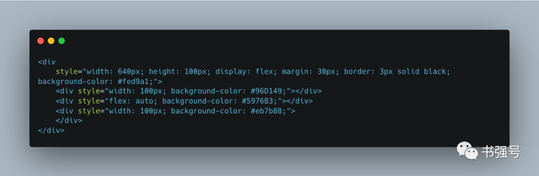
更优雅的做法是通过 flexbox 布局,左右固定宽度,剩余空间都是中间的,即弹性伸缩属性设置为自动(flex: auto),等同于 flex: 1 1 auto。
其中 flex-grow 为 1 意味着空间富余可以扩展,flex-shrink 为 1 意味着空间不够可以收缩,flex-basis 为 auto 意味着使用 width 或 height 显示设置的宽高(主轴方向横向则取宽度,纵向则取高度),没有设置则使用内容的宽高。
⑵ 标题超长打点,需要设置不换行(white-space: nowrap)、溢出隐藏(overflow: hidden) 和文本溢出打点(text-overflow: ellipsis)。
⑶ 左右图标布局,常见的做法准确计算边距使得刚好左侧左对齐,右侧右对齐。
但更优雅的做法还是 flexbox 布局,把计算的事“甩”给弹性布局,直接左侧主轴方向正方向(flex-direction: row,默认值),右侧主轴方向反方向(flex-direction: row-reverse)。
㈡ 左右布局
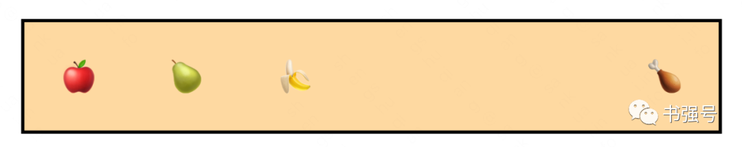
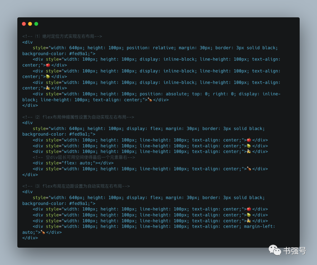
题目: 左侧若干图标从左到右依次排放,最后一个图标靠最右侧放置。
解答:
有三种解题方法,除了上面的绝对布局和弹性伸缩属性设置为自动外,还更简单的方案,就是在flexbox布局中设置左边为自动(margin-left: auto)。
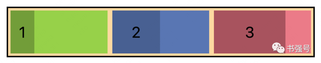
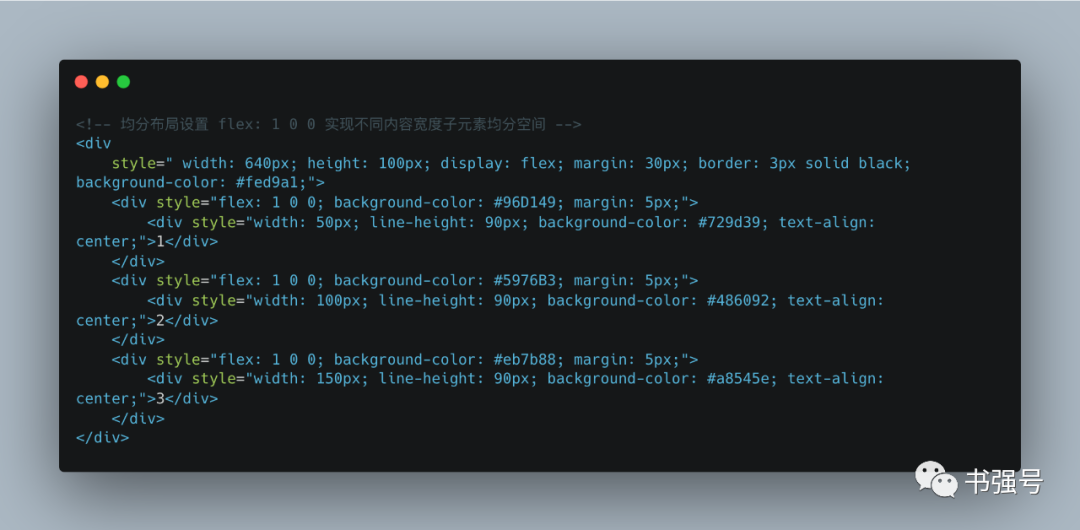
㈢ 均分布局
题目:
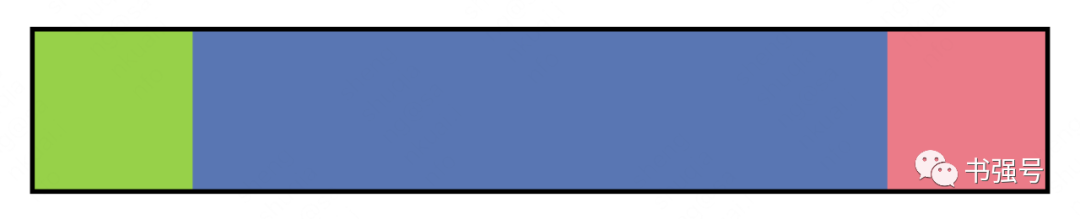
不同内容宽度的子元素均分空间(下图绿蓝红为子元素,其中深色为内容区,浅色为扩展富余空间)。
解答:
众所周知,自动弹性伸缩(flex: auto)只能扩展富余空间而非整体空间,上题我们很容易且好像也只能做到如下效果:
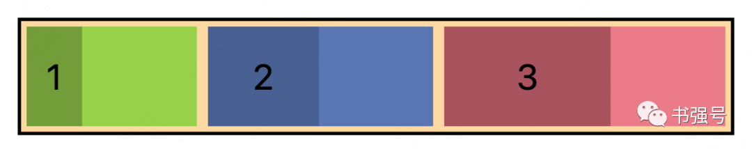
均分空间做不到?
答案必须是“No”。
flex: auto 全称是 flex: 1 1 auto,其中最后一位是 flex-basis,即弹性基准大小,默认是内容大小。那么内容大小能不能设置为0?
答案曰之“能”。
直接上代码:
㈣ 跟随布局
题目:图标始终紧紧跟随在标题后面,当标题内容超长时,图标仍然显示,标题文本可以超长打点。
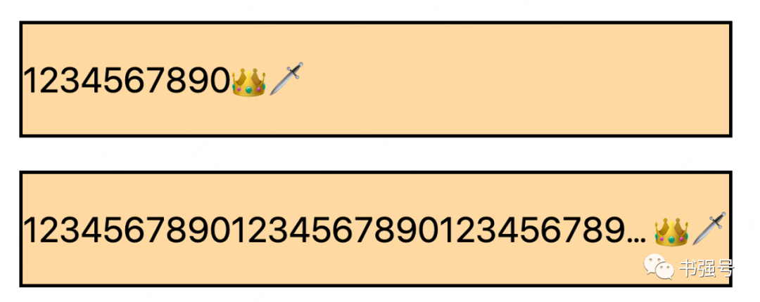
解答:
这问题也太水了吧?
整个标题设置为弹性布局,文本伸缩属性使用默认值(flex: initial,即 flex: 0 1 auto,空间富余不伸展但空间不足要收缩),设置超长打点(overflow: hidden; text-overflow: ellipsis;),图标放标题右侧即可。
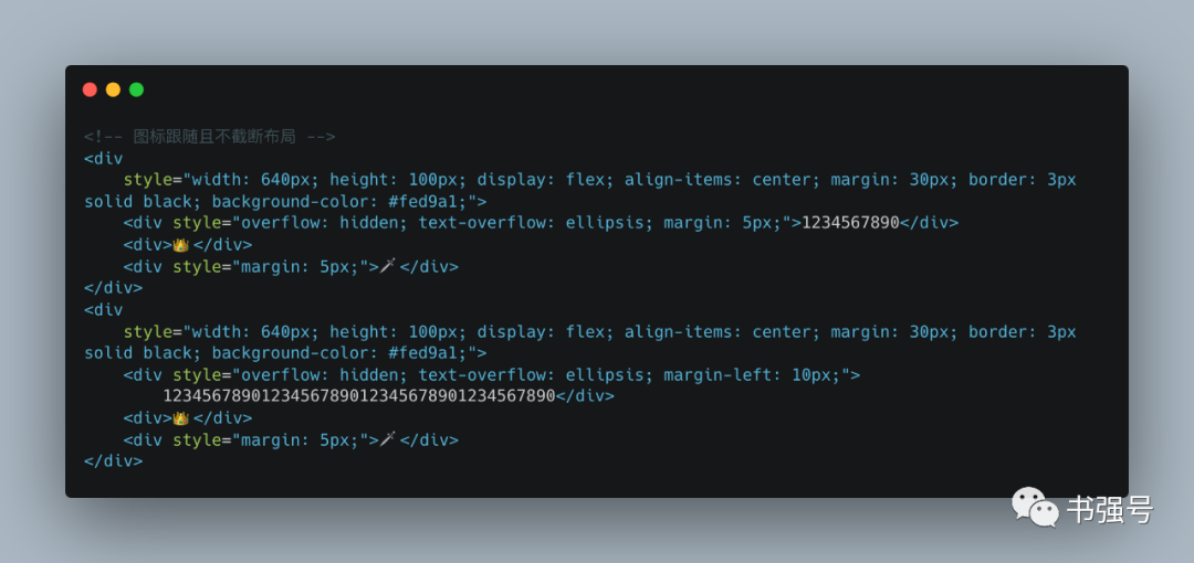
这里多说一句,细心的小伙伴发现,上面超长打点没有设置不换行(white-space: nowrap)。
为啥超长了不是另起一行?
因为div标签默认块布局(display: block),本身就是不换行的,如果布局属性换成了弹性布局,则需要像标题布局一样设置不换行。
等等,这道题“水”怎么说?
之所以有这道题 ,是因为我延用了 Android 的布局思维(我从 Android 转 Web 不久),标题跟随不截断在 App 中首页和列表页随处可见,自然 Android 也需要实现该功能。
但 Android 里面如果要超长打点,就必须限定宽度,常规写法是文本宽度为0,自适应占用其他控件布局后剩下的富余空间(LinearLayout# layout_width: 0; layout_weight: 1; ),因为 Android 支持的布局限制,使得该题变得有点意思了。
如果带入到前端,假设伸缩属性只能设置为即伸展又收缩(flex: auto),如何实现标题跟随不截断?
先直接改下上面代码看看具象效果。
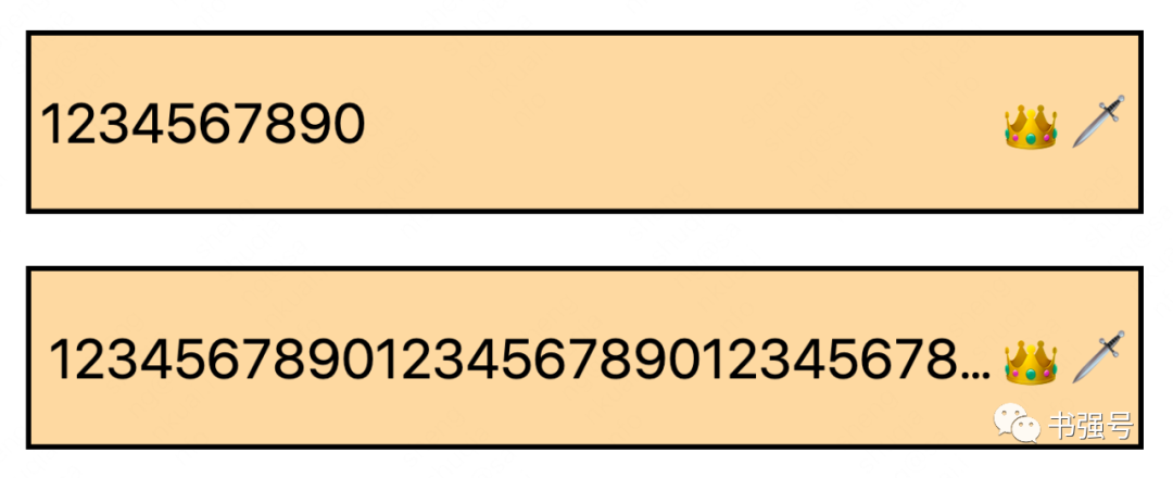
那么,问题来了?
在文本未超长时,图标不跟随了...
让我们看看 Android 上面的效果,下面图示红框圈起来的 2 个区域,区域 1 和上面 Web 实现类似,文本控件宽度为 0 权重为 1(android:layout_width="0px" android:layout_weight="1"),在文本较短时直接扩展了富余空间撑大了,导致图标右对齐而不是跟随。
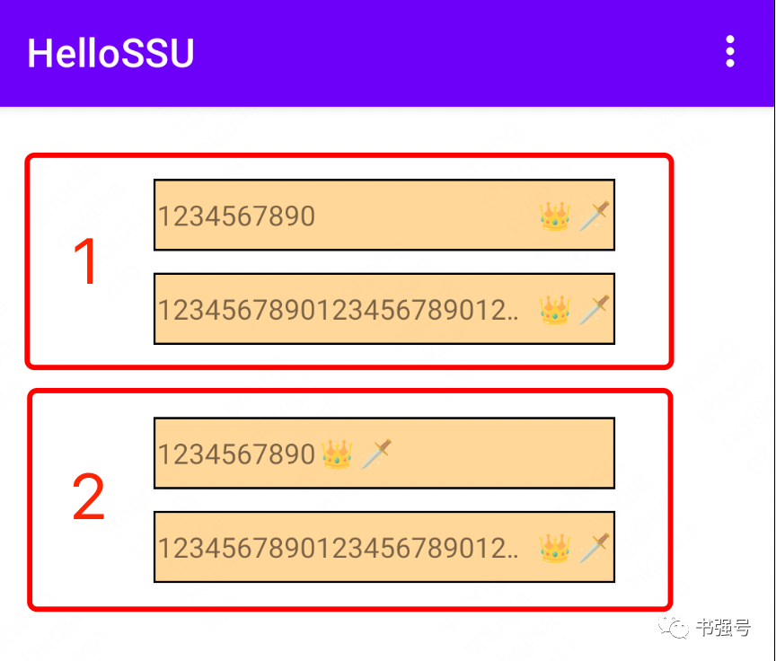
这里用到一个“小妙招”,文本控件属性不变,但是文本和图标控件再包一层横向线性布局自适应宽度(android:layout_width="wrap_content"),这样就能确保文本较短时不会撑大。
因为父控件为自适应宽度,没有额外的富余空间且最大空间受自己父控件约束,效果即区域 2。
上述思路来源于原美团同事袁件在 2015 年的分享,这个解题思路之所以念念不忘,主要是有点像脑筋急转弯,记住了也就会了,要是硬想可能很难想出来。
当然了,一般这种情况通过自定义布局就能简单实现,主旨就是先算其他控件大小,如果当前宽度过长则只占据剩下空间,否则正常自身宽度。
同样方法照搬到 Web 是否可以?
让我们来试试,文本控件自动伸缩,Android 设置属性为 layout_width="0px" 和 layout_weight="1",等同于 Web 设置为 flex: auto。
在文本和图标外包了一层自适应宽度的横向线性布局,Android 设置属性为 layout_width="wrap_content",等同于 Web 设置为(width: 100%; max-width: min-content; )或(width: min-content; max-width: 100%;),即宽度为内容大小和父组件大小中最小值。
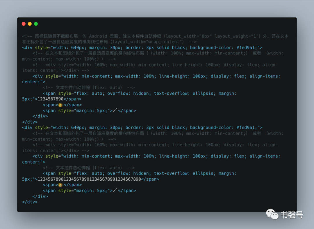
划重点,通过同时设置 width 和 max-width 使得宽度在短内容时跟随,在长内容时打点,本身也是“小妙招”,正常很少两个同时使用。认同的小伙伴有必要记一下。
为啥我绕这么大的圈子讲一个 Web 上舍易求难的问题,主要是通过 Web 实践检验已有的 Android 经验,逻辑大同小异必然实现殊途同归,同时多场景对比,加强自己对弹性布局的理解。
㈣ 父子宽度约束探究
题目:父组件宽度固定(width: 200px),组件设置为弹性布局(display: flex),里面子组件是文本和图标。
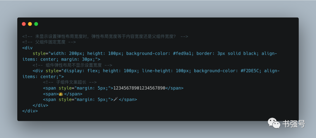
在文本长度超出时,组件宽度是超长的内容宽度(下图中标号 1)还是父组件宽度(下图中标号 2)?
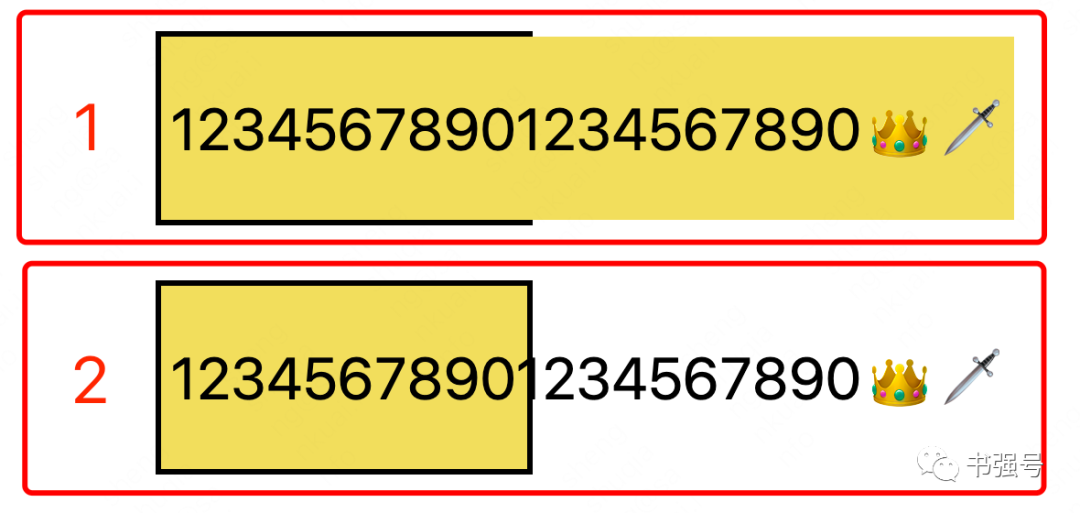
解答:
结论先行,实测答案时标号 2。
咋一看,弹性组件容器没有设置宽度,感觉其宽度应该就是内容宽度,既然内容超长,那么背景色肯定和内容一样。
既然和想的不一样,查一下 CSS 官方文档,width 不显示设置时使用默认值 auto,auto 在文档中的解释是“浏览器将会为指定的元素计算并选择一个宽度。”
不过感觉说了和没说一样,到底是怎么一个计算算法也没有讲。
实测发现 auto 对应的是父组件大小,即背景色覆盖区域只是父组件范围。
那么如果我们要做到组件宽度是超长内容宽度呢?
这是一道送分题,直接设置宽度为内容大小(width: min-content)即可。
不过我在实测中发现,还有另外一个方法,将父组件设置为弹性布局也能达到同样效果。
逻辑上说,不显示设置宽度则取默认值 auto,即父组件大小,父组件不管是否是弹性布局,大小已经显示指定了,但实际影响了组件宽度? 至于为什么是这样,现在的我的确不知道,问题留给未来的自己,或者屏幕前的你来回答。
㈤ 空间无限缩小
好奇心来自于看到官方文档 《flex 布局的基本概念》中的“如果有太多元素超出容器,它们会溢出而不会换行。”
太多不是会压缩么,对于弹性默认属性(flex: initial,即 flex: 0 1 auto,不扩展只收缩),怎么会是溢出?
我自己复制黏贴了一堆文本,发现竟然真是溢出?如下图。
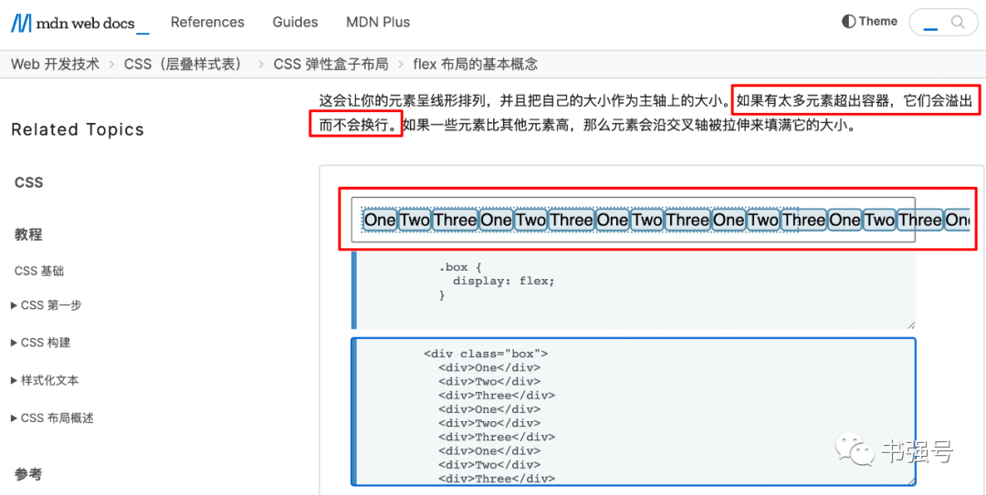
给我整不会了...
后来在和同事永健的沟通下,得知当组件宽度被收缩到最小内容大小时就不再收缩,文本本身大小即最小内容大小,可以通过最小宽度(min-width)设置内容大小。
至此,真相终于大白了。
顺便吹毛求疵一下,官方文档写得还是不严谨,引起了不必要的误解。
附 Web Demo Html 源码:
          <html>


          <head>


            <meta charset="utf-8">


            <title>flex Demo</title>


            <style type="text/css">


                body {


                    font-size: 32px;


                }


          </style>


          </head>


          <body>


            <!-- 标题栏布局 -->


            <div


                style="width: 640px; height: 100px; display: flex; align-items: center; margin: 30px; border: 3px solid black; background-color: #fed9a1;">


                <div style="width: 100px; display: flex; padding: 0 15px;">


                    <div> 🔙 </div>


                </div>


                <div style="flex: auto; margin: 0 10px; white-space: nowrap; overflow: hidden; text-overflow: ellipsis;">


                    标题标题标题标题标题标题标题标题标题</div>


                <div


                    style="width: 100px; display: flex; flex-direction: row-reverse; justify-content: space-between; padding: 0 15px;">


                    <div>...</div>


                    <div>🛒</div>


                </div>


            </div>


            <!-- 绝对定位方式实现左中右布局 -->


            <div


                style="width: 640px; height: 100px; position: relative; margin: 30px; border: 3px solid black; background-color: #fed9a1;">


                <div style="width: 100px; height: 100px; position: absolute; top: 0; left: 0; background-color: #96D149;"></div>


                <div style="height: 100px; padding: 0 100px; background-color: #5976B3;"></div>


                <div style="width: 100px; height: 100px; position: absolute; top: 0; right: 0; background-color: #eb7b88;">


                </div>


            </div>


            <!-- flex布局伸缩属性设置为自动实现左中右布局 -->


            <div


                style="width: 640px; height: 100px; display: flex; margin: 30px; border: 3px solid black; background-color: #fed9a1;">


                <div style="width: 100px; background-color: #96D149;"></div>


                <div style="flex: auto; background-color: #5976B3;"></div>


                <div style="width: 100px; background-color: #eb7b88;">


                </div>


            </div>


            <!-- ⑴ 绝对定位方式实现左右布局-->


            <div


                style="width: 640px; height: 100px; position: relative; margin: 30px; border: 3px solid black; background-color: #fed9a1;">


                <div style="width: 100px; height: 100px; display: inline-block; line-height: 100px; text-align: center;">🍎


                </div>


                <div style="width: 100px; height: 100px; display: inline-block; line-height: 100px; text-align: center;">🍐


                </div>


                <div style="width: 100px; height: 100px; display: inline-block; line-height: 100px; text-align: center;">🍌


                </div>


                <div


                    style="width: 100px; height: 100px; position: absolute; top: 0; right: 0; display: inline-block; line-height: 100px; text-align: center;">


                    🍗</div>


            </div>


            <!-- ⑵ flex布局伸缩属性设置为自动实现左右布局-->


            <div


                style="width: 640px; height: 100px; display: flex; margin: 30px; border: 3px solid black; background-color: #fed9a1;">


                <div style="width: 100px; height: 100px; line-height: 100px; text-align: center;">🍎


                </div>


                <div style="width: 100px; height: 100px; line-height: 100px; text-align: center;">🍐


                </div>


                <div style="width: 100px; height: 100px; line-height: 100px; text-align: center;">🍌


                </div>


                <!-- 空div延长可用空间使得最后一个元素靠右-->


                <div style="flex: auto;"></div>


                <div style="width: 100px; height: 100px; line-height: 100px; text-align: center;">


                    🍗</div>


            </div>


            <!-- ⑶ flex布局左边距设置为自动实现左右布局-->


            <div


                style="width: 640px; height: 100px; display: flex; margin: 30px; border: 3px solid black; background-color: #fed9a1;">


                <div style="width: 100px; height: 100px; line-height: 100px; text-align: center;">🍎</div>


                <div style="width: 100px; height: 100px; line-height: 100px; text-align: center;">🍐</div>


                <div style="width: 100px; height: 100px; line-height: 100px; text-align: center;">🍌</div>


                <div style="width: 100px; height: 100px; line-height: 100px; text-align: center; margin-left: auto;">🍗</div>


            </div>


            <!-- 均分布局设置 flex: 1 0 0 实现不同内容宽度子元素均分空间 -->


            <div


                style="width: 640px; height: 100px; display: flex; margin: 30px; border: 3px solid black; background-color: #fed9a1;">


                <div style="flex: 1 0 0; background-color: #96D149; margin: 5px;">


                    <div style="width: 50px; line-height: 90px; background-color: #729d39; text-align: center;">


                        1</div>


                </div>


                <div style="flex: 1 0 0; background-color: #5976B3; margin: 5px;">


                    <div style="width: 100px; line-height: 90px; background-color: #486092; text-align: center;">


                        2</div>


                </div>


                <div style="flex: 1 0 0; background-color: #eb7b88; margin: 5px;">


                    <div style="width: 150px; line-height: 90px; background-color: #a8545e; text-align: center;">


                        3</div>


                </div>


            </div>


            <!-- 设置flex: auto 只能均分富余空间 -->


            <div


                style="width: 640px; height: 100px; display: flex; margin: 30px; border: 3px solid black; background-color: #fed9a1;">


                <div style="flex: auto; background-color: #96D149; margin: 5px;">


                    <div style="width: 50px; line-height: 90px; background-color: #729d39; text-align: center;">


                        1</div>


                </div>


                <div style="flex: auto; background-color: #5976B3; margin: 5px;">


                    <div style="width: 100px; line-height: 90px; background-color: #486092; text-align: center;">


                        2</div>


                </div>


                <div style="flex: auto; background-color: #eb7b88; margin: 5px;">


                    <div style="width: 150px; line-height: 90px; background-color: #a8545e; text-align: center;">


                        3</div>


                </div>


            </div>


            <!-- 图标跟随且不截断布局 flex: initial,即 flex: 0 1 auto -->


            <div


                style="width: 640px; height: 100px; display: flex; align-items: center; margin: 30px; border: 3px solid black; background-color: #fed9a1;">


                <div style="flex: 0 1 auto; overflow: hidden; text-overflow: ellipsis; margin: 5px;">1234567890</div>


                <span>👑</span>


                <span style="margin: 5px;">🗡</span>


            </div>


            <div


                style="width: 640px; height: 100px; display: flex; align-items: center; margin: 30px; border: 3px solid black; background-color: #fed9a1;">


                <span style="flex: 0 1 auto; overflow: hidden; text-overflow: ellipsis; margin-left: 10px;">


                    1234567890123456789012345678901234567890</span>


                <span>👑</span>


                <span style="margin: 5px;">🗡</span>


            </div>


            <!-- 图标跟随且不截断布局:仅伸展不收缩(flex: auto) -->


            <div


                style="width: 640px; height: 100px; display: flex; align-items: center; margin: 30px; border: 3px solid black; background-color: #fed9a1;">


                <span style="flex: auto; overflow: hidden; text-overflow: ellipsis; margin: 5px;">1234567890</span>


                <span>👑</span>


                <span style="margin: 5px;">🗡</span>


            </div>


            <div


                style="width: 640px; height: 100px; display: flex; align-items: center; margin: 30px; border: 3px solid black; background-color: #fed9a1;">


                <span style="flex: auto; overflow: hidden; text-overflow: ellipsis; margin-left: 10px;">


                    1234567890123456789012345678901234567890</span>


                <span>👑</span>


                <span style="margin: 5px;">🗡</span>


            </div>


            <!-- 图标跟随且不截断布局:仿 Android 思路,除文本控件自动伸缩(layout_width="0px" layout_weight="1")外,还在文本和图标外包了一层自适应宽度的横向线性布局(layout_width="wrap_content") -->


            <div style="width: 640px; margin: 30px; border: 3px solid black; background-color: #fed9a1;">


                <!-- 在文本和图标外包了一层自适应宽度的横向线性布局((width: 100%; max-width: min-content;) 或者 (width: min-content; max-width: 100%;)) -->


                <!-- <div style="width: 100%; max-width: min-content; line-height: 100px; display: flex; align-items: center;"></div> -->


                <div style="width: min-content; max-width: 100%; line-height: 100px; display: flex; align-items: center;">


                    <!-- 文本控件自动伸缩(flex: auto) -->


                    <span style="flex: auto; overflow: hidden; text-overflow: ellipsis; margin: 5px;">1234567890</span>


                    <span>👑</span>


                    <span style="margin: 5px;">🗡</span>


                </div>


            </div>


            <div style="width: 640px; margin: 30px; border: 3px solid black; background-color: #fed9a1;">


                <!-- 在文本和图标外包了一层自适应宽度的横向线性布局((width: 100%; max-width: min-content;) 或者 (width: min-content; max-width: 100%;)) -->


                <!-- <div style="width: 100%; max-width: min-content; line-height: 100px; display: flex; align-items: center;"></div> -->


                <div style="width: min-content; max-width: 100%; line-height: 100px; display: flex; align-items: center;">


                    <!-- 文本控件自动伸缩(flex: auto) -->


                    <span style="flex: auto; overflow: hidden; text-overflow: ellipsis; margin: 5px;">


                        1234567890123456789012345678901234567890</span>


                    <span>👑</span>


                    <span style="margin: 5px;">🗡</span>


                </div>


            </div>


            <!-- 父子宽度约束探究:未显示设置弹性布局宽度时,弹性布局宽度等于内容宽度还是父组件宽度?-->


            <!-- 父组件固定宽度 -->


            <div


                style="width: 200px; height: 100px; background-color: #fed9a1; border: 3px solid black; align-items: center; margin: 30px;">


                <!-- 组件弹性布局显示设置宽度为内容宽度 -->


                <div


                    style="display: flex; width: min-content; height: 100px; line-height: 100px; background-color: #F2DE5C; align-items: center;">


                    <!-- 子组件文案超长 -->


                    <span style="margin: 5px;">12345678901234567890</span>


                    <span>👑</span>


                    <span style="margin: 5px;">🗡</span>


                </div>


            </div>


            <!-- 父组件固定宽度且设置为弹性容器 -->


            <div


                style="width: 200px; height: 100px; display: flex; background-color: #fed9a1; border: 3px solid black; align-items: center; margin: 30px;">


                <!-- 组件弹性布局不显示设置宽度 -->


                <div style="display: flex; height: 100px; line-height: 100px; background-color: #F2DE5C; align-items: center;">


                    <!-- 子组件文案超长 -->


                    <span style="margin: 5px;">12345678901234567890</span>


                    <span>👑</span>


                    <span style="margin: 5px;">🗡</span>


                </div>


            </div>


            <div


                style="width: 200px; height: 100px; background-color: #fed9a1; border: 3px solid black; align-items: center; margin:30px">


                <div style="display: flex; height: 100px; line-height: 100px; background-color: #F2DE5C; align-items: center;">


                    <span style="margin: 5px;">12345678901234567890</span>


                    <span>👑</span>


                    <span style="margin: 5px;">🗡</span>


                </div>


            </div>


          </body>


          </html
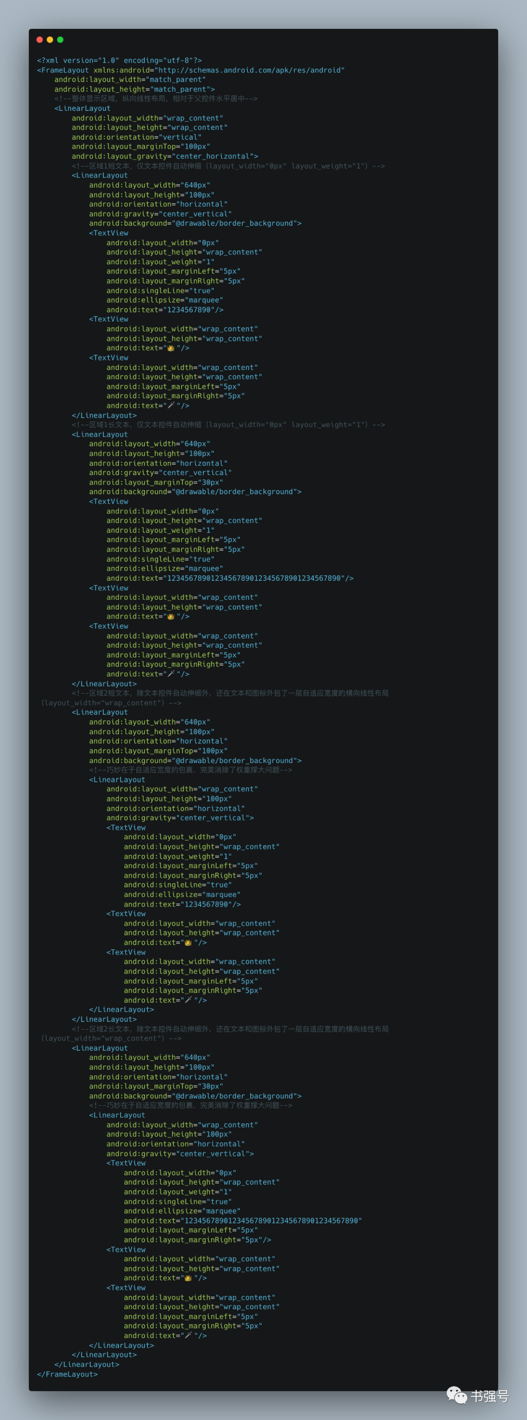
附 Android Demo XML 源码:
<FrameLayout xmlns:android="http://schemas.android.com/apk/res/android"
android:layout_width="match_parent"
android:layout_height="match_parent">
<!--整体显示区域,纵向线性布局,相对于父控件水平居中-->
<LinearLayout
android:layout_width="wrap_content"
android:layout_height="wrap_content"
android:orientation="vertical"
android:layout_marginTop="100px"
android:layout_gravity="center_horizontal">
<!--区域1短文本,仅文本控件自动伸缩(layout_width="0px" layout_weight="1")-->
<LinearLayout
android:layout_width="640px"
android:layout_height="100px"
android:orientation="horizontal"
android:gravity="center_vertical"
android:background="@drawable/border_background">
<TextView
android:layout_width="0px"
android:layout_height="wrap_content"
android:layout_weight="1"
android:layout_marginLeft="5px"
android:layout_marginRight="5px"
android:singleLine="true"
android:ellipsize="marquee"
android:text="1234567890"/>
<TextView
android:layout_width="wrap_content"
android:layout_height="wrap_content"
android:text="👑"/>
<TextView
android:layout_width="wrap_content"
android:layout_height="wrap_content"
android:layout_marginLeft="5px"
android:layout_marginRight="5px"
android:text="🗡"/>
</LinearLayout>
<!--区域1长文本,仅文本控件自动伸缩(layout_width="0px" layout_weight="1")-->
<LinearLayout
android:layout_width="640px"
android:layout_height="100px"
android:orientation="horizontal"
android:gravity="center_vertical"
android:layout_marginTop="30px"
android:background="@drawable/border_background">
<TextView
android:layout_width="0px"
android:layout_height="wrap_content"
android:layout_weight="1"
android:layout_marginLeft="5px"
android:layout_marginRight="5px"
android:singleLine="true"
android:ellipsize="marquee"
android:text="1234567890123456789012345678901234567890"/>
<TextView
android:layout_width="wrap_content"
android:layout_height="wrap_content"
android:text="👑"/>
<TextView
android:layout_width="wrap_content"
android:layout_height="wrap_content"
android:layout_marginLeft="5px"
android:layout_marginRight="5px"
android:text="🗡"/>
</LinearLayout>
<!--区域2短文本,除文本控件自动伸缩外,还在文本和图标外包了一层自适应宽度的横向线性布局(layout_width="wrap_content")-->
<LinearLayout
android:layout_width="640px"
android:layout_height="100px"
android:orientation="horizontal"
android:layout_marginTop="100px"
android:background="@drawable/border_background">
<!--巧妙在于自适应宽度的包裹,完美消除了权重撑大问题-->
<LinearLayout
android:layout_width="wrap_content"
android:layout_height="100px"
android:orientation="horizontal"
android:gravity="center_vertical">
<TextView
android:layout_width="0px"
android:layout_height="wrap_content"
android:layout_weight="1"
android:layout_marginLeft="5px"
android:layout_marginRight="5px"
android:singleLine="true"
android:ellipsize="marquee"
android:text="1234567890"/>
<TextView
android:layout_width="wrap_content"
android:layout_height="wrap_content"
android:text="👑"/>
<TextView
android:layout_width="wrap_content"
android:layout_height="wrap_content"
android:layout_marginLeft="5px"
android:layout_marginRight="5px"
android:text="🗡"/>
</LinearLayout>
</LinearLayout>
<!--区域2长文本,除文本控件自动伸缩外,还在文本和图标外包了一层自适应宽度的横向线性布局(layout_width="wrap_content")-->
<LinearLayout
android:layout_width="640px"
android:layout_height="100px"
android:orientation="horizontal"
android:layout_marginTop="30px"
android:background="@drawable/border_background">
<!--巧妙在于自适应宽度的包裹,完美消除了权重撑大问题-->
<LinearLayout
android:layout_width="wrap_content"
android:layout_height="100px"
android:orientation="horizontal"
android:gravity="center_vertical">
<TextView
android:layout_width="0px"
android:layout_height="wrap_content"
android:layout_weight="1"
android:singleLine="true"
android:ellipsize="marquee"
android:text="1234567890123456789012345678901234567890"
android:layout_marginLeft="5px"
android:layout_marginRight="5px"/>
<TextView
android:layout_width="wrap_content"
android:layout_height="wrap_content"
android:text="👑"/>
<TextView
android:layout_width="wrap_content"
android:layout_height="wrap_content"
android:layout_marginLeft="5px"
android:layout_marginRight="5px"
android:text="🗡"/>
</LinearLayout>
</LinearLayout>
</LinearLayout>
</FrameLayout>
全文完,如果觉得写得不错,那就点个“关注”或者“在看”。
转自微信公众号:书强号
The End
如果你觉得这篇内容对你挺有启发,我想请你帮我三个小忙: 1、点个 「在看」,让更多的人也能看到这篇内容 2、关注官网 https://muyiy.cn,让我们成为长期关系 3、关注公众号「高级前端进阶」,公众号后台回复 「加群」 ,加入我们一起学习并送你精心整理的高级前端面试题。
最后不要忘了点赞呦!
祝 2022 年暴富!暴美!暴瘦!