
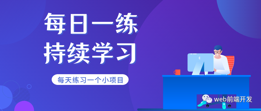
【每日一练】89—一个滑动卡片动画UI效果的实现
写在前面
已经有两天没有更新小练习了,希望大家没有忘记自我练习,保持一种持续学习的习惯很重要。
今天我们一起来练习一个滑动卡片效果,这种卡片式的UI效果,我们在前面的练习中也分享了不少。
但今天这个练习采用了折叠滑动式的设计,这种设计的好处就是,占用页面空间小,对于一些内容多的页面,这种效果是非常实用,现在,我们就一起来看一下它的最终效果:
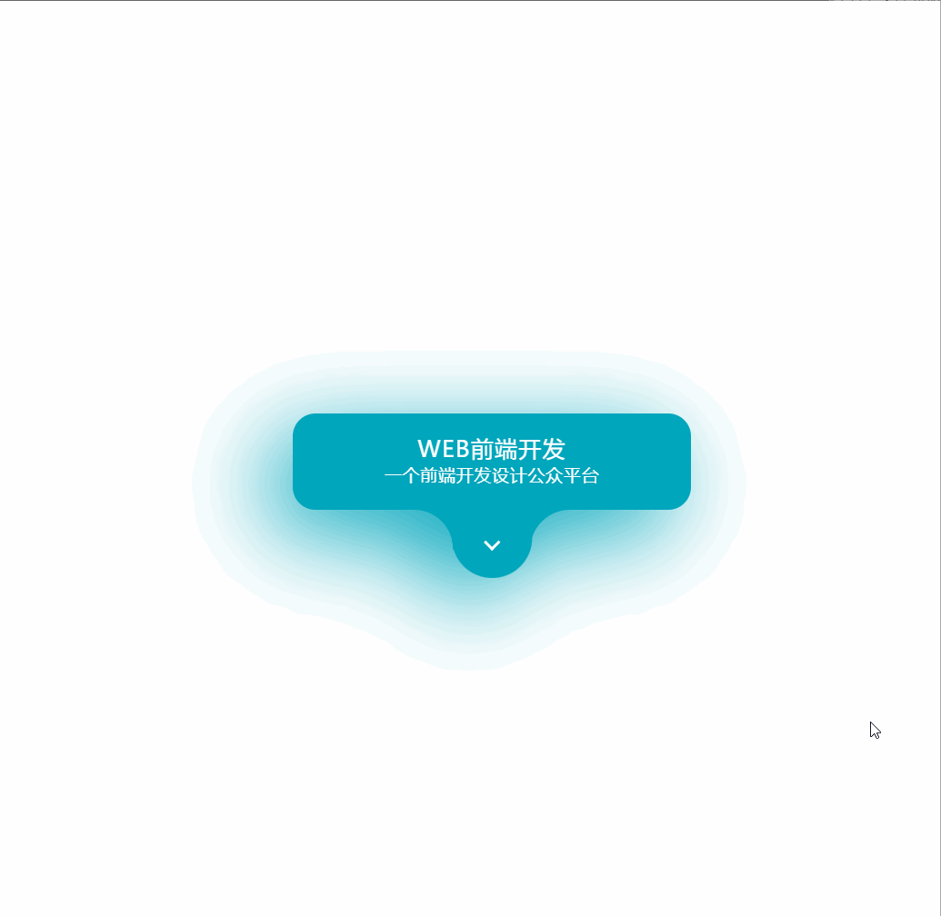
<html><head><meta charset="UTF-8"><title>【每日一练】89—一个滑动卡片动画UI效果的实现</title></head><body><div class="card"><div class="contentBx"><div class="content"><h2>web前端开发<br><span>一个前端开发设计公众平台</span></h2><div class="imgBx"><img src="img.png"></div><button>欢迎关注</button></div></div><div class="toggle"><span></span></div></div><script>let card = document.querySelector('.card');let cardtoggle = document.querySelector('.toggle');cardtoggle.onclick = function(){card.classList.toggle('active');};</script></body></html>
*{margin: 0;padding: 0;box-sizing: border-box;font-family: 'Poppins', sans-serif;}body{display: flex;justify-content: center;align-items: center;min-height: 100vh;background: #fff;}.card{position: relative;width: 350px;height: 85px;background: #00a6bc;border-radius: 20px;transition: 0.5s ease-in-out;filter: drop-shadow(-20px 20px 40px #00a6bc);}.card.active{height: 420px;}.toggle{position: absolute;left: 50%;transform: translate(-50%);bottom: -60px;width: 70px;height: 60px;border-bottom-left-radius: 35px;border-bottom-right-radius: 35px;background: #00a6bc;cursor: pointer;}.toggle::before{content: '';position: absolute;left: -34px;width: 35px;height: 35px;background: transparent;border-top-right-radius: 35px;box-shadow: 11px -10px 0 10px #00a6bc;}.toggle::after{content: '';position: absolute;right: -34px;width: 35px;height: 35px;background: transparent;border-top-left-radius: 35px;box-shadow: -11px -10px 0 10px #00a6bc;}.toggle span{position: absolute;top: 50%;left: 50%;transform: translate(-50%,-70%) rotate(405deg);width: 10px;height: 10px;border-bottom: 3px solid #fff;border-right: 3px solid #fff;transition: 0.5s;}.card.active .toggle span{transform: translate(-50%,-70%) rotate(225deg);}.contentBx{position: absolute;inset: 0;overflow: hidden;}.content{position: relative;padding: 20px;text-align: center;z-index: 10;display: flex;flex-direction: column;justify-content: center;align-items: center;}.content h2{color: #fff;font-weight: 500;font-size: 1.25em;text-transform: uppercase;letter-spacing: 0.05em;line-height: 1.1em;}.content h2 span{font-size: 0.75em;font-weight: 400;letter-spacing: 0.05em;text-transform: initial;}.imgBx{position: relative;width: 250px;height: 250px;background: #fff;margin-top: 20px;overflow: hidden;border: 5px solid #fff;box-shadow: -10px 10px 10px rgba(0,0,0,0.15);pointer-events: none;}.imgBx img{position: absolute;top: 0;left: 0;width: 100%;height: 100%;object-fit: cover;}.content button{position: relative;margin-top: 20px;padding: 10px 35px;border-radius: 25px;border: none;outline: none;cursor: pointer;box-shadow: -10px 10px 10px rgba(0,0,0,0.15);font-size: 1em;text-transform: uppercase;letter-spacing: 0.1em;font-weight: 500;color: #333;}
写在最后
以上就是今天我跟大家分享的【每日一练】全部内容,希望今天的小练习对你有用,如果你觉得有帮助的话,请点赞我,关注我,并将它分享给你身边做开发的朋友,也许能够帮助到他。
我是杨小爱,我们明天见。
学习更多技能
请点击下方公众号

评论