
太实用了!4种方法教你轻松制作交互式仪表板!
让客户深刻记住你的数据洞察和发现的最好方式,是创建交互式仪表板。为什么要互动呢?一方面是比较有趣,另一方面是客户对动作的记忆比静态的洞察力更深刻。
在本文中,我给大家分享 4 款 Python 工具包,使用它们为数据科学项目创建交互式仪表板非常的棒。喜欢本文记得收藏、关注、点赞。
1、Widgets
Ipywidgets(缩写为 Widgets) 是一个代码简单直观的交互式包,它为 Jupyter Notebooks 中的 GUI 提供 HTML 架构。
该包允许我们直接在 Jupyter Notebook 单元中创建交互式仪表板。
只需几行代码,你就可以将 Jupyter Notebook 改为仪表板。让我用几行代码展示如何做到这一点。
首先,我们需要安装所需的包
pip install ipywidgets
然后,我们需要在 Jupyter Notebook 中启用 Ipywidgets。要启用它,请在命令提示符中传递以下代码。
jupyter nbextension enable --py widgetsnbextension
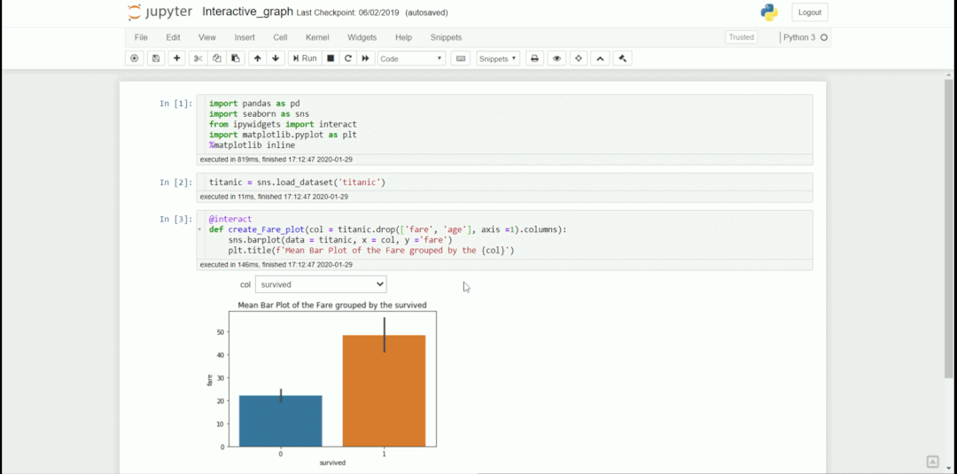
我们可以在 Jupyter Notebook 中创建交互式仪表板,并配备所有必要的软件包。我将使用泰坦尼克号样本数据进行举例。
import seaborn as sns
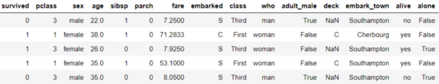
titanic = sns.load_dataset('titanic')
titanic.head()
我想创建一个交互式仪表板,获取按类别变量分组的泰坦尼克号票价平均值。在这种情况下,使用如下代码:
#Creating the interactive dashboard
from ipywidgets import interact
@interact
def create_fare_plot(col = titanic.drop(['fare', 'age'], axis =1).columns):
    sns.barplot(data = titanic, x = col, y ='fare')
    plt.title(f'Mean Bar Plot of the Fare grouped by the {col}')
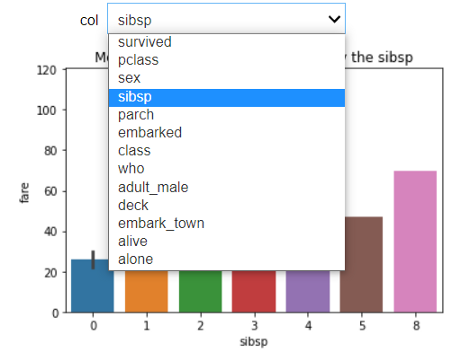
通过添加@interact代码,我们启动了交互过程。
2、Voila
Voila-dashboards 是一个简单的 Python 包,它将一个简单的 Jupyter Notebook 变成一个漂亮的 Web 仪表板。
只需一行安装代码,我们就可以快速渲染 Jupyter Notebook。
让我们安装 Voila-dashboards
pip install voila
完成 Voila 包的安装后,刷新 Jupyter Notebook 并查看 notebook 选项卡。在那里你会发现一个新的 Voila 按钮。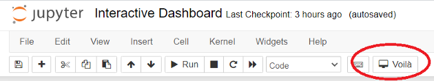 现在按下按钮,即可自动生成 Voila 仪表板。
3、Dash by Plotly
Dash by Plotly 是一个开源 Python 包,它是基于 Plotly 可视化的低代码框架包。
要试用 Dash,先安装软件包。
pip install dash
安装完成后,我将使用以下代码创建一个简单的 Titanic 仪表板。
import dash
from dash import dcc, html
import plotly.express as px
import pandas as pd
import seaborn as sns
app = dash.Dash()
df = sns.load_dataset('titanic')
fig = px.scatter(
df,
x="fare",
y="age",
size="pclass",
color="alive",
hover_name="embark_town",
log_x=True,
size_max=60
)
app.layout = html.Div(children = [
html.H1(children='Titanic Dashboard'),
dcc.Graph(id="fare_vs_age", figure=fig)])

if __name__ == "__main__":
    app.run_server(debug=True)
运行上述代码后,将在默认(http://127.0.0.1:8050/)中启动仪表板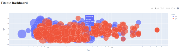 我们可以添加一个回调交互来让用户输入具有特定的输出。
import dash
from dash import dcc, html, Input, Output
import plotly.express as px
import pandas as pd
import seaborn as sns
app = dash.Dash()
df = sns.load_dataset('titanic')
fig = px.scatter(
df,
x="fare",
y="age",
size="pclass",
color="alive",
hover_name="embark_town",
log_x=True,
size_max=60
)
app.layout = html.Div(children = [
html.H1(children='Titanic Dashboard'),
dcc.Graph(id="fare_vs_age", figure=fig),
#Add interactive callback here
html.H4("Change the value in the text box to see callbacks in action"),
html.Div([
"Input: ",
dcc.Input(id='my-input', value='initial value', type='text')
]),
html.Br(),
html.Div(id='my-output'),
])
@app.callback(
Output(component_id='my-output', component_property='children'),
Input(component_id='my-input', component_property='value')
)
def update_output_div(input_value):
    return f'Output: {input_value}'
if __name__ == "__main__":
   app.run_server(debug=True)
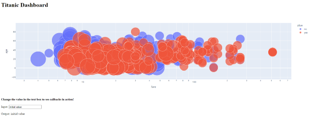
Dash by Plotly 在创建仪表板时非常方便,它提供了许多有用的 API。
4、Streamlit
Streamlit 是一个开源 Python 包,旨在为数据科学家和机器学习项目创建一个 Web 应用程序。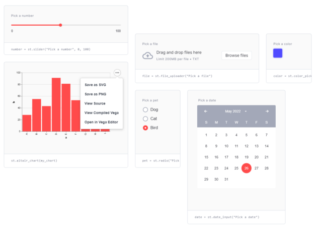 Streamlit 提供的 API 易于任何初学者使用,非常适合希望以交互方式构建其数据组合的任何人。
让我们先安装 Streamlit 包。
pip install streamlit
安装过程完成后,我们可以创建交互式仪表板。
让我给你下面的代码示例。
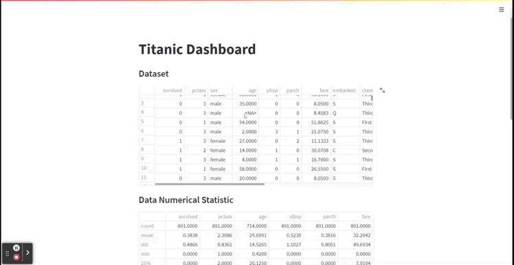
import streamlit as st
import pandas as pd
import plotly.express as px
import seaborn as sns
df = sns.load_dataset('titanic')
st.title('Titanic Dashboard')
st.subheader('Dataset')
st.dataframe(df)
st.subheader('Data Numerical Statistic')
st.dataframe(df.describe())
st.subheader('Data Visualization with respect to Survived')
left_column, right_column = st.columns(2)
with left_column:
   'Numerical Plot'
    num_feat = st.selectbox(
   'Select Numerical Feature', df.select_dtypes('number').columns)
    fig = px.histogram(df, x = num_feat, color = 'survived')
    st.plotly_chart(fig, use_container_width=True)
with right_column:
   'Categorical column'
    cat_feat = st.selectbox(
    'Select Categorical Feature', df.select_dtypes(exclude =   'number').columns)
    fig = px.histogram(df, x =cat_feat, color = 'survived' )
st.plotly_chart(fig, use_container_width=True)
使用 VScode 将文件保存为 titanic_st.py,然后在终端中运行该代码。
streamlit run titanic_st.py
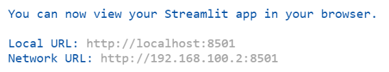
Streamlit 在上述地址上运行,我们可以访问我们的仪表板。
使用上面的简单代码,我们创建了一个交互式仪表板,API 并不难理解,我们只使用最少数量的代码。
结论
当我们需要展示数据科学项目时建议用交互式仪表板,它将改善大大改善用户体验。
扫码即可加我微信
学习交流
老表朋友圈经常有赠书/红包福利活动
万水千山总是情,点个 👍 行不行。