
又一款超酷的 Python 可视化神器:cutecharts
Python学习与数据挖掘
共 7965字,需浏览 16分钟
· 2022-01-03
关注"Python学习与数据挖掘",
设为“置顶或星标”,第一时间送达干货
前言
安装
Line——基本示例
def set_options(self,labels: Iterable,x_label: str = "",y_label: str = "",y_tick_count: int = 3,legend_pos: str = "upLeft",colors: Optional[Iterable] = None,font_family: Optional[str] = None,):""":param labels: X 坐标轴标签数据:param x_label: X 坐标轴名称:param y_label: Y 坐标轴名称:param y_tick_count: Y 轴刻度分割段数:param legend_pos: 图例位置,有 "upLeft", "upRight", "downLeft", "downRight" 可选:param colors: label 颜色数组:param font_family: CSS font-family"""def add_series(self, name: str, data: Iterable):""":param name: series 名称:param data: series 数据列表"""
基本示例
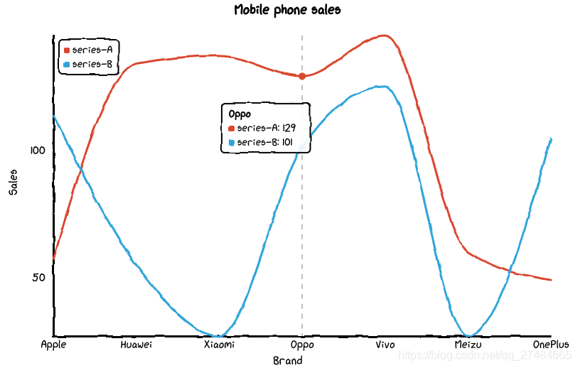
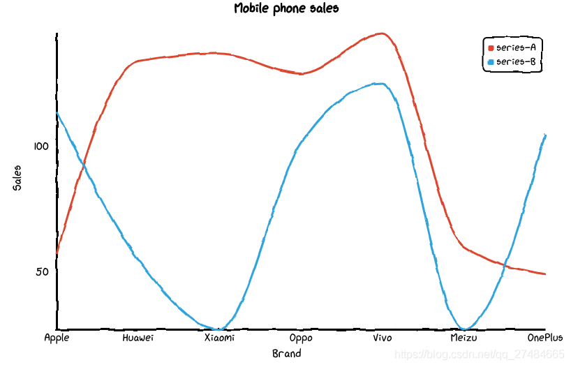
from cutecharts.charts import Line# 虚假数据x_data = ['Apple', 'Huawei', 'Xiaomi', 'Oppo', 'Vivo', 'Meizu', 'OnePlus']y_data_1 = [57, 134, 137, 129, 145, 60, 49]y_data_2 = [114, 55, 27, 101, 125, 27, 105]chart = Line("Mobile phone sales")chart.set_options(labels=x_data,x_label="Brand",y_label="Sales",)chart.add_series("series-A", y_data_1)chart.add_series("series-B", y_data_2)chart.render_notebook()
修改图例位置
from cutecharts.charts import Line# 虚假数据x_data = ['Apple', 'Huawei', 'Xiaomi', 'Oppo', 'Vivo', 'Meizu', 'OnePlus']y_data_1 = [57, 134, 137, 129, 145, 60, 49]y_data_2 = [114, 55, 27, 101, 125, 27, 105]chart = Line("Mobile phone sales")chart.set_options(labels=x_data,x_label="Brand",y_label="Sales",legend_pos="upRight")chart.add_series("series-A", y_data_1)chart.add_series("series-B", y_data_2)chart.render_notebook()
Bar——基本示例
def set_options(self,labels: Iterable,x_label: str = "",y_label: str = "",y_tick_count: int = 3,colors: Optional[Iterable] = None,font_family: Optional[str] = None,):""":param labels: X 坐标轴标签数据:param x_label: X 坐标轴名称:param y_label: Y 坐标轴名称:param y_tick_count: Y 轴刻度分割段数:param colors: label 颜色数组:param font_family: CSS font-family"""def add_series(self, name: str, data: Iterable):""":param name: series 名称:param data: series 数据列表"""
基本示例
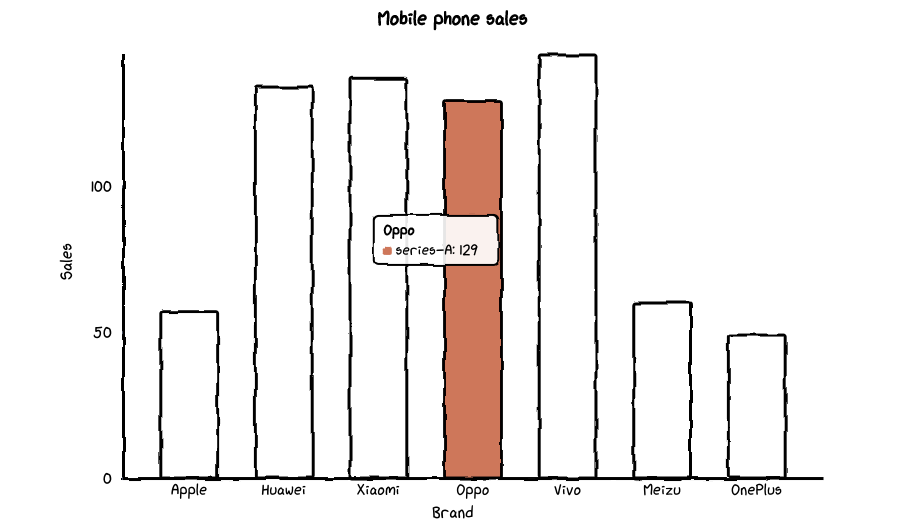
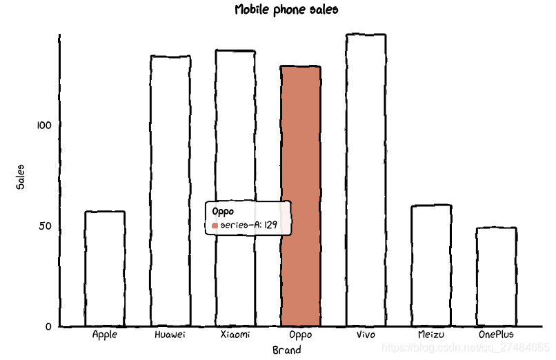
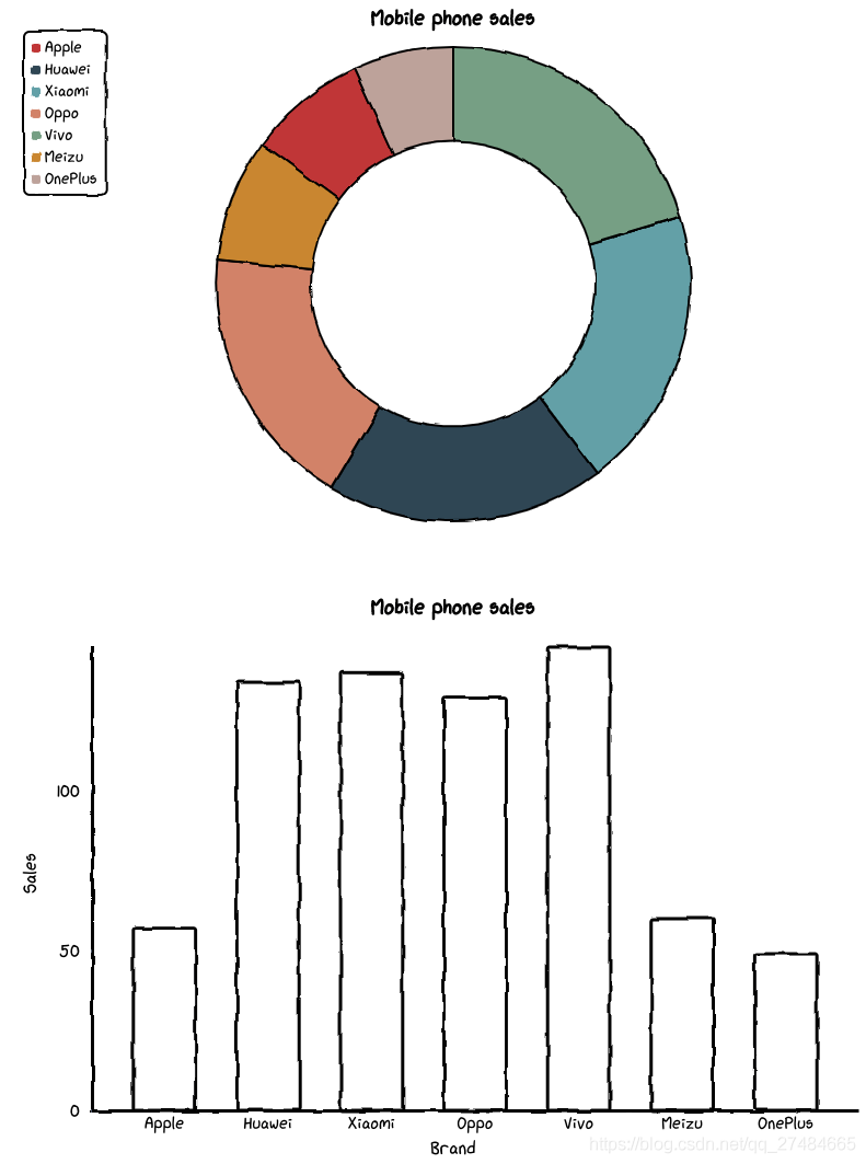
# 虚假数据x_data = ['Apple', 'Huawei', 'Xiaomi', 'Oppo', 'Vivo', 'Meizu', 'OnePlus']y_data = [57, 134, 137, 129, 145, 60, 49]chart = Bar("Mobile phone sales")chart.set_options(labels=x_data,x_label="Brand",y_label="Sales",colors=Faker.colors)chart.add_series("series-A", y_data)chart.render_notebook()
Pie——基本示例
def set_options(self,labels: Iterable,inner_radius: float = 0.5,legend_pos: str = "upLeft",colors: Optional[Iterable] = None,font_family: Optional[str] = None,):""":param labels: 数据标签列表:param inner_radius: Pie 图半径:param legend_pos: 图例位置,有 "upLeft", "upRight", "downLeft", "downRight" 可选:param colors: label 颜色数组:param font_family: CSS font-family"""def add_series(self, data: Iterable):""":param data: series 数据列表"""
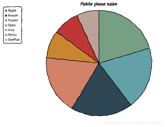
基本示例
# 虚假数据x_data = ['Apple', 'Huawei', 'Xiaomi', 'Oppo', 'Vivo', 'Meizu', 'OnePlus']y_data = [57, 134, 137, 129, 145, 60, 49]chart = Pie("Mobile phone sales")chart.set_options(labels=x_data,colors=Faker.colors)chart.add_series(y_data)chart.render_notebook()
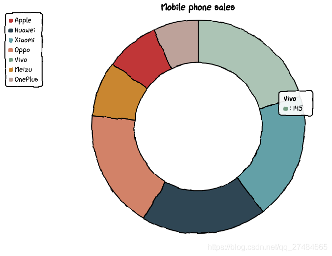
修改内圈半径
# 虚假数据x_data = ['Apple', 'Huawei', 'Xiaomi', 'Oppo', 'Vivo', 'Meizu', 'OnePlus']y_data = [57, 134, 137, 129, 145, 60, 49]chart = Pie("Mobile phone sales")chart.set_options(labels=x_data,inner_radius=0,colors=Faker.colors)chart.add_series(y_data)chart.render_notebook()
Radar——基本示例
def set_options(self,labels: Iterable,is_show_label: bool = True,is_show_legend: bool = True,tick_count: int = 3,legend_pos: str = "upLeft",colors: Optional[Iterable] = None,font_family: Optional[str] = None,):""":param labels: 数据标签列表:param is_show_label: 是否显示标签:param is_show_legend: 是否显示图例:param tick_count: 坐标系分割刻度:param legend_pos: 图例位置,有 "upLeft", "upRight", "downLeft", "downRight" 可选:param colors: label 颜色数组:param font_family: CSS font-family"""def add_series(self, name: str, data: Iterable):""":param name: series 名称:param data: series 数据列表"""
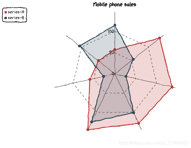
基本示例
# 虚假数据x_data = ['Apple', 'Huawei', 'Xiaomi', 'Oppo', 'Vivo', 'Meizu', 'OnePlus']y_data_1 = [57, 134, 137, 129, 145, 60, 49]y_data_2 = [114, 55, 27, 101, 125, 27, 105]chart = Radar("Mobile phone sales")chart.set_options(labels=x_data,is_show_legend=True,colors=Faker.colors)chart.add_series("series-A", y_data_1)chart.add_series("series-B", y_data_2)chart.render_notebook()
Scatter——基本示例
def set_options(self,x_label: str = "",y_label: str = "",x_tick_count: int = 3,y_tick_count: int = 3,is_show_line: bool = False,dot_size: int = 1,time_format: Optional[str] = None,legend_pos: str = "upLeft",colors: Optional[Iterable] = None,font_family: Optional[str] = None,):""":param x_label: X 坐标轴名称:param y_label: Y 坐标轴名称:param x_tick_count: X 轴刻度分割段数:param y_tick_count: Y 轴刻度分割段数:param is_show_line: 是否将散点连成线:param dot_size: 散点大小:param time_format: 日期格式:param legend_pos: 图例位置,有 "upLeft", "upRight", "downLeft", "downRight" 可选:param colors: label 颜色数组:param font_family: CSS font-family"""def add_series(self, name: str, data: Iterable):""":param name: series 名称:param data: series 数据列表,[(x1, y1), (x2, y2)]"""
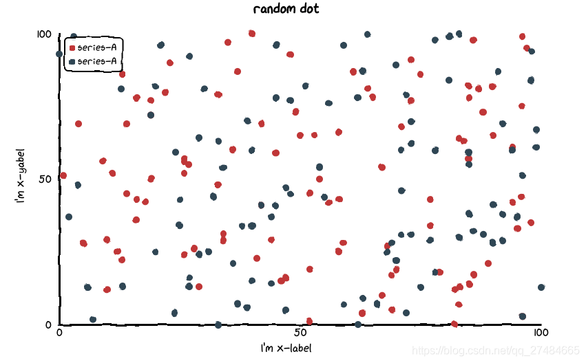
基本示例
data_1 = [(random.randint(0, 100), random.randint(0, 100)) for _ in range(100)]data_2 = [(random.randint(0, 100), random.randint(0, 100)) for _ in range(100)]chart = Scatter("random dot")chart.set_options(x_label = "I'm x-label",y_label = "I'm x-yabel",x_tick_count = 3,y_tick_count = 3,is_show_line = False,dot_size = 1,legend_pos = "upLeft",colors=Faker.colors)chart.add_series("series-A", data_1)chart.add_series("series-A", data_2)chart.render_notebook()
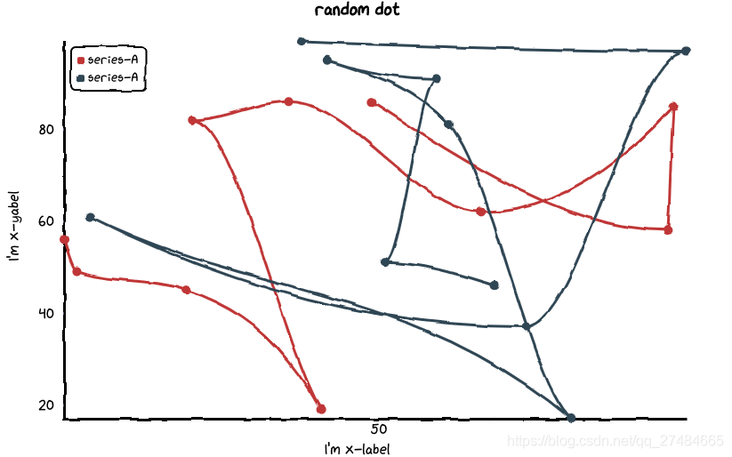
点连线
data_1 = [(random.randint(0, 100), random.randint(0, 100)) for _ in range(10)]data_2 = [(random.randint(0, 100), random.randint(0, 100)) for _ in range(10)]chart = Scatter("random dot")chart.set_options(x_label = "I'm x-label",y_label = "I'm x-yabel",x_tick_count = 3,y_tick_count = 3,is_show_line = True,dot_size = 1,legend_pos = "upLeft",colors=Faker.colors)chart.add_series("series-A", data_1)chart.add_series("series-A", data_2)chart.render_notebook()
组合图表——Page
# 虚假数据x_data = ['Apple', 'Huawei', 'Xiaomi', 'Oppo', 'Vivo', 'Meizu', 'OnePlus']y_data = [57, 134, 137, 129, 145, 60, 49]chart_1 = Pie("Mobile phone sales")chart_1.set_options(labels=x_data,inner_radius=0.6,colors=Faker.colors)chart_1.add_series(y_data)chart_2 = Bar("Mobile phone sales")chart_2.set_options(labels=x_data,x_label="Brand",y_label="Sales",colors=Faker.colors)chart_2.add_series("series-A", y_data)page = Page()page.add(chart_1, chart_2)page.render_notebook()
原文链接:https://blog.csdn.net/qq_27484665/article/details/115472329
长按或扫描下方二维码,后台回复:加群,即可申请入群。一定要备注:来源+研究方向+学校/公司,否则不拉入群中,见谅!
(长按三秒,进入后台)
推荐阅读

评论