 数据森麟
数据森麟


公众号后台回复“图书“,了解更多号主新书内容 作者:宁俊骐
来源:DataCharm

今天小编给大家推荐一种绘制另类分布图的绘制方法,其可以绘制出经济学人风格的箱线分布统计图。当然,你可以将其看作是箱线图的另外一种可视化形式。涉及的知识点为R-ggeconodist包绘图技巧,详细内容如下:
R-ggeconodist包简介 R-ggeconodist包样例介绍
R-ggeconodist包简介
R-ggeconodist包作为建立在ggplot2基础上的第三方包,其可以任意添加其他图层(geom_),当然,其目的是帮助我们绘制出经济学人风格样式的箱线统计图,主要包含的绘图函数如下:
add_econodist_legend():获取经济学人风格的图例(econodist legend ) econodist_legend_grob():创建与Econodist图表一起使用的图grob。 geom_econodist():经济学人图层绘制。 left_align():帮助将ggplot2绘图组件左侧。 theme_econodist():经济学人风格的ggplot2绘图主题。
接下来,小编就通过几个例子介绍R-ggeconodist包的绘图效果。
R-ggeconodist包样例介绍
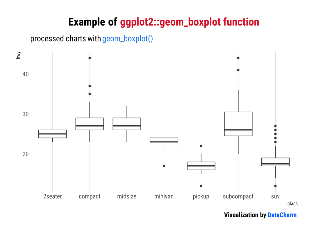
「样例一」:ggplot2::geom_boxplot() 和 ggeconodist::geom_econodist()
ggplot2::geom_boxplot()
library(tidyverse)
library(ggtext)
library(hrbrthemes)
library(wesanderson)
library(ggsci)
library(ggeconodist)

plot01 <- ggplot(mpg, aes(class, hwy)) +
  geom_boxplot() +
  labs(
    title = "Example of <span style='color:#D20F26'>ggplot2::geom_boxplot function</span>",
    subtitle = "processed charts with <span style='color:#1A73E8'>geom_boxplot()</span>",
    caption = "Visualization by <span style='color:#0057FF'>DataCharm</span>") +
  hrbrthemes::theme_ipsum(base_family = "Roboto Condensed") +
  theme(
    plot.title = element_markdown(hjust = 0.5,vjust = .5,color = "black",
                                  size = 20, margin = margin(t = 1, b = 12)),
    plot.subtitle = element_markdown(hjust = 0,vjust = .5,size=15),
    plot.caption = element_markdown(face = 'bold',size = 12)
      )
ggeconodist::geom_econodist()
plot01_01 <- ggplot(mpg, aes(class, hwy)) +
  ggeconodist::geom_econodist(width = 0.25) +
  labs(
    title = "Example of <span style='color:#D20F26'>ggeconodist::geom_econodist function</span>",
    subtitle = "processed charts with <span style='color:#1A73E8'>geom_econodist()</span>",
    caption = "Visualization by <span style='color:#0057FF'>DataCharm</span>") +
  hrbrthemes::theme_ipsum(base_family = "Roboto Condensed") +
  theme(
    plot.title = element_markdown(hjust = 0.5,vjust = .5,color = "black",
                                  size = 20, margin = margin(t = 1, b = 12)),
    plot.subtitle = element_markdown(hjust = 0,vjust = .5,size=15),
    plot.caption = element_markdown(face = 'bold',size = 12)
      )
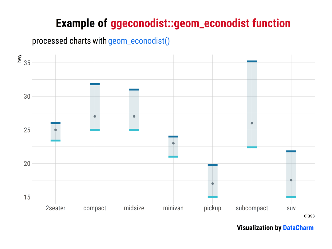
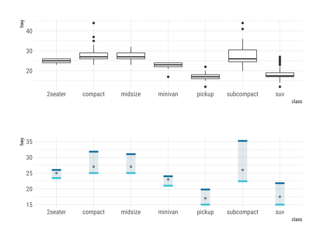
下面这幅图可以更好的对比两者不同的可视化效果:
介绍完具体的不同之后,我们再试着对其默认的颜色进行更改:
「样例二」:
plot02 <- ggplot(mpg, aes(class, hwy)) +
  ggeconodist::geom_econodist(width = 0.5,median_point_size = 1.5,tenth_col = "#BC3C28", ninetieth_col = "#0072B5") +
  coord_flip() +
  labs(
    title = "Example of <span style='color:#D20F26'>ggeconodist::geom_econodist function</span>",
    subtitle = "processed charts with <span style='color:#1A73E8'>geom_econodist()</span>",
    caption = "Visualization by <span style='color:#0057FF'>DataCharm</span>") +
  hrbrthemes::theme_ipsum(base_family = "Roboto Condensed") +
  theme(
    plot.title = element_markdown(hjust = 0.5,vjust = .5,color = "black",
                                  size = 20, margin = margin(t = 1, b = 12)),
    plot.subtitle = element_markdown(hjust = 0,vjust = .5,size=15),
    plot.caption = element_markdown(face = 'bold',size = 12)
      )
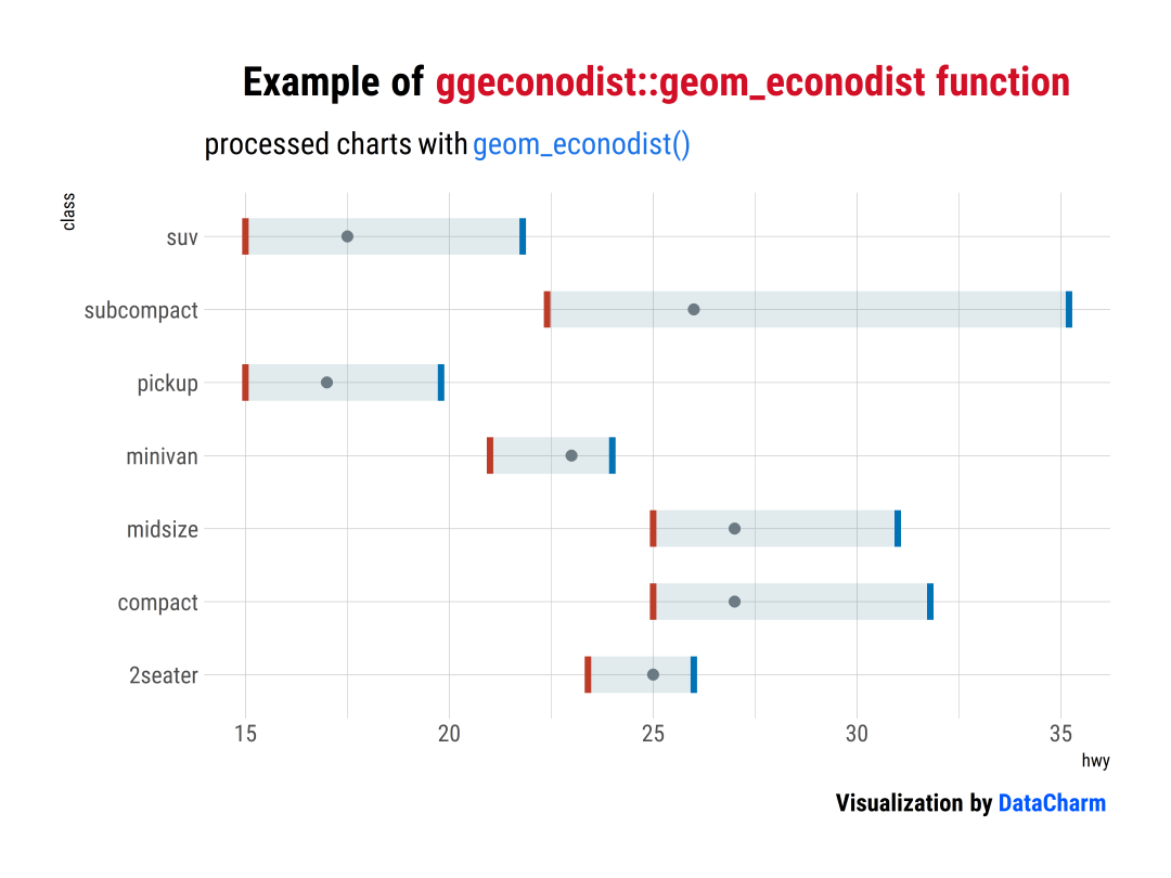
当然,你还可以附上不同颜色:
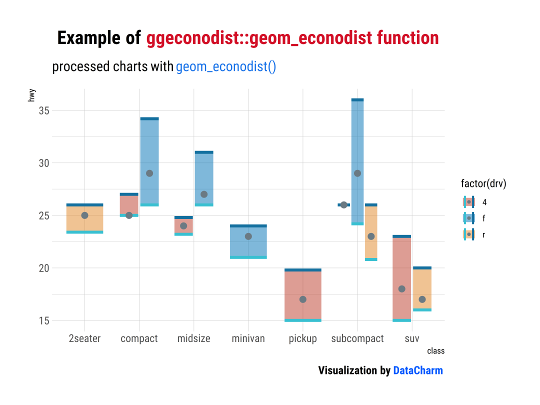
「样例三」:
plot03 <- ggplot(mpg, aes(class, hwy)) +
  ggeconodist::geom_econodist(aes(fill=factor(drv)),alpha=.5) +
  ggsci::scale_fill_nejm()+
  labs(
    title = "Example of <span style='color:#D20F26'>ggeconodist::geom_econodist function</span>",
    subtitle = "processed charts with <span style='color:#1A73E8'>geom_econodist()</span>",
    caption = "Visualization by <span style='color:#0057FF'>DataCharm</span>") +
  hrbrthemes::theme_ipsum(base_family = "Roboto Condensed") +
  theme(
    plot.title = element_markdown(hjust = 0.5,vjust = .5,color = "black",
                                  size = 20, margin = margin(t = 1, b = 12)),
    plot.subtitle = element_markdown(hjust = 0,vjust = .5,size=15),
    plot.caption = element_markdown(face = 'bold',size = 12)
      )
「样例四」:添加额外样例
gapminder %>%
  filter(year %in% c(1952, 1962, 1972, 1982, 1992, 2002)) %>%
  filter(continent != "Oceania") %>%
  ggplot(aes(x = factor(year), y = lifeExp, fill = continent)) +
  geom_econodist(
    median_point_size = 1.2,
    tenth_col = "#b07aa1",
    ninetieth_col = "#591a4f",
    alpha = .5,
    show.legend = FALSE
  ) +
  ggsci::scale_fill_jama(name = NULL) +
  coord_flip() +
  facet_wrap(~continent, nrow = 4) +
   labs(
    title = "Example of <span style='color:#D20F26'>ggeconodist::geom_econodist function</span>",
    subtitle = "processed charts with <span style='color:#1A73E8'>geom_econodist()</span>",
    caption = "Visualization by <span style='color:#0057FF'>DataCharm</span>") +
  hrbrthemes::theme_ipsum_rc(base_family = "Roboto Condensed") +
  theme(
    plot.title = element_markdown(hjust = 0.5,vjust = .5,color = "black",
                                  size = 20, margin = margin(t = 1, b = 12)),
    plot.subtitle = element_markdown(hjust = 0,vjust = .5,size=15),
    plot.caption = element_markdown(face = 'bold',size = 12)
      ) %>%
  # 添加额外图例
  add_econodist_legend(
    econodist_legend_grob(
      tenth_col = "#b07aa1",
      ninetieth_col = "#591a4f",
    ),
    below = "axis-b-1-4",
    just = "right"
  ) %>%
  grid.draw() %>%
ggsave(filename = geom_econodist04.png",
  width = 7.5, height = 8, dpi = 900)

更多详细内容可参考:R-ggeconodist介绍[1]
总结
今天小编介绍了另类的分布统计图绘制(geom_econodist),带给大家不一样的视觉效果,希望小伙伴们可以尝试下~~
◆ ◆ ◆ ◆ ◆
麟哥新书已经在当当上架了,我写了本书:《拿下Offer-数据分析师求职面试指南》,目前当当正在举行活动,大家可以用相当于原价5折的预购价格购买,还是非常划算的:
数据森麟公众号的交流群已经建立,许多小伙伴已经加入其中,感谢大家的支持。大家可以在群里交流关于数据分析&数据挖掘的相关内容,还没有加入的小伙伴可以扫描下方管理员二维码,进群前一定要关注公众号奥,关注后让管理员帮忙拉进群,期待大家的加入。
管理员二维码:
猜你喜欢 ● 你相信逛B站也能学编程吗