 小詹学Python


(好久没更新可视化绘制技巧了,继续走着 )
)
今天小编给大家介绍一下子弹图(Bullet chart) 的绘制方法,主要内容包括:
子弹图(Bullet chart)简单介绍 子弹图(Bullet chart)的R绘制技巧 子弹图(Bullet chart)的Python绘制技巧
子弹图(Bullet chart)简单介绍
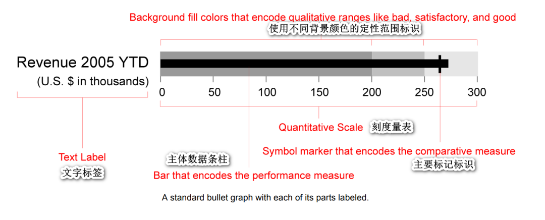
子弹图(Bullet chart) 给大多数据人的第一印象可能就只是简单的柱形图叠加,但其所使用的场景和表达的含义却远远超过柱形图,特别是在分析环比、同比时。子弹图的主要构成元素和可视化表示如下:
文字标签和主体条柱 刻度量表 主要标记标识 用于对比的标识(可选) 定性范围标识,一般2-5个即可。
文末小编还给大家准备了一个介绍子弹图(Bullet chart) 设计的pdf文件,感兴趣的可以学习下(下载方式文末给出)~,更多关于子弹图(Bullet chart)的介绍,小伙伴可自行探索哈~
子弹图(Bullet chart)的R绘制技巧
得益于R语言在可视化绘制上的便捷性,小编这里分别提供R-ggplot2和R-bulletchartr包绘制子弹图(Bullet chart) 的技巧分享。
R-ggplot2包绘制
R-ggplot2包绘制子弹图(Bullet chart) 还是非常方便的,如下:
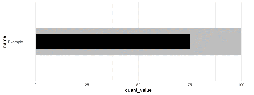
「样例一」:
library(tidyverse)
tibble(
  name = "Example",
  quant_value = 75,
  qualitative = 100
) %>%
  ggplot(aes(x = quant_value, y = name)) +
  geom_col(aes(x = qualitative), fill = "grey") +
  geom_col(width = 0.5, fill = "black") +
  coord_cartesian(ylim = c(0.3, 1.7)) +
  theme_minimal() +
  theme(panel.grid.major.y = element_blank())
「样例二」:Add a target
ex_df <- bind_rows(
  tibble(
  name = rep("Ex 1", 2),
  group = c("Qualitative", "Measure"),
  color = c("grey", "black"),
  value = c(100, 75),
  width = c(0.9, 0.5),
  target = rep(82, 2),
  ymin = rep(0.7, 2),
  ymax = rep(1.3, 2)
  ),
  tibble(
  name = rep("Ex 2", 2),
  group = c("Qualitative", "Measure"),
  color = c("grey", "black"),
  value = c(88, 64),
  width = c(0.9, 0.5),
  target = rep(77, 2),
  ymin = rep(1.7, 2),
  ymax = rep(2.3, 2)
  )
)

ex_df %>%
  ggplot(aes(x = value, y = name, fill = color)) +
  geom_col(width = c(0.9, 0.5, 0.9, 0.5)) +
  geom_linerange(
    aes(x = target, ymin = ymin, ymax = ymax),
    size = 2, color = "red"
    ) +
  coord_cartesian(ylim = c(0.3, 2.7)) +
  scale_fill_identity() +
  theme_minimal() +
  theme(panel.grid.major.y = element_blank())
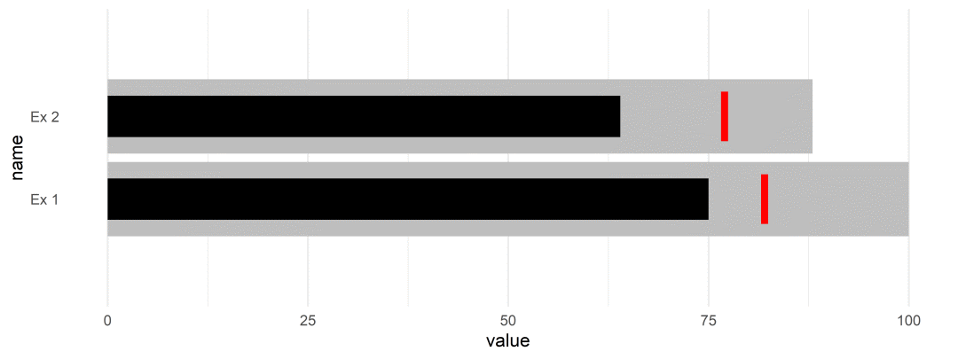
而绘制其他多类别数据的方法也都是类似的,小伙伴们可自行测试。
R-bulletchartr包绘制
R-bulletchartr包则是专门用于绘制子弹图(Bullet chart) 的第三方包,使用也非常方便,且其对绘图数据的格式要求也比较低,详细介绍如下:
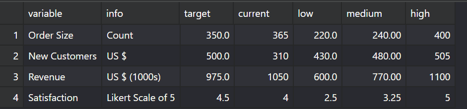
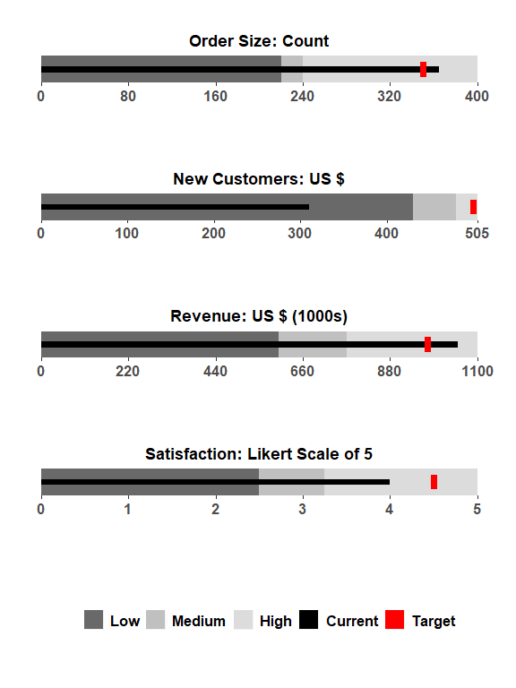
「样例一」:bullet_chart()
数据预览:
绘制代码
## load example data
load(read_example("bc_ex.rda"))

bullet_chart(dataframe = bc_ex)
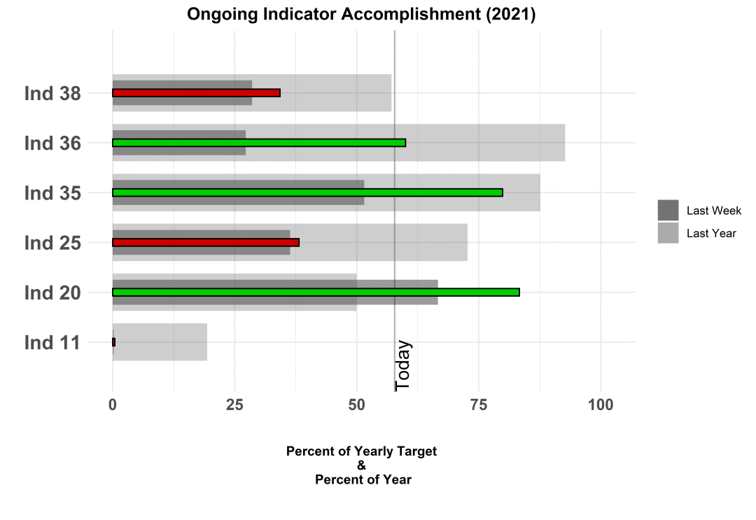
「样例二」:bullet_chart_wide()
数据预览: 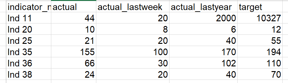
绘制代码:
bullet_chart_wide(file_name = read_example("Indicators_Targets_ext.xlsx"),
                  cal_type = "cal")
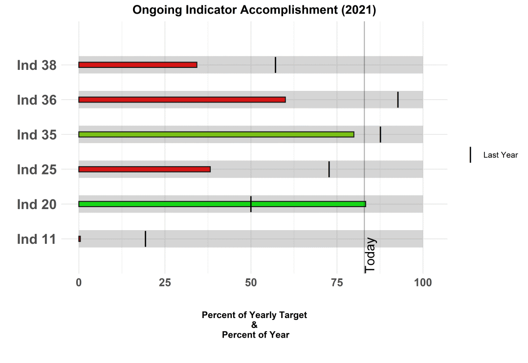
「样例三」:bullet_chart_vline()
数据预览: 绘制代码:
bullet_chart_vline(file_name = read_example("Indicators_Targets_ext.xlsx"))
更多R-bulletchartr包其他绘图函数和参数设置可参考R-bulletchartr包[1]
Python绘制
Python-matplotlib 绘制
之前小编有转载过一篇文章专门介绍使用Matplotlib绘制子弹图(Python-Matplotlib 子弹图绘制),作者是定义bulletgraph()函数进行绘制,感兴趣的小伙伴可以看下,这里就不再描述。
Python-plotly 绘制
作为Python交互式可视化绘制强大工具之一,plotly库可以绘制多类图表,当然也包括子弹图(Bullet chart),如下:
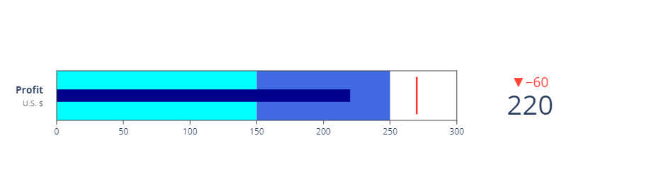
「样例一」:
import plotly.graph_objects as go

fig = go.Figure(go.Indicator(
    mode = "number+gauge+delta", value = 220,
    domain = {'x': [0, 1], 'y': [0, 1]},
    delta = {'reference': 280, 'position': "top"},
    title = {'text':"<b>Profit</b><br><span style='color: gray; font-size:0.8em'>U.S. $</span>", 'font': {"size": 14}},
    gauge = {
        'shape': "bullet",
        'axis': {'range': [None, 300]},
        'threshold': {
            'line': {'color': "red", 'width': 2},
            'thickness': 0.75, 'value': 270},
        'bgcolor': "white",
        'steps': [
            {'range': [0, 150], 'color': "cyan"},
            {'range': [150, 250], 'color': "royalblue"}],
        'bar': {'color': "darkblue"}}))
fig.update_layout(height = 250)
fig.show()
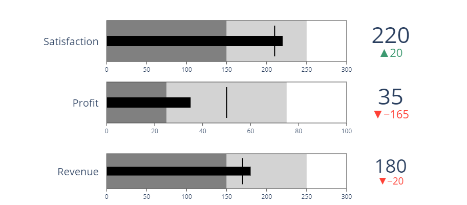
「样例二」:Multi Bullet
import plotly.graph_objects as go

fig = go.Figure()

fig.add_trace(go.Indicator(
    mode = "number+gauge+delta", value = 180,
    delta = {'reference': 200},
    domain = {'x': [0.25, 1], 'y': [0.08, 0.25]},
    title = {'text': "Revenue"},
    gauge = {
        'shape': "bullet",
        'axis': {'range': [None, 300]},
        'threshold': {
            'line': {'color': "black", 'width': 2},
            'thickness': 0.75,
            'value': 170},
        'steps': [
            {'range': [0, 150], 'color': "gray"},
            {'range': [150, 250], 'color': "lightgray"}],
        'bar': {'color': "black"}}))

fig.add_trace(go.Indicator(
    mode = "number+gauge+delta", value = 35,
    delta = {'reference': 200},
    domain = {'x': [0.25, 1], 'y': [0.4, 0.6]},
    title = {'text': "Profit"},
    gauge = {
        'shape': "bullet",
        'axis': {'range': [None, 100]},
        'threshold': {
            'line': {'color': "black", 'width': 2},
            'thickness': 0.75,
            'value': 50},
        'steps': [
            {'range': [0, 25], 'color': "gray"},
            {'range': [25, 75], 'color': "lightgray"}],
        'bar': {'color': "black"}}))

fig.add_trace(go.Indicator(
    mode = "number+gauge+delta", value = 220,
    delta = {'reference': 200},
    domain = {'x': [0.25, 1], 'y': [0.7, 0.9]},
    title = {'text' :"Satisfaction"},
    gauge = {
        'shape': "bullet",
        'axis': {'range': [None, 300]},
        'threshold': {
            'line': {'color': "black", 'width': 2},
            'thickness': 0.75,
            'value': 210},
        'steps': [
            {'range': [0, 150], 'color': "gray"},
            {'range': [150, 250], 'color': "lightgray"}],
        'bar': {'color': "black"}}))
fig.update_layout(height = 400 , margin = {'t':0, 'b':0, 'l':0})

fig.show()
Python-plotly库绘图功能还是非常强大的,后期公众号会推出系列专题。更多plotly库绘制子弹图(Bullet chart) 可参考plotly库绘制子弹图[2]。
总结
今天的这篇推文,小编简单的介绍了子弹图(Bullet chart) 的R和Python绘制方法,希望小伙伴们可以选择自己喜欢的工具进行绘制哈~
参考资料
R-bulletchartr包官网: https://acdivocatech.github.io/bulletchartr/index.html。
[2]plotly库绘制子弹图: https://plotly.com/python/bullet-charts/。

E N D

各位伙伴们好,詹帅本帅假期搭建了一个个人博客和小程序,汇集各种干货和资源,也方便大家阅读,感兴趣的小伙伴请移步小程序体验一下哦!(欢迎提建议)
推荐阅读
推荐阅读