 高级前端进阶


背景
最近在看css新世界,对于忙于写业务的我,收获颇多。本文不考虑css兼容性。
@supports
@supports 是CSS中常见的@规则,可以用来检测当前浏览器是否支持某个css特性。
需求:不支持animation的浏览器,使用gif动画,支持animation的浏览器,使用动画。ps:不考虑@supports的兼容性(ie10 和ie11)
    .loading{
         width:10px;
         heigth:10px;
         background:url(./loading.gif);
    }

    //判断是否支持animation 属性,支持则增加动画效果
    @support (animation:none) {
        .loading{
             width:10px;
             heigth:10px;
             background:url(./loading.png);
             animation: spin 1s linear infinite;
        }
        @keyframes spin{
            from { transform: rotate(360deg);}
            to {transform: rotate(0deg);}
        }
    }
复制代码
例如:使用position:sticky 实现滚动粘滞效果,传统浏览器使用js支持。
    //js 判断是否支持positon:sticky 属性  CSS.supports(propertyName,value)
    if( !window.CSS || !CSS.supports || !CSS.supports('position','sticky'){
        //TODO
    }

复制代码
fit-content
fit-content 我们可以理解为内容的大小,如果把内容理解为"大腿",那么fit-content就是"紧身裤"
需求:文本少的时候,文本水平居中,多行文本的时候,文本向左对齐(这什么鬼需求,但我确实遇到了)。
    // 传统实现
    .content{
         display:table;
         margin:auto;
    }
    // 如果是内联元素
    .content{
         display:inline-block;
         margin:auto;
    }
    // fit-content 实现
   .content{
         width:fit-content;
         margin:auto;
    }
复制代码
fit-content 优势
保护了元素原始的display计算值,例如 li 标签设置成display:table,前面的项目符号就不会出现,::marker伪元素也会失效。 让元素尺寸有了确定的值。
针对第二点让元素有了确定的值,我们的应用场景。例如:我们利用绝对布局,使用margin:auto 来实现居中效果,需要我们设置具体的with或者height的属性值。
    .test2-center{
        position: absolute;
        width: 300px;
        height: 200px;
        background: red;
        left: 0;
        top: 0;
        right: 0;
        bottom: 0;
        margin: auto;
    }

复制代码
有的时候我们不确定width,height,我们就会使用transform 来实现居中
    .test3-center{
        position: absolute;
        left: 50%;
        top: 50%;
        background: red;
        transform: translate(-50%, -50%);

    }
复制代码
这个时候我们如果需要给 test3-center 添加一个位移动画
    @keyframes move{
        from { transform:translateY(5px);}
        to { transform:translateY(0); }

    }
复制代码
这个时候我们的transform就会受到位移动画干扰。
更好的方法是使用我们的 fit-content,这样就有了确定的宽高,居中可以生效了。
    .test3-center{
        position: absolute;
        width:fit-content;
        height:fit-content;
        left: 0;
        top: 0;
        right: 0;
        bottom: 0;
        margin: auto;
        animation: move .2s;

    }
复制代码
border-image
border-image 属性作用过程分为两个点:
源图像的划分(九宫格) 九宫格尺寸的控制
border-image 成员组成:
border-image-source //图像资源,不讲解 border-image-slice border-image-width border-image-outset border-image-repeat
border-image 应用场景:设计师给了我们一张list的背景图,背景图四个角有不同的小图案,中间区域可以拉伸,由于list的高度是不固定的,我们不能确定背景的高度,只能靠内容填充,这就需要我们的背景拉伸,设计师的原则:四个角不变形,中间区域拉伸。这个时候我们的border-image就可以出场了。
border-image类似于安卓中常用到的.9图。
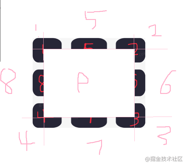
下面案例使用源图像如下:
九宫格
border-image 划分九宫格如下:
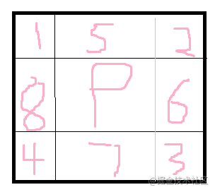
border-image 会将这九宫格作用在源图像上。
border-image-slice
    //语法
    border-image-slice: <number-percentage>{1,4} && fill?

复制代码
表示支持1 ~ 4个数值或者1 ~ 4个百分比值,后面带一个fill关键字,fill关键字可选。border-image-slice 用于划分源图像,划分的方位和顺序为:上,右,下,左。
例如:border-image-slice:100 ,表示距离源图像上方100px,距离源图像右侧100px,距离源图像下方100px,距离源图像左侧100px,这个时候四个角1,2,3,4都被固定了,其他区域拉伸。
    .test5 {
            position: relative;
            width: 400px;
            height: 300px;
            border: 50px solid red;
            border-image-source: url("./bg1.png");
            border-image-slice: 100;

        }
复制代码
这里需要注意border-image-slice 只是划分源图像。具体border的宽度跟border-width或者border-image-width有关。
border属性一定要写在border-image 属性前面,否则border-image无效。
border-image-slice 只能是数值或者百分比,不能带单位(px)。
默认情况下源图像中心位置(9号位置)是不参与填充的,如果想要填充效果,使用fill关键字。
  border-image-slice:22% fill;
复制代码
border-image-width
border-image-width 和border-image-outset 都是控制九宫格的尺寸。
border-image-width 属性和border-width的属性支持个数一样,都是1 ~ 4 个,值得对应方位也一样,只是值得类型不一样。
border-image-width 属性支持数值作为属性值,这个数值会作为系数与border-width的宽度相乘,最终的计算值作为边框的宽度。
border-image-width 属性值如果是具体的长度值(30px,20rem),则边框宽度与border-width就没有任何关系了。理论上,设置border-width为0,border-image-width 设置具体长度值,就可以正常渲染边框,但是chrome不能正常渲染边框,因此我们为了让border-image-width生效,设置border-width 为0.02px;
border-image-width 为百分比,是相对元素自身尺寸计算,水平方向相对于宽度,垂直方向相对于高度。
border-image-width 设置为auto 关键字。会使用border-image-slice 属性划分的尺寸作为九宫格的长度值。(推荐)
border-image-width 和border-width 不支持负数值。
border-image-width 控制的是1-8区域的尺寸。
border-image-outset
border-image-outset 控制中心区域(9号区域)的尺寸,是往外扩张的意思。同样支持四个方位的属性值。
 .test5{
     border-image-source: url("./bg1.png");
     border-image-outset: 20px;
 }
复制代码
这里就是元素中心的区域(9号区域)向左右上下都扩大20px,所以9号区域的宽度为:9号区域原始宽度+40px,高度为:9号区域原始高度+40px
border-image-repeat
border-image-repeat 控制 5-8号区域的图像的平铺规则。
 .test5{
     border-image-source: url("./bg1.png");
     border-image-repeat: stretch;//默认值,让源图像充满整个显示区域。
     border-image-repeat: repeat;//让源图像紧密相连,在边界位置会截断图像。
     border-image-repeat: round;//让源图像金币相连,适当伸缩,边界位置不会截断图像,完整显示图像。
     border-image-repeat: space;//让源图像保持原有尺寸,中间区域等宽留有空白,图像平铺,边界位置完整显示图像。
 }
复制代码
后语
欢迎大家多提意见。一赞一回!欢迎评论。
关于本文
作者:qyjandroid
https://juejin.cn/post/7000261375654101005
The End
“在看”吗?在看就点一下吧
