ggplot2|详解八大基本绘图要素
共 894字,需浏览 2分钟
· 2021-02-09
"一张统计图形就是从数据到几何对象(geometric object, 缩写为geom, 包括点、线、条形等)的图形属性(aesthetic attributes, 缩写为aes, 包括颜色、形状、大小等)的一个映射。此外, 图形中还可能包含数据的统计变换(statistical transformation, 缩写为stats), 最后绘制在某个特定的坐标系(coordinate system, 缩写为coord)中, 而分面(facet, 指将绘图窗口划分为若干个子窗口)则可以用来生成数据中不同子集的图形。"
----- Hadley Wickham
一 ggplot2 背景介绍
ggplot2是由Hadley Wickham创建的一个十分强大的可视化R包。按照ggplot2的绘图理念,Plot(图)= data(数据集)+ Aesthetics(美学映射)+ Geometry(几何对象)。本文将从ggplot2的八大基本要素逐步介绍这个强大的R可视化包。
数据(Data)和映射(Mapping)
几何对象(Geometric)
标尺(Scale)
统计变换(Statistics)
坐标系统(Coordinante)
图层(Layer)
分面(Facet)
主题(Theme)
二 数据(data) 和 映射(Mapping)
数据:用于绘制图形的数据,本文主要使用经典的mtcars数据集和diamonds数据集子集为例来画图。
#install.packages("ggplot2")
library(ggplot2)
data(diamonds)
set.seed(1234)
diamond <- diamonds[sample(nrow(diamonds), 2000), ]
head(diamond)
# A tibble: 6 x 10
  carat cut     color clarity depth table price     x     y     z
  <dbl> <ord>   <ord> <ord>   <dbl> <dbl> <int> <dbl> <dbl> <dbl>
1  0.91 Ideal   G     SI2      61.6    56  3985  6.24  6.22  3.84
2  0.43 Premium D     SI1      60.1    58   830  4.89  4.93  2.95
3  0.32 Ideal   D     VS2      61.5    55   808  4.43  4.45  2.73
4  0.33 Ideal   G     SI2      61.7    55   463  4.46  4.48  2.76
5  0.7  Good    H     SI1      64.2    58  1771  5.59  5.62  3.6
6  0.33 Ideal   G     VVS1     61.8    55   868  4.42  4.45  2.74
映射:aes()函数是ggplot2中的映射函数, 所谓的映射即为数据集中的数据关联到相应的图形属性过程中一种对应关系, 图形的颜色,形状,分组等都可以通过通过数据集中的变量映射。
#使用diamonds的数据子集作为绘图数据,克拉(carat)数为X轴变量,价格(price)为Y轴变量。
p <- ggplot(data = diamond, mapping = aes(x = carat, y = price))#将钻石的颜色(color)映射颜色属性:
p <- ggplot(data=diamond, mapping=aes(x=carat, y=price, shape=cut, colour=color))
p+geom_point() #绘制点图#将钻石的切工(cut)映射到形状属性:
p <- ggplot(data=diamond, mapping=aes(x=carat, y=price, shape=cut))
p+geom_point() #绘制点图#将钻石的切工(cut)映射到分组属性:
#默认分组设置, 即group=1
p + geom_boxplot()
#分组(group)也是ggplot2种映射关系的一种,  如果需要把观测点按额外的离散变量进行分组处理, 必须修改默认的分组设置。
p1 <- ggplot(data=diamond, mapping=aes(x=carat, y=price, group=factor(cut)))
p1 + geom_boxplot()
注意:不同的几何对象,要求的属性会有些不同,这些属性也可以在几何对象映射时提供,以下语法与上面的aes中是一样的。
#结果与上述一致
ggplot(data = diamond)+geom_point(aes(x=carat, y=price, colour=color))
ggplot(data = diamond) +geom_point(aes(x=carat, y=price, shape=cut))
ggplot(data = diamond) +geom_boxplot(aes(x=carat, y=price, group=factor(cut)))
ggplot(data = diamond) +geom_point(aes(x=carat, y=price, colour=color,shape=cut))注:ggplot2支持图层,可以把不同的图层中共用的映射提供给ggplot函数,而某一几何对象才需要的映射参数提供给geom_xxx函数。
三 几何对象(Geometric)
几何对象代表我们在图中实际看到的图形元素,如点、线、多边形等。数据与映射部分介绍了ggplot函数执行各种属性映射,只需要添加不同的几何对象图层,即可绘制出相应的图形。
此处介绍几种常用的几何对象,geom_histogram用于直方图,geom_bar用于画柱状图,geom_boxplot用于画箱式图等。
直方图
单变量连续变量:可绘制直方图展示,提供一个连续变量,画出数据的分布。
#以价格(price)变量为例,且按照不同的切工填充颜色
ggplot(diamond)+geom_histogram(aes(x=price, fill=cut))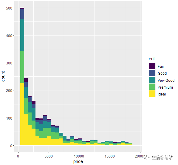
#设置position="dodge",side-by-side地画直方图
ggplot(diamond)+geom_histogram(aes(x=price, fill=cut), position="dodge")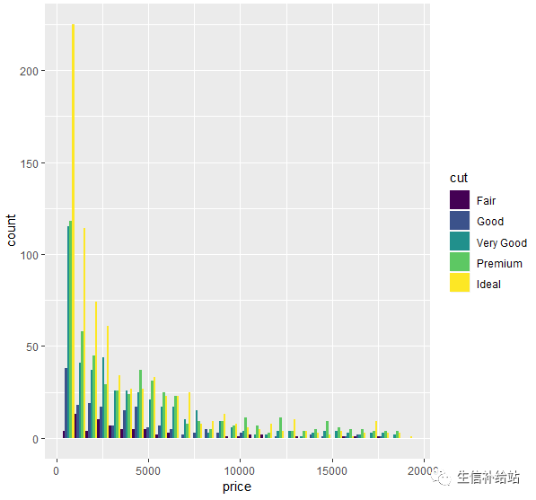
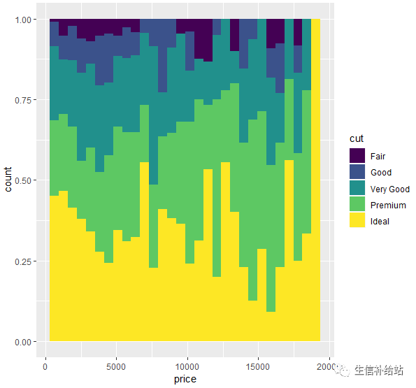
#设置使用position="fill",按相对比例画直方图
ggplot(diamond)+geom_histogram(aes(x=price, fill=cut), position="fill")
柱状图
单变量分类变量:可使用柱状图展示,提供一个x分类变量,画出数据的分布。
#以透明度(clarity)变量为例,且按照不同的切工填充颜色,柱子的高度即为此分类下的数目。
ggplot(diamond)+geom_bar(aes(x=clarity, fill=cut))
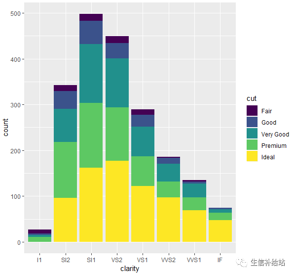
注:ggplot2会通过x变量自动计算各个分类的数目。
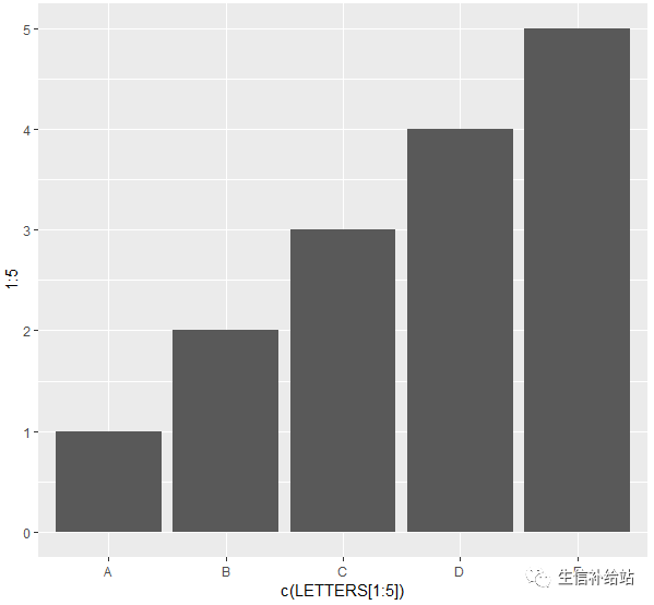
#直接指定个数,需要通过stat参数,指定geom_bar按特定高度画图
ggplot()+geom_bar(aes(x=c(LETTERS[1:5]),y=1:5), stat="identity")
区分与联系:
直方图把连续型的数据按照一个个等长的分区(bin)切分,然后计数画柱形图。
柱状图是把分类数据,按类别计数。
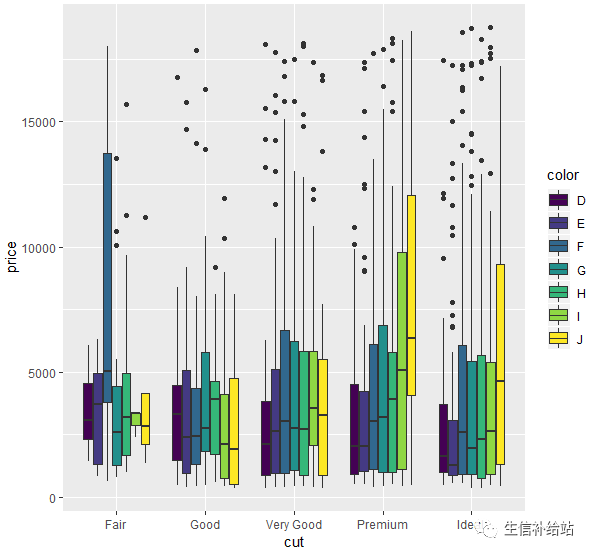
箱式图
箱线图通过绘制观测数据的五数总括,即最小值、下四分位数、中位数、上四分位数以及最大值,描述了变量值的分布情况。同时箱线图能够显示出离群点(outlier),通过箱线图能够很容易识别出数据中的异常值。
#按切工(cut)分类,对价格(price)变量画箱式图,再按照color变量分别填充颜色。
ggplot(diamond,aes(x=cut, y=price,fill=color))+geom_boxplot()
ggplot(diamond)+geom_boxplot(aes(x=cut, y=price,fill=color))
以上可见,通过映射和几何对象就可以将数据集中的变量数值变成几何图形以及几何图形的各种图形元素。
注:每一种几何对象所能涉及的aes()类型有区别,在绘制对应对象的时候,要注意选择正确的映射方式,以下仅供参考:
| geom | stat | aes |
|---|---|---|
| geom_abline | abine | colour,linetype,size |
| geom_area | identity | colour,fill,linetype,size,x,y |
| geom_bar | bin | colour,fill,linetype,size,weight,x |
| geom_bin2d | bin2d | colour,fill,linetype,size,weight,xmax,xmin,ymax,ymin |
| geom_blank | identity | |
| geom_boxplot | boxplot | colour,fill,lower,middle,size,upper,weight,x,ymax.ymin |
| geom_contour | contour | colour,linetype,size,weight,x |
| geom_crossbar | identity | colour,fill,linetype,size,x,y,ymax,ymin |
| geom_density | density | colour,fill,linetype,size,weight,x,y |
| geom_density2d | density2d | colour,linetype,size,weight,x,y |
| geom_dotplot | bindot | colour,fill,x,y |
| geom_errorbar | identity | colour,linetype,size,width,x,ymax,ymin |
| geom_errorbarh | identity | colour,linetype,size,width,x,ymax,ymin |
| geom_freqpoly | bin | colour,linetype,size |
| geom_hex | binhex | colour,fill,size,x,y |
| geom_histogram | bin | colour,fill,linetype,size,weight,x |
| geom_hline | hline | colour,linetype,size |
| geom_jitter | identity | colour,fill,shape,size,x,y |
| geom_line | identity | colour,linetype,size,x,y |
| geom_linerange | identity | colour,linetype,size,size,x,ymax,ymin |
| geom_map | identity | colour,fill,linetype,size,x,y,map_id |
| geom_path | identity | colour,linetype,size,x,y |
| geom_point | identity | colour,fill,shape,size,x,y |
| geom_pointrange | identity | colour,fill,linetype,shape,size,x,ymax,ymin |
| geom_polygon | identity | colour,fill,linetype,size,x,y |
| geom_quantile | quantile | colour,linetype,size,weight,x,y |
| geom_raster | identity | colour,fill,linetype,size,x,y |
| geom_rect | identity | colour,fill,linetype,size,xmax,xmin,ymax,ymin |
| geom_ribbon | identity | colour,fill,linetype,size,x,ymax,ymin |
| geom_rug | identity | colour,linetype,size |
| geom_segment | identity | colour,linetype,size,x,xend.y.yend |
| geom_smooth | smooth | aplha,colour,fill,linetype,size,weight,x,y |
| geom_step | identity | colour,linetype,size,x,y |
| geom_text | identity | angle,colour,hjust,label,size,size,vjust,x,y |
| geom_tile | identity | colour,fill,linetype,size,x,y |
| geom_violin | ydensity | weigth,colour,fill,size,linetype,x,y |
| geom_vline | vline | colour,linetype,size |
四、标尺(Scale)
在对图形属性进行映射之后,使用标尺可以控制这些属性的显示方式,比如坐标刻度,颜色属性等。
ggplot2的scale系列函数有很多,命名和用法是有一定规律的。一般使用三个单词用_连接,如scale_fill_gradient和 scale_x_continuous,
第一个都是scale
第二个是color fill x y linetype shape size等可更改的参数
第三个是具体的类型
此处仅介绍颜色设置和坐标轴设置函数的一些用法,其他类似。
1 颜色标尺设置(color fill)
1.1 颜色标尺“第二个”单词选择方法
颜色的函数名第二个单词有color和fill两个,对应分组使用的颜色函数即可。
比如柱状图,fill是柱子的填充颜色,这时就使用scale_fill系列函数来更改颜色。
比如点图使用color分组,则使用scale_color_系列函数来更改颜色。
1.2 颜色标尺“第三个”单词选择方法
根据第三个单词的不同,更换的颜色分为以下几种
1)离散型:在颜色变量是离散变量的时候使用,比如分类时每一类对应一种颜色
manual 直接指定分组使用的颜色
hue 通过改变色相(hue)饱和度(chroma)亮度(luminosity)来调整颜色
brewer 使用ColorBrewer的颜色
grey 使用不同程度的灰色
2)连续型:颜色变量是连续变量的时候使用,比如0-100的数,数值越大颜色越深这样
gradient 创建渐变色
distiller 使用ColorBrewer的颜色
identity 使用color变量对应的颜色,对离散型和连续型都有效
1.3 更改离散型变量的颜色函数
#数据,映射以及几何对象
p <- ggplot(diamond, aes(color))+geom_bar(aes(fill=cut)) #左上manual 直接指定分组使用的颜色
#values参数指定颜色
#直接指定颜色 (右上)
p + scale_fill_manual(values=c("red", "blue", "green","yellow","orange"))
#对应分组指定 (左下)
p + scale_fill_manual(values=c("Fair" = "red", "Good" = "blue", "Very Good" = "green" , Premium = "orange", Ideal = "yellow"))
#更改图例名字,对应指定并更改图例标签 (右下)
p + scale_fill_manual("class", values=c("red", "blue", "green","yellow","orange"),
                       breaks = c("Fair", "Good", "Very Good","Premium","Ideal"),
                       labels = c("一般", "好", "很好", "高级", "理想"))

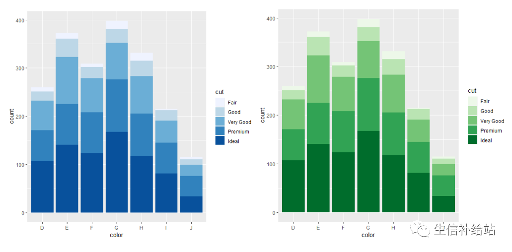
brewer 使用ColorBrewer的颜色
#palette参数调用色板
library(RColorBrewer)
#主要是palette参数调用色板
p + scale_fill_brewer() # 默认使用Blues调色板中的颜色(左)
p + scale_fill_brewer(palette = "Greens") #使用Greens调色板中的颜色 (右)
p + scale_fill_brewer(palette = "Greens",direction = -1)
grey 使用不同程度的灰色
#通过start end 两个参数指定,0为黑,1为白,都在0-1范围内
p + scale_fill_grey()  # 左图
#设定灰度范围
p + scale_fill_grey(start=1, end=0)  # 右图
p + scale_fill_grey(start=1, end=0.5)

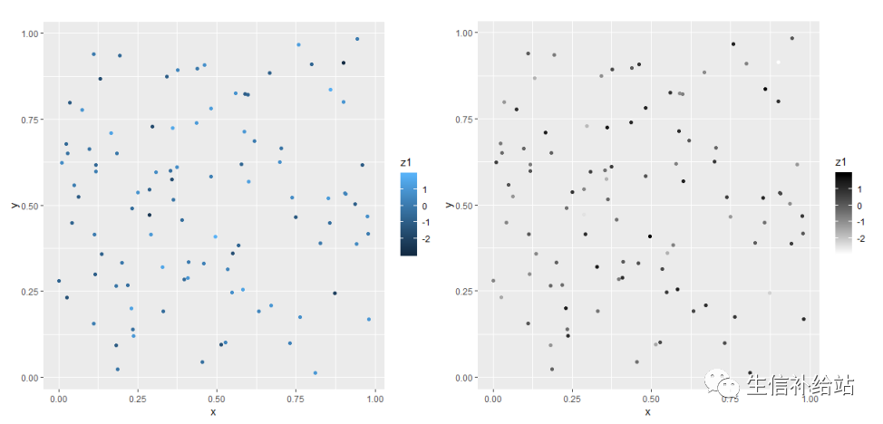
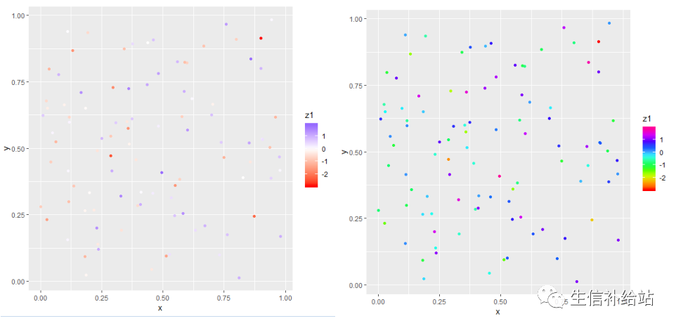
1.4 更改连续型变量的颜色函数
#构建数据集
df <- data.frame(
x = runif(100),
y = runif(100),
z1 = rnorm(100)
)
p <- ggplot(df, aes(x, y)) + geom_point(aes(colour = z1))
gradient 创建渐变色#参数设定节点颜色
#设置两端颜色
p + scale_color_gradient(low = "white", high = "black")
#设置中间过渡色
p + scale_color_gradient2(low = "red", mid = "white", high = "blue")
#使用R预设调色板
p + scale_color_gradientn(colours =rainbow(10))
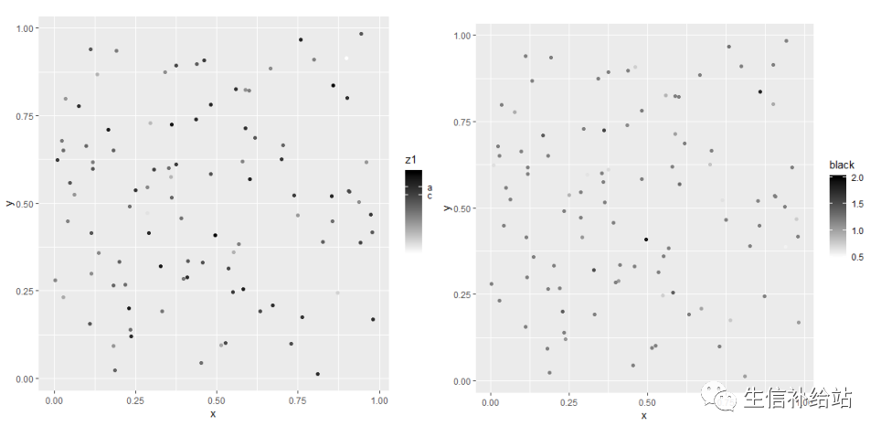
#legeng展示指定标签
p + scale_color_gradient(low = "white", high = "black",
breaks=c(1,2,0.5),
labels=c("a","b","c"))
#legend名称
p + scale_color_gradient("black", low = "white", high = "black",
limits=c(0.5,2))
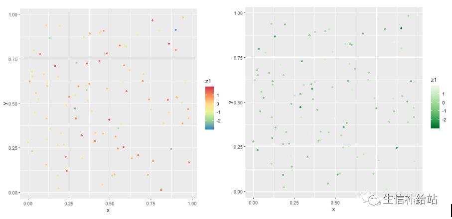
distiller 使用ColorBrewer的颜色
#将ColorBrewer的颜色应用到连续变量上
p + scale_color_distiller(palette = "Spectral")
p + scale_color_distiller(palette = "Greens")
2 坐标轴标尺修改(x , y)
本部分主要是对坐标轴做如下改变,
更改坐标轴名称
更改x轴上标数的位置和内容
显示对一个轴做统计变换
只展示一个区域内的点
更改刻度标签的位置
实现上面的这些可以使用scale_x等函数,同时像xlab这样的函数实现其中某一方面的功能,但是用起来更加方便
因为这里的数据也有连续和离散之分,所以也要使用不同的函数来实现。
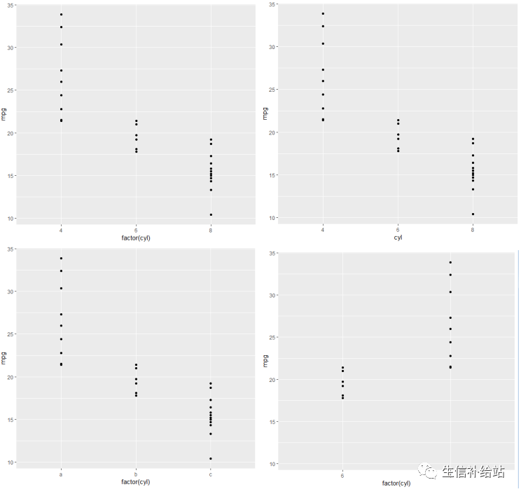
# 横坐标是离散变量,纵坐标是连续变量
p <- ggplot(mtcars, aes(factor(cyl), mpg)) + geom_point()

# 更改坐标轴名称
p + scale_x_discrete("cyl")
# 更改横轴标度
p + scale_x_discrete(labels = c("4"="a","6"="b","8"="c"))
# 指定横轴顺序以及展示部分
p + scale_x_discrete(limits=c("6","4"))
# 连续变量可以更改标度(图与上相似,略)
p + scale_y_continuous("ylab_mpg")
p + scale_y_continuous(breaks = c(10,20,30))
p + scale_y_continuous(breaks = c(10,20,30), labels=scales::dollar)
p + scale_y_continuous(limits = c(10,30))
# 连续变量可以更改标度,还可以进行统计变换
p + scale_y_reverse() # 纵坐标翻转,小数在上面,大数在下面
p + scale_y_log10()
p + scale_y_continuous(trans = "log10")
p + scale_y_sqrt()# 更改刻度标签的位置p + scale_x_discrete(position = "top") +
scale_y_continuous(position = "right")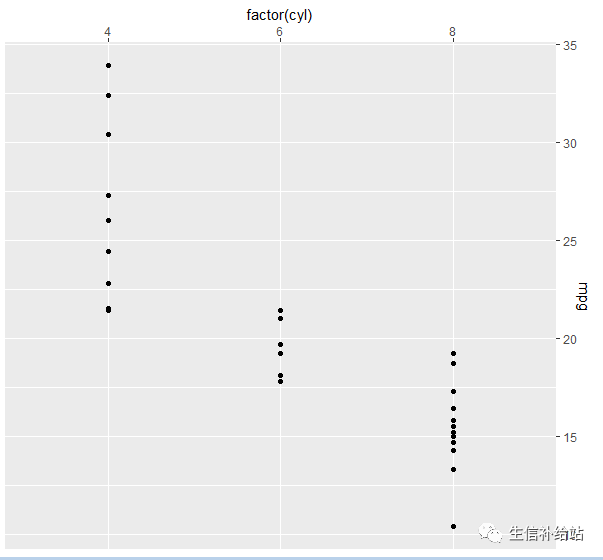
注:除使用scale参数进行设置外,后面会介绍使用更简单易用的函数。
五 统计变换(Statistics)
ggplot2提供了多种统计变换方式,此处介绍两种较常用的。
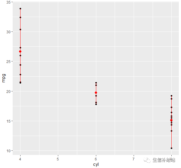
1 stat_summary
要求数据源的y能够被分组,每组不止一个元素, 或增加一个分组映射,即aes(x= , y = , group = )
library(Hmisc)
g <- ggplot(mtcars,aes(cyl, mpg)) + geom_point()
#mean_cl_bool对mpg进行运算,返回均值,最大值,最小值;其他可用smean.cl.normal,smean.sdl,smedian.hilow。
g + stat_summary(fun.data = "mean_cl_boot", color = "red", size = 2)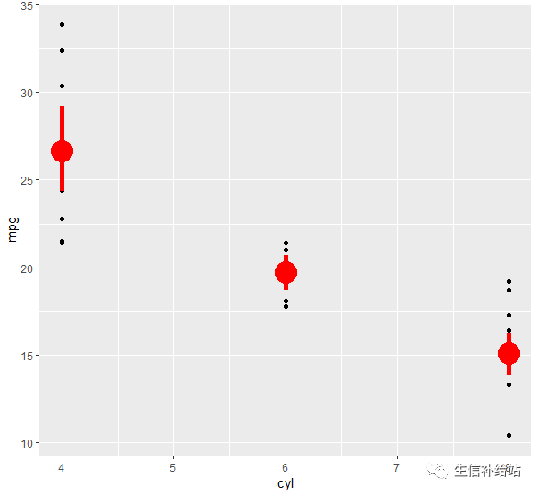
#fun.y 对y的汇总函数,返回单个数字,y通常会被分组汇总后每组返回1个数字
g + stat_summary(fun.y = "mean", color = "red", size = 2, geom = "point") # 计算各组均值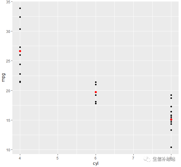
# 增加1组颜色变量映射,然后求均值并连线
g + aes(color = factor(vs)) + stat_summary(fun.y = mean, geom = "line") 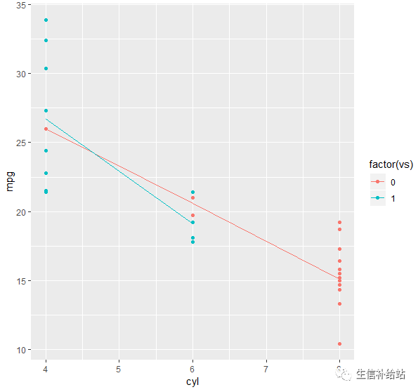
#fun.ymax 表示取y的最大值,输入数字向量,每组返回1个数字
g + stat_summary(fun.y = mean, fun.ymin = min, fun.ymax = max, color = "red") # 计算各组均值,最值
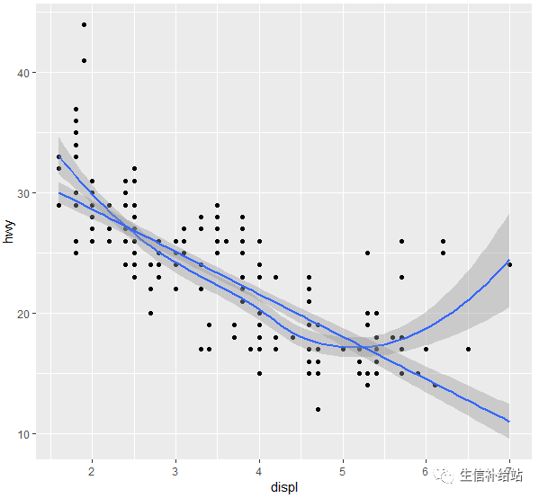
2 stat_smooth
对原始数据进行某种统计变换计算,然后在图上表示出来,例如对散点图上加一条回归线。
#添加默认曲线
#method 表示指定平滑曲线的统计函数,如lm线性回归, glm广义线性回归, loess多项式回归, gam广义相加模型(mgcv包), rlm稳健回归(MASS包)
ggplot(mpg, aes(displ, hwy)) +geom_point() +stat_smooth()

ggplot(mpg, aes(displ, hwy)) +geom_point() +geom_smooth() +stat_smooth(method = lm, se = TRUE)
#formula 表示指定平滑曲线的方程,如 y~x, y~poly(x, 2), y~log(2) ,需要与method参数搭配使用
ggplot(mpg, aes(displ, hwy)) +geom_point() +stat_smooth(method = lm, formula = y ~ splines::bs(x, 3), se = FALSE)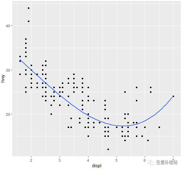
#se 表示是否显示平滑曲线的置信区间,默认TRUE显示;level = 0.95
ggplot(mpg, aes(displ, hwy, color = class)) + geom_point() + stat_smooth(se = FALSE, method = lm)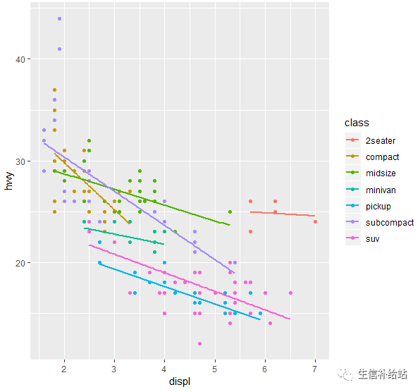
注:以下为ggplot2提供的其他统计变换方式,也可以自己写函数基于原始数据进行计算。
stat_abline       stat_contour      stat_identity     stat_summary
stat_bin          stat_density      stat_qq           stat_summary2d
stat_bin2d        stat_density2d    stat_quantile     stat_summary_hex
stat_bindot       stat_ecdf         stat_smooth       stat_unique
stat_binhex       stat_function     stat_spoke        stat_vline
stat_boxplot      stat_hline        stat_sum          stat_ydensity
六 坐标系统(Coordinante)
坐标系统控制坐标轴,可以进行变换,例如XY轴翻转,笛卡尔坐标和极坐标转换,以满足我们的各种需求。
1 coord_flip()实现坐标轴翻转
ggplot(diamond)+geom_bar(aes(x=cut, fill=cut))+coord_flip()

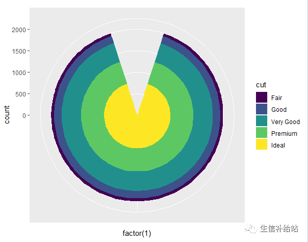
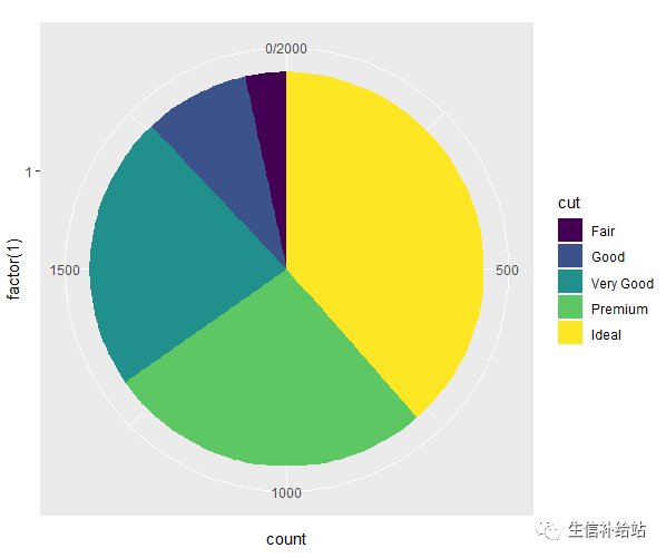
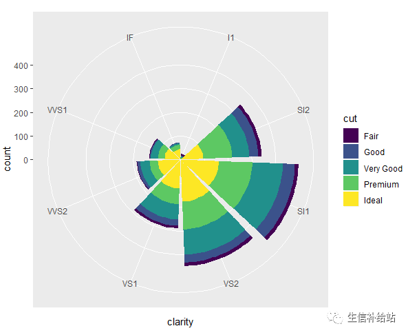
2 coord_polar()实现极坐标转换
#靶心图
ggplot(diamond)+geom_bar(aes(x=factor(1), fill=cut))+coord_polar()
#饼图
ggplot(diamond)+geom_bar(aes(x=factor(1), fill=cut))+coord_polar(theta="y")
#风玫瑰图(windrose)
ggplot(diamond)+geom_bar(aes(x=clarity, fill=cut))+coord_polar()
七 图层(Layer)
ggplot的强大之处在于直接使用+号即可实现叠加图层,前面散点图添加拟合曲线即为图层叠加。
ggplot(mpg, aes(displ, hwy)) +geom_point() +geom_smooth() +stat_smooth(method = lm, se = TRUE)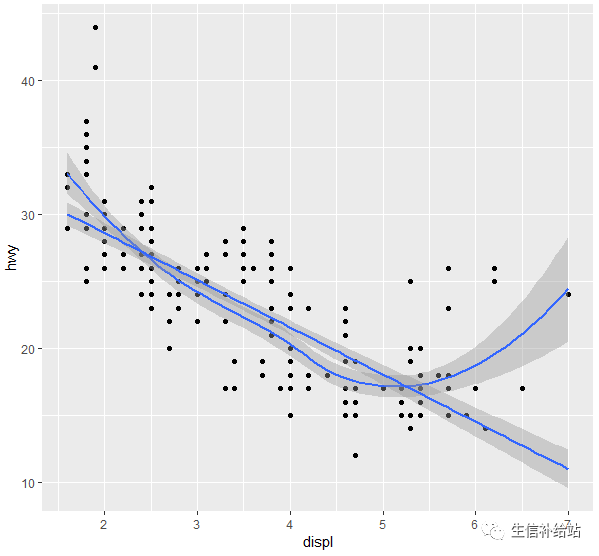
ggplot函数可以设置数据和映射,每个图层设置函数(geom_xxx和stat_xxx)也都可以设置数据和映射,这虽然便利,但也可能产生一些混乱。
ggplot2的图层设置函数对映射的数据类型是有较严格要求的,比如geom_point和geom_line函数要求x映射的数据类型为数值向量,而geom_bar函数要使用因子型数据。如果数据类型不符合映射要求就得做类型转换,在组合图形时还得注意图层的先后顺序。
八 分面(Facet)
分面设置在ggplot2应该也是要经常用到的一项画图内容,在数据对比以及分类显示上有着极为重要的作用,
facet_wrap 和 facet_grid是两个经常要用到的分面函数。
1 facet_wrap:基于一个因子进行设置,形式为:~变量(~单元格)
#cyl变量进行分面
p<-ggplot(mtcars,aes(mpg,hp))+geom_point()
p+facet_wrap(~cyl)
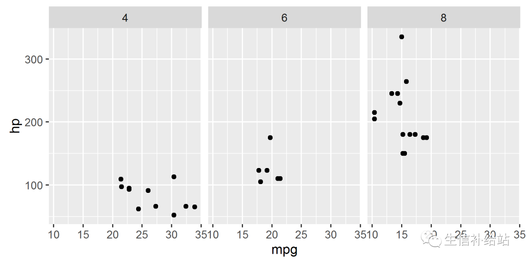
#每个分面单独的坐标刻度,单独对x轴设置
#scales参数fixed表示固定坐标轴刻度,free表示反馈坐标轴刻度,也可以单独设置成free_x或free_y
p+facet_wrap(~cyl,scales="free")
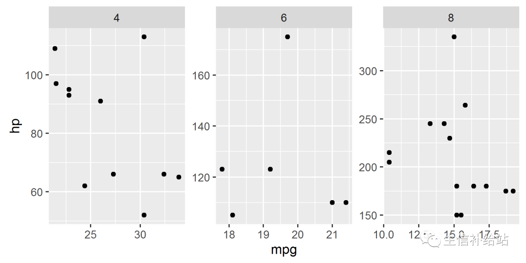
#每个分面单独的坐标刻度,单独对y轴设置
#nrow,ncol参数为数值,表示 分面设置成几行和几列
p+facet_wrap(~carb,scales="free",nrow=1)
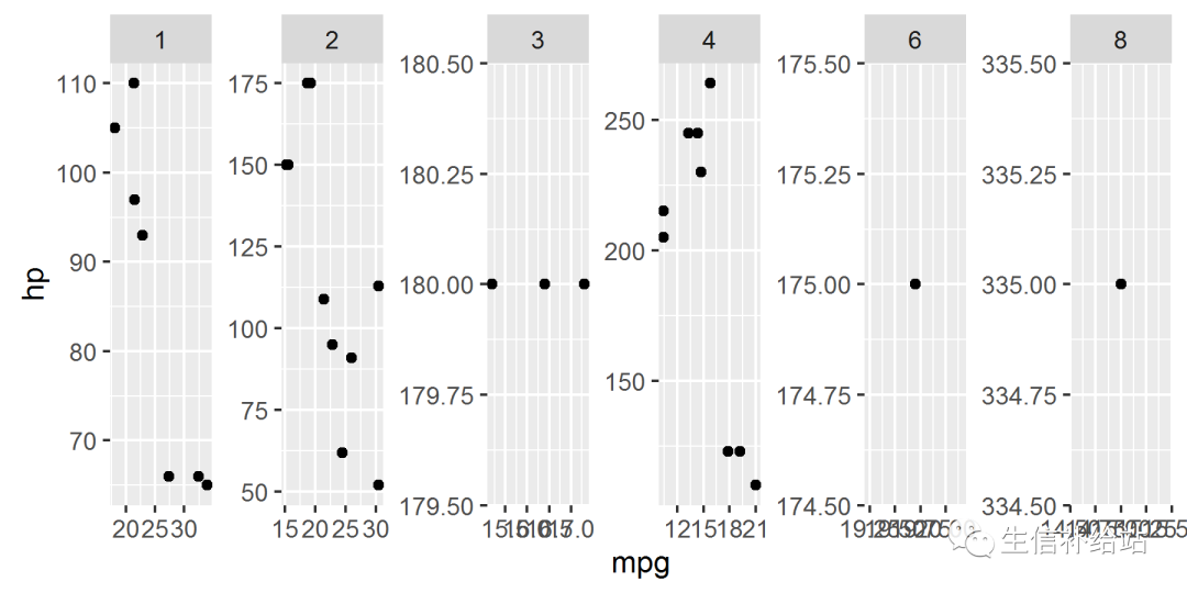
对nrow设置后的效果图表变得比较拥挤,正常情况下,facet_wrap自然生成的图片,只设置scale = free 会相对比较好看。
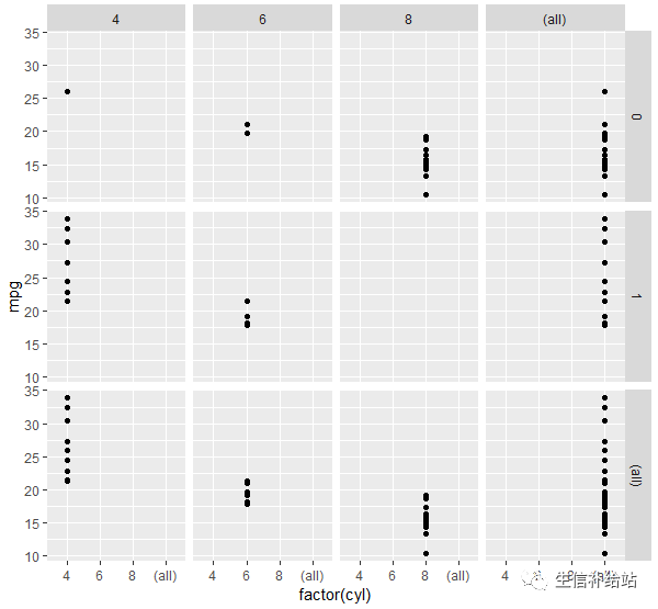
2 facet_grid:基于两个因子进行设置,形式为:变量~变量(行~列),如果把一个因子用点表示,也可以达到facet_wrap的效果,也可以用加号设置成两个以上变量
p+facet_grid(vs~cyl)
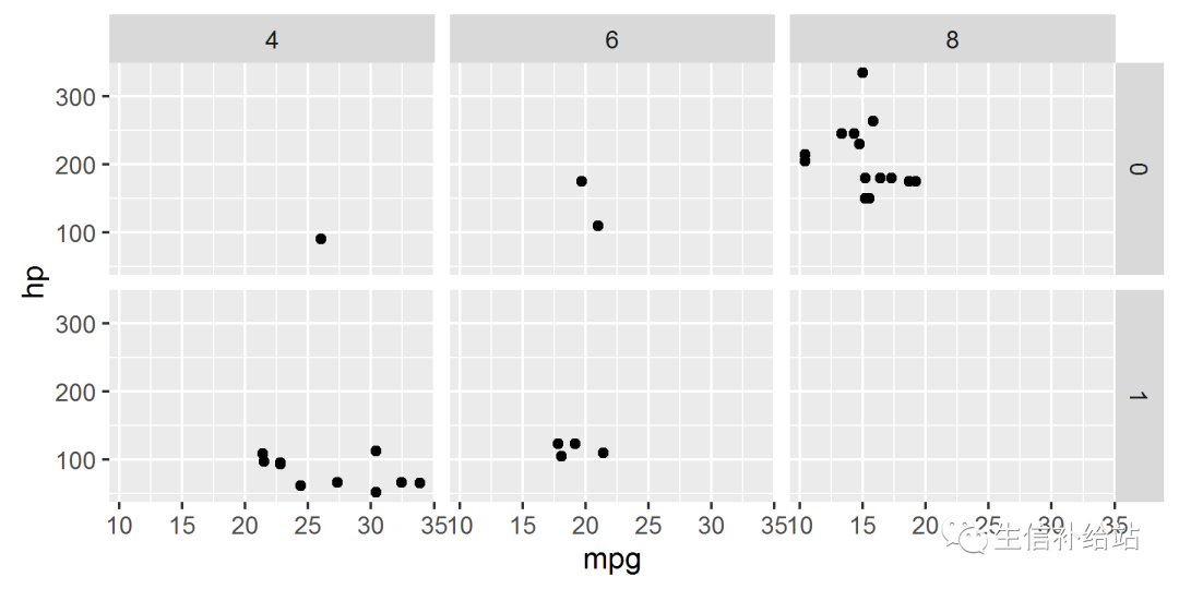
#space 表示分面空间是否可以按照数据进行缩放,参数和scales一样
p+facet_grid(vs~cyl,scales="free",space="free")
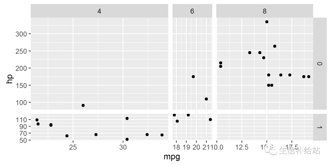
从上图可以看出把scales 和space 都设置成free之后,不仅坐标刻度不一样了,连每个分面的大小也不一样了。
#margins 通过TRUE或者FALSE表示否设置而一个总和的分面变量,默认情况为FALSE,即不设置
p+facet_grid(vs~cyl,margins=TRUE)
分面可以让我们按照某种给定的条件,对数据进行分组,然后分别画图。
九 主题(Theme)
ggplot画图之后,需要根据需求对图进行”精雕细琢“,title, xlab, ylab毋庸置疑,其他的细节也需修改。
1 theme参数修改
详细参数可参考:ggplot2-theme(主题)
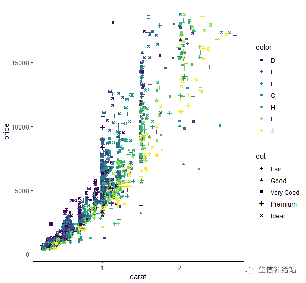
p <- ggplot(data = diamond) +geom_point(aes(x=carat, y=price, colour=color,shape=cut))
p + labs(title="学习ggplot2可视化",subtitle = "参数好多",caption = "熟能生巧")+
theme(plot.title=element_text(face="bold.italic",color="steelblue",size=24, hjust=0.5,vjust=0.5,angle=360,lineheight=113))

下面为theme的相关参数,可以细节修改处,之后的后面会继续补充。
function (base_size = 12, base_family = "")
 {
     theme(line = element_line(colour = "black", size = 0.5, linetype = 1,
         lineend = "butt"), rect = element_rect(fill = "white",
         colour = "black", size = 0.5, linetype = 1), text = element_text(family = base_family,
         face = "plain", colour = "black", size = base_size, hjust = 0.5,
         vjust = 0.5, angle = 0, lineheight = 0.9), axis.text = element_text(size = rel(0.8),
         colour = "grey50"), strip.text = element_text(size = rel(0.8)),
         axis.line = element_blank(), axis.text.x = element_text(vjust = 1),
         axis.text.y = element_text(hjust = 1), axis.ticks = element_line(colour = "grey50"),
         axis.title.x = element_text(), axis.title.y = element_text(angle = 90),
         axis.ticks.length = unit(0.15, "cm"), axis.ticks.margin = unit(0.1,
             "cm"), legend.background = element_rect(colour = NA),
         legend.margin = unit(0.2, "cm"), legend.key = element_rect(fill = "grey95",
             colour = "white"), legend.key.size = unit(1.2, "lines"),
         legend.key.height = NULL, legend.key.width = NULL, legend.text = element_text(size = rel(0.8)),
         legend.text.align = NULL, legend.title = element_text(size = rel(0.8),
             face = "bold", hjust = 0), legend.title.align = NULL,
         legend.position = "right", legend.direction = NULL, legend.justification = "center",
         legend.box = NULL, panel.background = element_rect(fill = "grey90",
             colour = NA), panel.border = element_blank(), panel.grid.major = element_line(colour = "white"),
         panel.grid.minor = element_line(colour = "grey95", size = 0.25),
         panel.margin = unit(0.25, "lines"), strip.background = element_rect(fill = "grey80",
             colour = NA), strip.text.x = element_text(), strip.text.y = element_text(angle = -90),
         plot.background = element_rect(colour = "white"), plot.title = element_text(size = rel(1.2)),
         plot.margin = unit(c(1, 1, 0.5, 0.5), "lines"), complete = TRUE)
 }
2 ggplot2 默认主题
除此外,ggplot2提供一些已经写好的主题,比如theme_grey()为默认主题,theme_bw()为白色背景主题,theme_classic()为经典主题。
p + theme_classic()
3 ggplot2 扩展包主题
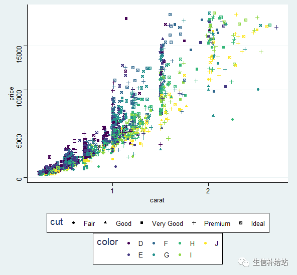
library(ggthemes)
p + theme_stata()
除上述外,ggthemes包还提供其他主题,小伙伴们自己尝试吧。
theme_economist theme_economist_white
theme_wsj 	 	theme_excel
theme_few 	 	theme_foundation
theme_igray 	theme_solarized
theme_stata 	theme_tufte
4 自定义主题
可根据常见需要自定义常用主题
theme_MJ <- function(..., bg='white'){
    require(grid)
    theme_classic(...) +
        theme(rect=element_rect(fill=bg),
              plot.margin=unit(rep(1,4), 'lines'),
              panel.border=element_rect(fill='transparent', color='transparent'),
              panel.grid=element_blank(),
              axis.title = element_text(color='black', vjust=0.1),
              axis.ticks.length = unit(-0.1,"lines"),
              axis.ticks = element_line(color='black'),
              legend.title=element_blank(),
              legend.key=element_rect(fill='transparent', color='transparent'))
}
p + theme_MJ() + labs(title="学习ggplot2可视化",subtitle = "参数好多记不住?",caption = "熟能生巧!")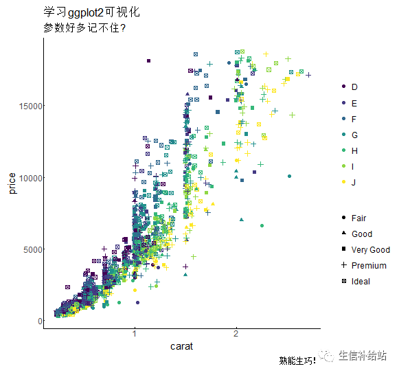
以上就是ggplot2的八大要素,七颗龙珠可召唤神龙,八大要素合理使用可画出“神龙”,🤭!!!
百度搜索 ImageGP,轻松在线绘图
ggplot2高效实用指南 (可视化脚本、工具、套路、配色)
往期精品(点击图片直达文字对应教程)
|
|
|
|
|
|
|
|
|
|
|
|
|
|
|
|
|
|
|
|
|
|
|
|
|
|
|
|


后台回复“生信宝典福利第一波”或点击阅读原文获取教程合集