关注▲ W3Cschool▲ ,每天一篇文章,与你共同成长
作者丨小小摇钱树
来源丨https://juejin.im/post/6881429197542785031
一、纯图片的DIV
html代码**(以下效果皆围绕这个代码展开)
"lists">
    "#" class="box">
        "avatar.jpg">

    "#" class="box">
        "avatar.jpg">
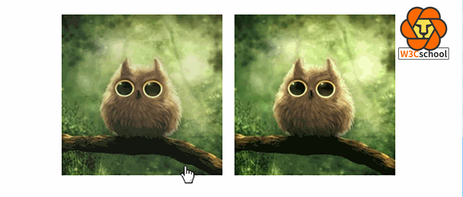
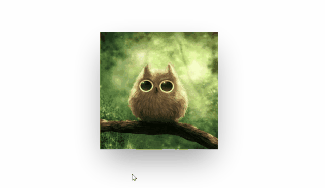
1、缓动上移
效果图:
.lists{
    display: flex;
    margin-top: 100px;
    justify-content: center;
}
.box{
    width: 200px;
    height: 200px;
    transition: all 0.3s;
}
.box~.box{
    margin-left: 15px;
}
.box img{width: 100%;height: 100%;}
.box:hover{
    transform: translateY(-6px);
}
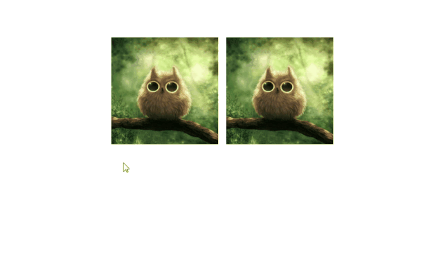
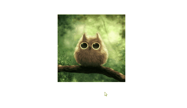
2、放大效果
效果图:

.lists{
    display: flex;
    margin-top: 100px;
    justify-content: center;
}
.box{
    width: 200px;
    height: 200px;
    transition: all 0.3s;
}
.box~.box{
    margin-left: 15px;
}
.box img{width: 100%;height: 100%;}
.box:hover{
    transform: scale(1.03);
}
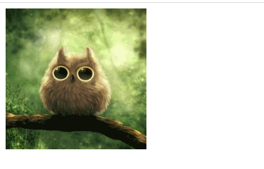
3、框内放大效果
效果图: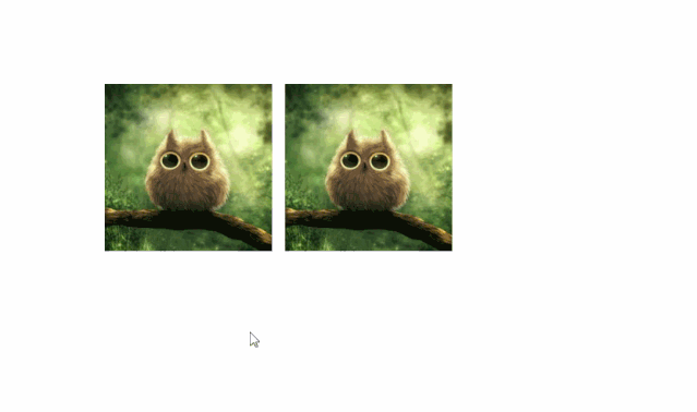
.lists{
    display: flex;
    margin-top: 100px;
    justify-content: center;
}
.box{
    width: 200px;
    height: 200px;
    overflow:hidden;
}
.box~.box{
    margin-left: 15px;
}
.box img{
    width: 100%;
    height: 100%;
    transition: all 0.5s;
}
.box:hover img{
    transform: scale(1.1);
}
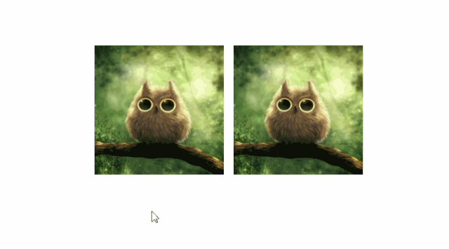
4、蒙层效果
效果图:
.lists{
    display: flex;
    margin-top: 100px;
    justify-content: center;
}
.box{
    width: 200px;
    height: 200px;
    overflow:hidden;
    background-color: #4f4f4f;
}
.box~.box{
    margin-left: 15px;
}
.box img{
    width: 100%;
    height: 100%;
    transition: all 0.5s;
}
.box:hover img{
    opacity: 0.8
}
二、上图下文的DIV
不建议将整个div放大,会导致文字模糊抖动。上移的幅度也不要太大,否则会出现同样的效果。
html代码:(以下效果皆围绕这个代码展开)
"lists">
    "#" class="item">
        "item_pic">
            "avatar.jpg">
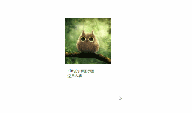
"title">Kitty的标题标题 "content">这是内容 1、框内放大图片+阴影
效果图:
.lists{
    display: flex;
    margin-top: 100px;
    justify-content: center;
}
.item{
    width: 200px;
    color: #333;
    text-decoration: none;
    border: 1px solid #eee;
    transition: all 0.5s;
}
.item .item_pic{
    width: 200px;
    height: 200px;
    overflow: hidden;
}
.item .item_pic img{
    width: 100%;
    height: 100%;
    transition: all 0.5s;
}
.item:hover .item_pic img{
    transform: scale(1.1);
}
.item:hover{
    box-shadow: 0 0 15px rgba(0,0,0,0.2);
}
.item_content{
    padding: 20px 10px;
}
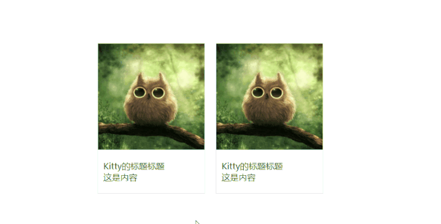
2、缓动上滑+阴影
这个样式很典型,比如花瓣网、掘金的活动栏目。
当div上移的时候,还是可以很清楚的看到字体模糊了,可以把字体缩小点,上移的幅度设置成一个像素。
效果图:
.lists{
    display: flex;
    margin-top: 100px;
    justify-content: center;
}
.item{
    width: 200px;
    color: #333;
    text-decoration: none;
    border: 1px solid #eee;
    transition: all 0.5s;
    margin-right: 20px;
}
.item .item_pic{
    width: 200px;
    height: 200px;
    overflow: hidden;
}
.item .item_pic img{
    width: 100%;
    height: 100%;
    transition: all 0.5s;
}
.item:hover{
    /*-1或者-2最佳*/
    transform: translateY(-1px);
    box-shadow: 0 0 15px rgba(0,0,0,0.3);
}
.item_content{
    padding: 20px 10px;
}
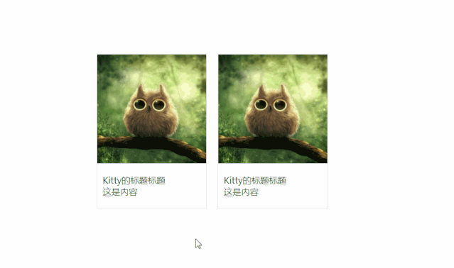
3、蒙层效果+文字变色+边框
效果图:
.lists{
    display: flex;
    margin-top: 100px;
    justify-content: center;
}
.item{
    width: 200px;
    color: #333;
    text-decoration: none;
    border: 1px solid #eee;
    margin-right: 20px;
    transition: all 0.5s;
}
.item .item_pic{
    width: 200px;
    height: 200px;
    overflow: hidden;
    background-color: #4f4f4f;
}
.item .item_pic img{
    width: 100%;
    height: 100%;
    transition: all 0.5s;
}
.item:hover{
    border: 1px solid green;
}
.item:hover .item_pic img{
    opacity: 0.8;
}
.item:hover .item_content{
    color: green;
}
.item_content{
    padding: 20px 10px;
    transition: all 0.5s;
}
三、文字覆盖图片DIV
1、不知道取什么名字了,反正好看就对了
效果图:
html代码:
"box">
    "avatar.jpg" alt="Kitty的头像" />
    "box2">
        Kitty的头像
        Kitty的名字
css代码:
.box {
    position:relative;
    z-index:1;
    display:inline-block;
    overflow:hidden;
    background:#3085a3;
    text-align:center;
    cursor:pointer
}
.box img {
    width:200px;
    height:200px;
    opacity:1;
    transition:opacity .35s,transform .35s;
    float:left;
}
.box:hover img {
    opacity:.5;
}
.box h3 {
    margin-top:20%;
    transition:transform .35s;
    transform:translate3d(0,20px,0);
    opacity:0;
    color:#fff;
    font-size:16px;
}
.box p {
    margin:10px 0 0;
    padding:15px;
    border:1px solid #fff;
    opacity:0;
    transition:opacity .35s,transform .35s;
    transform:translate3d(0,20px,0) scale(1.1);
    color:#FFF;
}
.box:hover h3 {
    transform:translate3d(0,0,0);
    opacity:1;
}
.box:hover p {
    opacity:1;
    transform:translate3d(0,0,0) scale(1);
}
.box2 {
    width:200px;
    height:200px;
    padding:15px;
    position:absolute;
    box-sizing: border-box;
}
2、文字滑动进入
效果图:
html代码:
"lists">
    "item">
        "text">
          标题名称
          "avatar.jpg">
          "animate-text">Kitty 的测试案例
          "animate-text">这里放内容简介,内容简介,这里放内容简介,内容简介,这里放内容简介,内容简介
          "dots">
css代码:
* { margin: 0; padding: 0;}
.lists{
    width: 100%;
    display: flex;
    justify-content: center;
    margin-top: 100px;
}
.item {
    width: 300px;
    height: 300px;
    background-color: #99aeff;
    position: relative;
    cursor: pointer;
    transition: all 0.4s ease-out;
    box-shadow: 0px 35px 77px -17px rgba(0, 0, 0, 0.44);
    overflow: hidden;
    color: #fff;
}
.item img {
    height: 100%;
    width: 100%;
    position: absolute;
    top: 0;
    left: 0;
    z-index: 0;
    transition: all 0.4s ease-out;
}
.item .text {
    width: 100%;
    height: 100%;
    box-sizing: border-box;
    z-index: 99;
    position: absolute;
    padding: 30px;
}
.item h1 {
    text-shadow: 2px 2px 10px rgba(0, 0, 0, 0.3);
}
.item h2 {
    margin-top: 20px;
    font-style: italic;
    transform: translateX(200px);
}
.item p {
    margin-top: 20px;
    line-height: 25px;
    transform: translateX(-200px);
    transition-delay: 0.2s;
}
.animate-text {
    opacity: 0;
    transition: all 0.6s ease-in-out;
}
.item:hover {
    box-shadow: 0px 35px 77px -17px rgba(0, 0, 0, 0.64);
    transform: scale(1.05);
}
.item:hover img {
    opacity: 0.2;
}
.item:hover .animate-text {
    transform: translateX(0);
    opacity: 1;
}
.dots {
    position: absolute;
    bottom: 20px;
    right: 30px;
    margin: 0 auto;
    width: 30px;
    height: 30px;
    display: flex;
    flex-direction: column;
    align-items: center;
    justify-content: space-around;
}
.dots span {
    width: 5px;
    height: 5px;
    background-color: #fff;
    border-radius: 50%;
    display: block;
    opacity: 0;
    transition: transform 0.4s ease-out, opacity 0.5s ease;
    transform: translateY(30px);
}
.item:hover span {
    opacity: 1;
    transform: translateY(0px);
}
.dots span:nth-child(1) {
    transition-delay: 0.05s;
}
.dots span:nth-child(2) {
    transition-delay: 0.1s;
}
.dots span:nth-child(3) {
    transition-delay: 0.15s;
}
3、按钮滑动进入
效果图:
html代码:
"item">
    "avatar.jpg" alt="" />
    "btns">
        "follow">关注
        "love">点赞
css代码:
.item{
    width: 300px;
    height: 300px;
    margin: 100px auto;
    cursor: pointer;
    position: relative;
}
.item img{
    width: 100%;
    height: 100%;
    background-color: #4f4f4f;
    position: relative;
    z-index: 2;
}
.item:hover .btns{
    z-index: 3;
}
.item .btns{
    width: 100%;
    height: 100%;
    position: absolute;
    top: 0;
    left: 0;
    z-index: 1;
    background-color: rgba(0,0,0,0.3);
    transition: all 0.6s;
}
.follow,.love{
    width: 100px;
    height: 30px;
    line-height: 30px;
    text-align: center;
    border-radius: 4px;
    transition: all 0.3s;
    font-size: 14px;
    opacity: 0;
    background-color: #fff;
    color: #999;
}
.item:hover .follow{
    transform: translateY(80px);
    opacity: 1;
}
.item:hover .love{
    transform: translateY(-80px);
    opacity: 1;
}
.follow{
    position: absolute;
    left: calc(50% - 50px);
    top: -30px;
}
.love{
    position: absolute;
    bottom: -30px;
    left: calc(50% - 50px);
}
-End-
编程狮(W3Cschool)
学编程,从W3Cschool开始

微信扫描二维码,关注公众号
 0
0
赞
 0
0
收藏
 NEW
NEW
 w3cschool


